geez everybody... i'm very sorry it took me so long to get here. well here goes...
kathy... well what can i say. it pretty much embodies the overall theme. great lines, very fluid. i really dig the "clashing patterns" as the fashionista's would say. grid's, curves and straight lines all coming together in some willy nilly BUT somehow balanced frame. i love the huge foreground so no critiques there... the only possible nit pick i can come up with is the downsloping road? where it meets the grid of the foreground seems a little blown out to me. but that's really searching for a criticism... please forgive me. great job!
jan... again another huge foreground and it seems to make sense to me. it kind of guides your eye's to the somewhat "satirical" element of the girl on the sign. that's the element that really makes the photo unusual, gives it a sense of depth. the only thing i'd maybe like to see is a little less sky and foreground. now that's certainly not a critique... more of a hmmm, i wonder.
gabriel... cool photo indeed. the fella's eye's seem perfectly in line with the folks soaking up the rays. i love the huge swath of blue seemingly invading the frame. it seems to really create a sense of tension for me. again a symphony of totally seperate things coming together to attempt some sort of order. i really like what you were going for here. i was thinkink if it was shot in the am or pm the center wouldn't suffer the wash out however the people might not be around for it... and the photo wouldn't be the same without them.
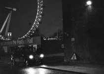
alkis... honestly i can't really see it my friend. i'm really hesitant to comment on it. it's obviously a really great study of lights and tone but i'm just not able to make much out. terribly sorry...
alright that leaves emraphoto. may i say wow! what a masterpiece... hang on, sorry that's me.
cheers
john