Crop this photo

Joao

Negativistic forever
Local time
4:33 PM
Joined
Oct 14, 2006
Messages
1,410
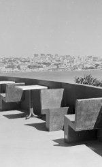
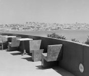
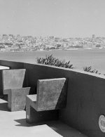
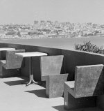
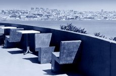
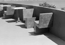
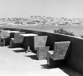
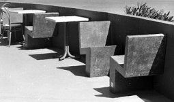
Can you crop this photo in order to get a better composition? Please feel free to try (square, portrait or landcape, does not matter).
Thanks
Joao

3494734150_883e66248c.jpg
 
no crop

no crop

a sort of cropping where you just try and emphasize whats important to you.


p.s. the only way of judging the horizon here is possibly by the seat.
 
Last edited:
@cweg the first one made me smile, really, really great how the crop changed the image. I would have _never_ thought of this, maybe I should start cropping more (...consciously)

martin
 
3494734150883e66248cb.jpg


Cut off all unnecessary parts. The vast open sky is evenly coloured and therefore rather dull. The essence of the wall and seats is preserved without showing the ventilation opening (?) in the wall. Had it still been perfectly round I would have kept it for easthetic reasons, but since it is oval due to picture perspective, it is merely a distracting object.

All solutions are valid, it all depends on the viewers preferences!
 
Vertical Crop

Vertical Crop

I've never uploaded before so I hope this works OK
Regards

Harry
 

Attachments

  • crop.jpg
    crop.jpg
    46.6 KB · Views: 0
I wanna play

I wanna play

great tones in the sky and sunny areas
 

Attachments

  • 3494734150_883e66248c.jpg
    3494734150_883e66248c.jpg
    106.5 KB · Views: 0
  • 3494734150_883e66248c_edited-1.jpg
    3494734150_883e66248c_edited-1.jpg
    75.9 KB · Views: 0
Square Crop

Square Crop

Thought I would also try a square crop.
There are a number of strong geometric shapes in the concrete seats and to accentuate these I have cropped as tight as possible.
Regards

Harry
 

Attachments

  • square crop.jpg
    square crop.jpg
    30.5 KB · Views: 0
Roland is on the right track IMO ... that's the one that works best for me!
 
Thanks

Thanks

I welcome all the comments and sugestions. I was amazed with (and learned from) the variety of proposed options, it resulted as a "Crtique" thread put into practice. Thank you all for your input
Best regards
Joao
 
here's mine

here's mine

here... just the graphic portion is the most interesting..
 

Attachments

  • 3494734150_883e66248c.jpg
    3494734150_883e66248c.jpg
    60.1 KB · Views: 0
Personally, I would crop to place the horizon nearer the rule of thirds and lose the circular object in the wall as it is distracting. I also leveled up the horizon a little.

I might also try using just the graphic shapes of the chairs.

In both cases I've taken the bottom of the wall into the corner of the image. In the second image I've taken the top of the wall into the other corner.
 

Attachments

  • 1.jpg
    1.jpg
    49.9 KB · Views: 0
  • 2.jpg
    2.jpg
    30.3 KB · Views: 0
Last edited:
Back
Top Bottom