Davidin10003
Established
I had an e-p1, and while I love the camera in concept, I never really bonded with it. When the e-p2 came out, I was very interested in the EVF, so I sold the e-p1 and upgraded.
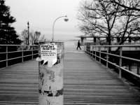
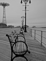
After a couple of weeks, I'm finally bonding with this camera. I keep the Panny 20/1.7 lens on it most of the time, but I also shoot with some m-mount lenses (35, 50, and 90mm). Here are some shots I liked from a walk around Coney Island on a very cold day in February. C& C welcome!
David
The set is at: http://www.flickr.com/photos/david10003/sets/72157623398234467/