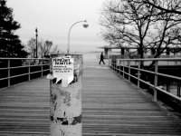
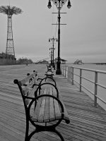
Finally getting comfortable with E-P2. C&C welcome!

Davidin10003

Established
Local time
10:24 AM
Joined
Dec 17, 2009
Messages
52
I had an e-p1, and while I love the camera in concept, I never really bonded with it. When the e-p2 came out, I was very interested in the EVF, so I sold the e-p1 and upgraded.

After a couple of weeks, I'm finally bonding with this camera. I keep the Panny 20/1.7 lens on it most of the time, but I also shoot with some m-mount lenses (35, 50, and 90mm). Here are some shots I liked from a walk around Coney Island on a very cold day in February. C& C welcome!

David

The set is at: http://www.flickr.com/photos/david10003/sets/72157623398234467/
 

Attachments

  • 4393814688_2b924a325e_o.jpg
    4393814688_2b924a325e_o.jpg
    45.6 KB · Views: 0
  • 4393806858_5f90b90319_o.jpg
    4393806858_5f90b90319_o.jpg
    41.6 KB · Views: 0
I'm finding these a little static and ordinary, for the most part--the best ones, though, are the "Playland" one with all the grass, and the one of the Cyclone sign through the fence--the framing is interesting on those. I'd concentrate on looking for unusual ways of seeing these otherwise familiar things.

Coney Island is cool...it's been ten years or so since I've been there...gotta go back this summer.
 
Considering the cold, grey, uninspiring day I'd say they are all pretty good. Lacking shadows some of the landmark buildings are just flat looking.
It's been 30 years since I've been there.
 
Thanks, Ducky

Thanks, Ducky

Yes, it was a miserable day to be out shooting. 16 degrees and very windy...I couldn't actually feel my fingers on the camera, so manual focusing we especially hard! But, when you get the time to go out shooting for a couple of hours, I guess you have to take what you get.

Anyway, thanks for the comments, and you're right, some (any) directional light would have been great. They are rather flat.
 
Mabelsound, thanks for the input. And I agree that some of them are lacking...I need to be a more stringent editor!

That's the best response to constructive criticism I have ever read. If only more people would adopt this attitude.

Looking through the images, I think your composition is somewhat sloppy. Many would benefit from slightly different angles.

This place seems to be doomed to look static and ordinary; there doesn't seem to be a lot going on. Static and ordinary can still be interesting though, at least I feel that way. Instead of trying to spice things up by using artsy angles I'd embrace the static (staticity?) and go all the way - straight horizons, upfront angles and precisely composed shots. As far as examples go, I'd check out large format photographers (Soth, Epstein, Höfer, Phelps, ... ).

This is obviously just one approach, one idea. I'm sure there are plenty of alternatives.

Cheers, martin
 
Martin, great feedback, thanks! And I think I like the idea of trying some more "formally" composed shots in that dead environment...I'll give that a shot. Thanks much for the photographers to look at.
Regards,
David
 
No problem; could somebody help me out here, though, I'm seriously racking my brains - what's the noun of static? My dictionary says there isn't one, static as a noun only refers to electricity. What else could I use?

And David, I'll try to subscribe you Flickr Feed somehow, I'm really curious how your next trip is gonna work out.

martin
 
Stasis?

Main Entry: sta·sis
Pronunciation: \ˈstā-səs, ˈsta-\
Function: noun
Inflected Form(s): plural sta·ses \ˈstā-ˌsēz, ˈsta-\
Etymology: New Latin, from Greek, act or condition of standing, stopping, from histasthai to stand — more at stand
Date: 1745
1 : a slowing or stoppage of the normal flow of a bodily fluid or semifluid: as a : slowing of the current of circulating blood b : reduced motility of the intestines with retention of feces
2 a : a state of static balance or equilibrium : stagnation b : a state or period of stability during which little or no evolutionary change in a lineage occurs
 
I agree with some of the other comments. I think with a subject like this, you need to do things a little differently to excite the eye to not read it as, "oh another picture of urban decay" or "another photo of Coney Island". The ones that work introduce another element of visual interest:


I think this one works because the fence gives both an interesting perspective and conveys the idea of it being abandoned:

4393801154_bcdf04861f.jpg


This one is interesting in form but could use more contrast to make it work:

4393041431_480d36ebae.jpg


The figure in the backgound make this one interesting:
4393814688_c01f9b5fdc.jpg
 
Last edited:
Nightfly, thanks so much for taking the time to give me detailed feedback. I was very undecided about the first one, so I was interested to hear what you thought worked about it. And the last one you mentioned is my favorite from the series. I'll try to bump up the contrast on the abstract 'sand on the boardwalk' shot and see if it works a little better.

And you make a good point about trying to do something different than just the "same old motifs" that are so easy to fall into.

Thanks,
David
 
Another thing you might want to try is some post processing on the graffiti shots. I shoot a lot of graffiti and urban decay sort of stuff because I'm attracted to it and only a small portion makes it into my final edits. But I find things like cross processing slide film brings the contrast up and shifts the colors enough to make it pop and convey the visual attraction. It's in no way documentary or accurate but it conveys the thing that made me take the shot. I'm sure some creative post processing could be used to highlight the attraction of the shot to you as long as you are not philosophically opposed. This is an extreme example of one of my photos that was cross processed and then tweaked in post production:

466497010_fbba7ff025.jpg


I fundamentally like this image of yours and I think this image could be made more compelling with some post processing:

4393044123_7f479feb35.jpg


I think you could either bump up the contrast and colors to make it pop OR lower the contrast and desaturate to emphasize the mood of it. Something to sort of change the image and convey more of a point of view.
 
Last edited:
Back
Top Bottom