First results from darkroom!

chenick

Nick's my name!
Local time
2:27 AM
Joined
Apr 6, 2004
Messages
300
Location
Dublin, Ireland
Hi all,

I've just completed an introductory darkroom course, which I loved. Sigh, more equipment to source now, I thought I had GAS under control 🙂

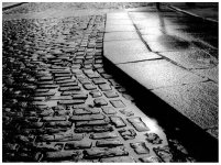
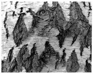
Here are the first results (scans are not the best, they're from 8x10 prints and I had to dig out an old scanner and an even older PC from storage as the scanner only worked with windows 98)

The street shot was Fuji Acros 100 souped in HC-110 for 5 mins (guesstimate) and printed on Ilford Multigrade pearl paper I think. Bessa R3A and CV Nokton 50mm F1.5

Same dev and paper for the tree shot, but was a Pentax ME Super and 50mm F1.4, along with Kodak TMAX 400 (too grey for my liking)

-Nick
 

Attachments

  • street_700x.jpg
    street_700x.jpg
    121.3 KB · Views: 0
  • sbark_700X.jpg
    sbark_700X.jpg
    157.6 KB · Views: 0
The tree print could have been given a bit more exposure. Depending on what are the lighter bits, you might have aimed for more contrast. Doesn't look offensive in the least. Your liking doesn't really matter. You should ask if the print correctly represents the tones of what you photographed.
 
payasam said:
Your liking doesn't really matter. You should ask if the print correctly represents the tones of what you photographed.

What if he wanted a particular effect, quite irrelevant to the actual tones of the subject as it existed before him when he took the photograph?

Clarence
 
payasam said:
Your liking doesn't really matter. You should ask if the print correctly represents the tones of what you photographed.

Sorry, that's just nonsense. Photography is an art. It is not the task of the photographer to simply reproduce the scene he or she photographs as accurately as possible.
 
payasam said:
Your liking doesn't really matter. You should ask if the print correctly represents the tones of what you photographed.

I don't think I agree with this statement entirely. It's true, 90% of the printing process is straight up textbook, but the real art is the last 10%. The print should reflect your personal vision of the scene and what you would like to say with it. The real task (ie that last 10%) is making it seem natural. Ansel Adams touches on this in his book, The Print. You've gotta make your print sing, not just interpret reality.
 
Thanks all...

The reason I didn't particularly like the Kodak T-Max was because of the low contrast
For the tree photo I was trying to increase the contrast as much as I could in the darkroom; the actual final print is slighty better than the scan here, but still a bit flat. Overall the print doesn't represent the tones accurately, but hey, it's all a learning experience.

Cheers,
Nick

payasam said:
The tree print could have been given a bit more exposure. Depending on what are the lighter bits, you might have aimed for more contrast. Doesn't look offensive in the least. Your liking doesn't really matter. You should ask if the print correctly represents the tones of what you photographed.
 
The street view is really well proportioned lots of elements on the Golden Mean, nice Gestalt patterns in the paving and that strong depressing shadow running out on the left gives a real mood to the image, well done, on thedown side; on my monitor the highlights look blown, but that’s for your judgment
 
That is if we wanted to make a "natural" print, which is not always the case.
IMHO it looks good, just needs some tweaking under the enlarger, or some extra exposure. A lot of people expose TMAX 400 as a 200film (set your speed dial to 200) and develop normally. IMHO Delta 400 is a much better film.


payasam said:
Your liking doesn't really matter. You should ask if the print correctly represents the tones of what you photographed.
 
Thanks Stewart,

You're right, the highlights are blown, but that's probably due to the cheap scanner (Agfa Snapscan 1212, so old it only works with Win 98)
Highlights in the print have plenty of detail.

I'm on the lookout for a dedicated neg scanner now...

-Nick

Sparrow said:
... on thedown side; on my monitor the highlights look blown, but that’s for your judgment
 
Excellent results, Nick. The street scene, as you know, has very high contrast. The shadow detail on the lower left corner is well-preserved - it would be very difficult to achieve that AND control the highlight without applying zone technique principles, IMHO. Furthermore, HC110 is regarded as good at controlling the highlights.

For a first effort, you definitely did well. I, for one, look forward to your future results. Congratulations.
 
Thank you all for your opinion, and you, JVX, for the kindest expression of it. Having belonged for forty plus years to the documentary tradition, I doubt that I can now rise to artsy fartsy heights.
 
Payasam, I think we didn't mean to sound hostile. It can be quite difficult to put across a question or a rebuttal on a forum without coming across as being aggressive.

Clarence
 
Clarence, I do not think it is difficult to remain civilised even when strongly disputing something. You suggested that the photographer might have aimed at a particular effect. While I may not see much point in presenting reality as something other than what it is, your manner of expression was unobjectionable and you spoke of something which was indeed possible.
 
Something I don't understand, Chris: "making it seem natural" vs. "not just interpret reality". I'd say "depict" rather than "interpret" if I wanted to do the first, which is precisely what I recommended anyway.

Here's a nit to pick. Wasn't Orson a Welles while the Wells was a Fargo?
 
payasam said:
Thank you all for your opinion, and you, JVX, for the kindest expression of it. Having belonged for forty plus years to the documentary tradition, I doubt that I can now rise to artsy fartsy heights.


Are you saying that documentary photography should be perfect records of the original as it presented itself?

Isn't a photograph a record of how a person saw an object or event rather than just a cold record of what it looked like?

Will it be too 'artsy fartsy' to introduce elements like personal perception
to the photograph?
 
Without meaning to sound at all rude, I think stating "Your liking doesn't really matter" to be rather rude in itself.

I thought photography was a hobby?
 
Kully, I should perhaps have qualified what I said with "in my view" or something like that. Fascinating that no one appears to have noticed the other things I said.

Photography is indeed a hobby for millions of people, but for many it is a means of survival. Cooking is not a hobby for a housewife or a chef.
 
To put some oil on the waves:

in my opinion, any photographer should get enough experience and knowledge to reproduce reality as close as possible. As a matter of fact, that's what he should work on first.

Once experienced enough and having full control over the equipement and processes for reproducing reality, one can dive into the artistic deviations of reality.

Your liking does matter, but it doesn't make sense to create something according to your liking if you can't understand how you did it and why you like it better than reality.

Groeten,

Vic
 
Back
Top Bottom