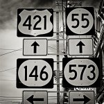
How does this image make you feel, do you like it, love it or hate it?

aldenfender

Established
Local time
6:12 AM
Joined
May 30, 2010
Messages
66
This may be a ridiculous post but... I cant decide for myself... I like it, yet it aggravates me at the same time and I have no clue why.
How does it make you feel?


6219050377_7cae190de1.jpg
 
Last edited:
In color - nah, nice but not really interesting. I really like it in B/W, kind of scary and foreboding - a totally different image.
 
am I the only one? I like the B+w, interesting perspective. I'm weird but I enjoy the color version more.. love that little flag peeking out..

The image seems busy but it still works for me. though I would have cropped just a lil on the left side so the vertical pole is in the center..
 
My problem with it is the space at the top and the cut off bottom. My eyes would never be able to make peace with that.
 
That sign is nothing. I will try to get a photo of roads in Japan. That will really confuse the hell out of you. Yes, they are in Roman Letters. The directions roads go is mindboggling!
 
My problem with it is the space at the top and the cut off bottom. My eyes would never be able to make peace with that.

Dear Vince,

Seconded.

It's a variant on a picture that must have been taken by almost anyone who has ever been to the United States: better than many, because of the flag and the wires, not as good as the best. They're most entertaining (in my book) when you have signs pointing both east and west, or north and south, on both sides of the stack -- and when the stack is bigger, with six or eight roads, not just four, so it's too confusing to read quickly when you're driving. I wonder how many accidents these signs cause?

Then again, in Brittany once, I saw two signs, one above the other, saying TOUTES DIRECTIONS and AUTRES DIRECTIONS (ALL DIRECTIONS and OTHER DIRECTIONS).

Cheers,

R.
 
It jars because of the repetition of elements, Gestalt thing (Gestalt - "essence or shape of an entity's complete form"), the visual dissonance is because of the slight differences in some of the elements
 
Last edited:
There's a lot of visual and cognitive tension in the original shot. The B&W version seems to calm it down and make the image more interesting.
 
I too would probably have cropped more tightly around the signs, but apart from that what it's saying to me is that someone has tried to impose some strict order on an environment that shows in the background to contain a fair degree of disorder.
But the attempt to do this has been compromised by the very elements of the signage that were intended to bring order.
 
Like several other posters, I am indifferent to the image. I think it is great that you put an image out for critique. That's something we should do more of here at RFF. Thanks for posting.
 
Well, if there ever was an image on RFF that shows how distracting color can be...but not only that, the color image on a bright sunny day just lends a busy, crappy urban atmosphere to what the viewer sees. BW on the otherhand, is a more somber, dark mood and fits the image much better IMO.:angel:
 
Being a sign designer it aggravates me because the circular element with only two digits breaks the rythem and draws my eye straight to it.

I suppose it's conditioning, others may be drawn straight to the red of the flag, but that disc with the '55' bugs me.
 
I think it is much better in color..I like the flag and the busy elements within the frame. As to how it makes me feel.......... not much honestly. I cant get past the missing lower edge and the pile of building on the side. The image has no balance.


Glad you posted this
 
Back
Top Bottom