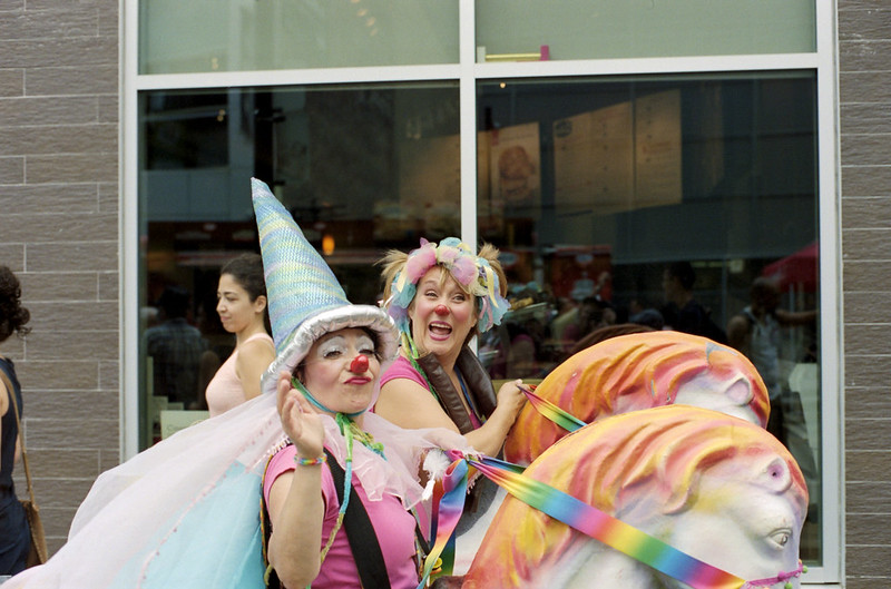
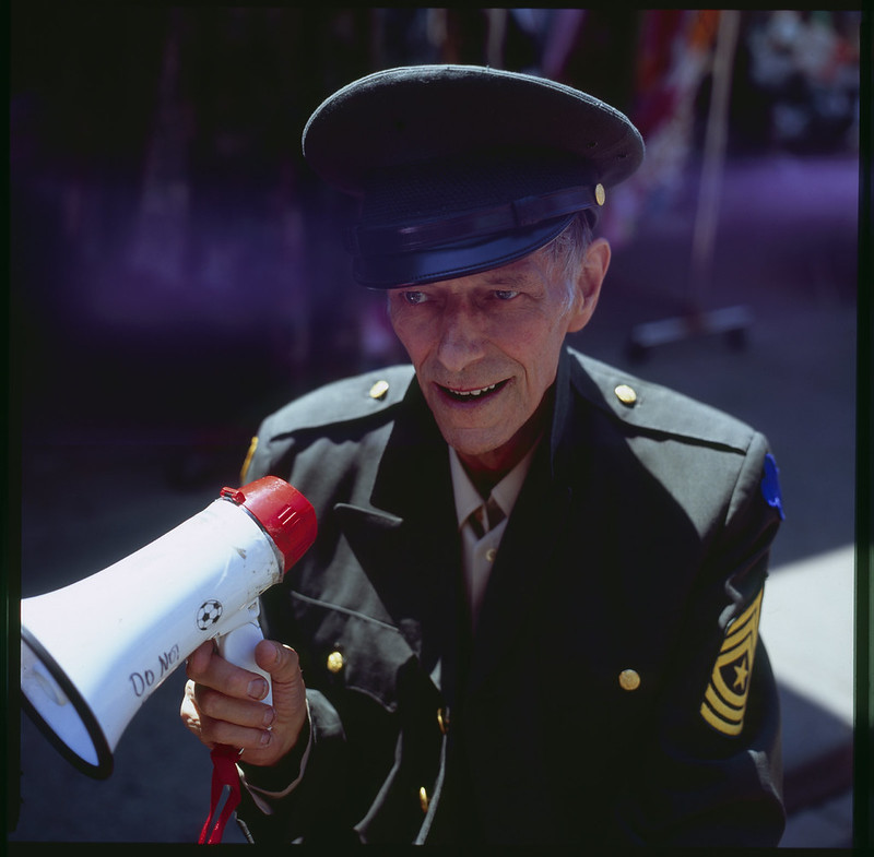
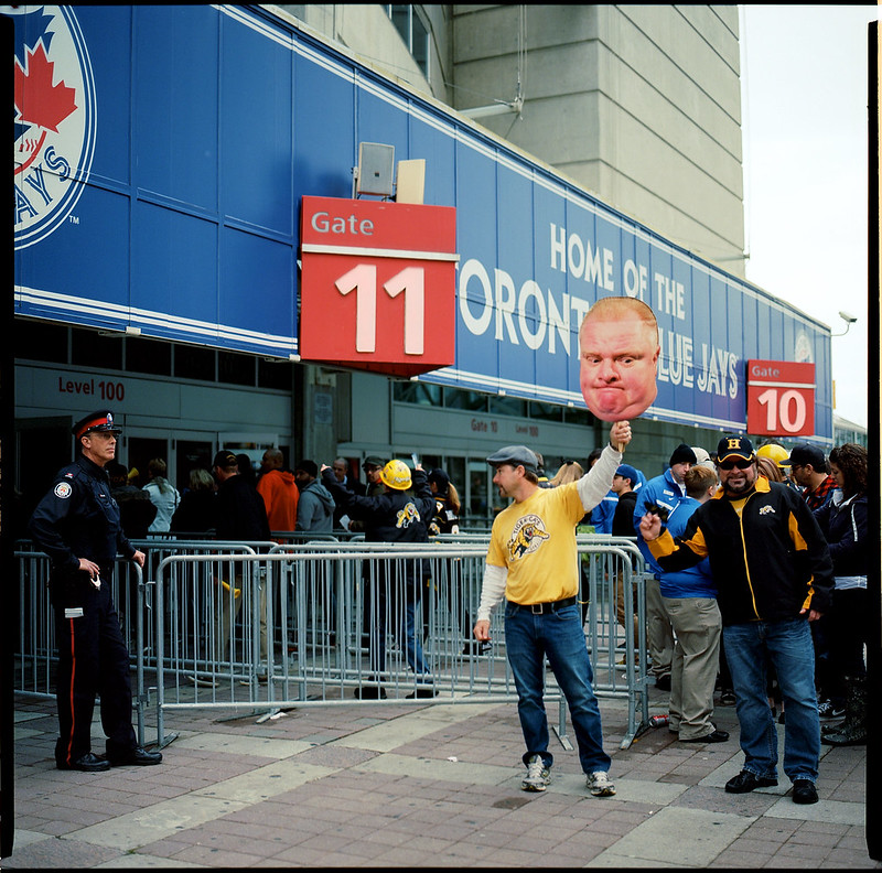
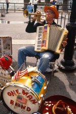
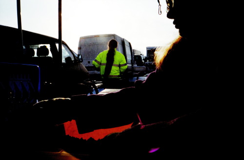
Ko.Fe., I've always felt that the most important thing in a colour photograph is the colour.. so it becomes more of a challenge in street photography where there is usually colour everywhere and it's often moving as well.. moving coloured vehicles and people, a constantly-shifting colour canvas..
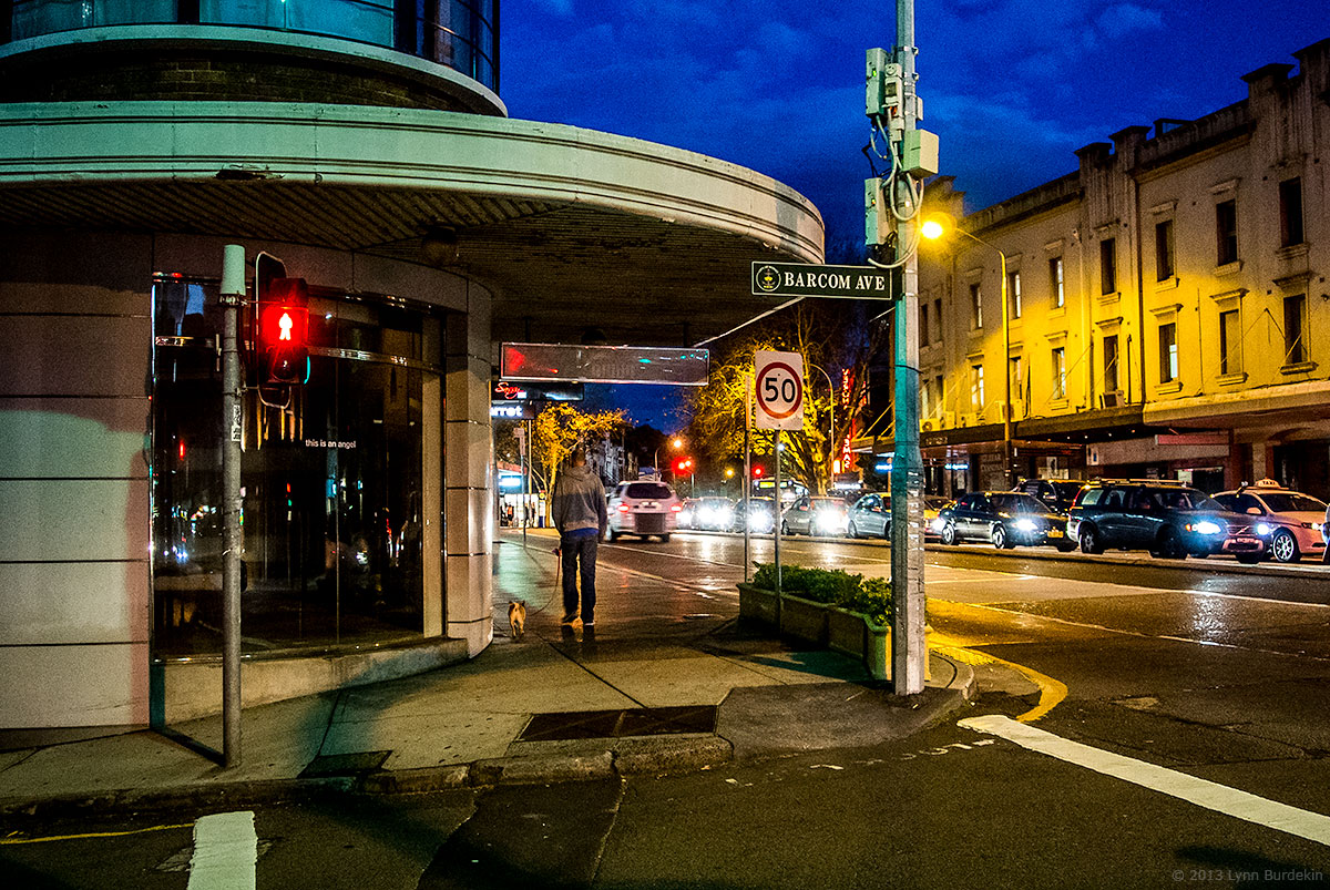
There are some light conditions where I think it's easier to compose in colour, but there's exceptions to every rule.. I like dusk and darkness where the high luminance colour is rich and shadow areas are more likely to be neutral and muted.. but photos like Alex Webb's and Ernst Haas, and the first picture by Edge100 above show that in bright high contrast light you can still find ways to isolate bright colour.
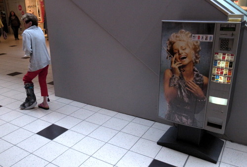
Golden hour colour is overlaid with warm tones which can give an overall attractive muted-colour look that can also be achieved in post processing.
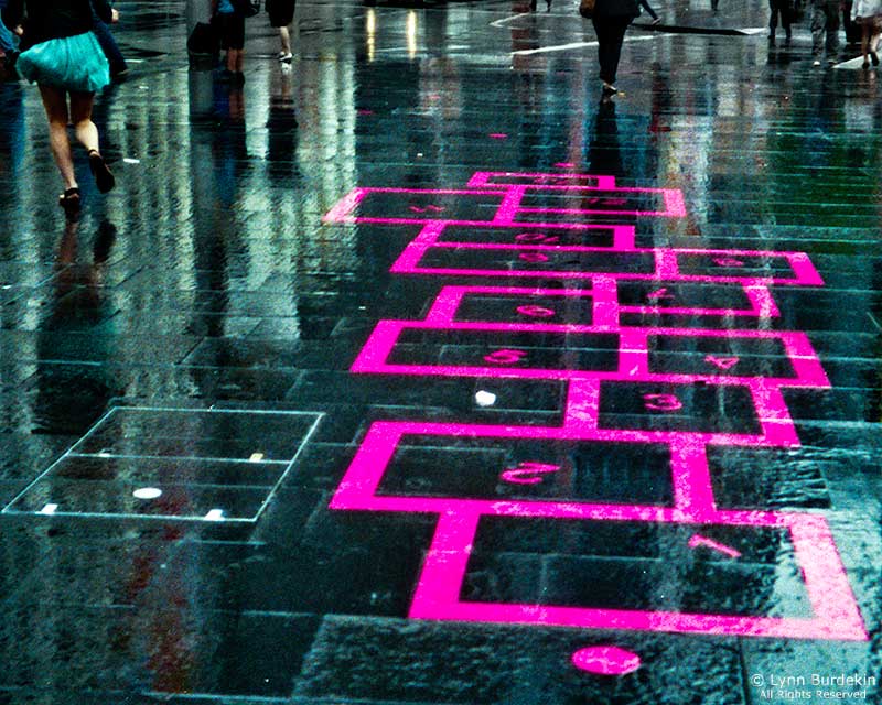
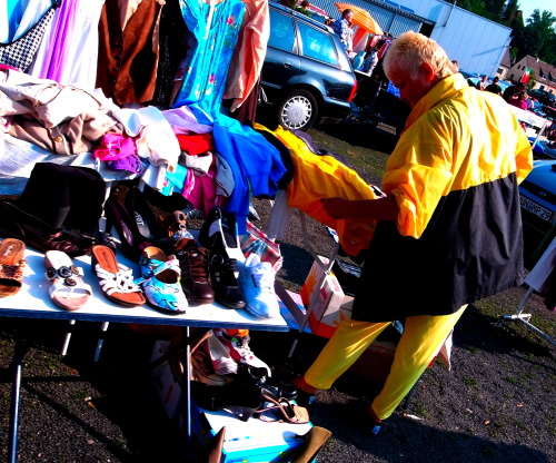
Flat low-contrast days resemble a colour field so that colour composition can be abstracted, for example in the way of Mondrian, thinking about the arrangement of coloured shapes in space.. Stephen Shore's streetscapes are excellent examples of composing in colour.
Your photographic tools in the colour rendition and apparent acutance can influence the liveliness or recession of colour within an image - think of the difference between a Zeiss lens and a Summitar.. and also choice of film, you'd be very familiar with the difference between Ektar and Portra. So many choices.
So I guess what I'm saying is it depends what sort of look you want your colour street photography to have, and what sort of light and environment you are working in. Compare for instance Yanidel's distinctive Paris street colour look
here, and
Alex Webb, or Ernst Haas's colour photos of New York. Worlds apart (I prefer Webb and Haas).
As to transparency film, why not? If you nail the exposure it can be very rewarding. Deep shadows and rich colour.
Cheers,

 1024) {this.width=1024;this.alt='Click here to see a large version';}" onmouseover="if(this.alt) this.style.cursor='pointer';" onclick="if(this.alt) window.open('https://farm8.staticflickr.com/7622/16806083291_9b70636bf6_c.jpg');" border="0">
 1024) {this.width=1024;this.alt='Click here to see a large version';}" onmouseover="if(this.alt) this.style.cursor='pointer';" onclick="if(this.alt) window.open('https://farm9.staticflickr.com/8589/16058099953_d21988fb91_c.jpg');" border="0">
 1024) {this.width=1024;this.alt='Click here to see a large version';}" onmouseover="if(this.alt) this.style.cursor='pointer';" onclick="if(this.alt) window.open('https://farm8.staticflickr.com/7512/15953720822_20a2fae631_c.jpg');" border="0">
 1024) {this.width=1024;this.alt='Click here to see a large version';}" onmouseover="if(this.alt) this.style.cursor='pointer';" onclick="if(this.alt) window.open('https://farm8.staticflickr.com/7519/15647765332_22211b5216_c.jpg');" border="0">
 1024) {this.width=1024;this.alt='Click here to see a large version';}" onmouseover="if(this.alt) this.style.cursor='pointer';" onclick="if(this.alt) window.open('https://farm6.staticflickr.com/5564/14844613458_22eace21aa_c.jpg');" border="0">