I finally did it!

Another added congratulations on moving into the processing world! As noted by others, after over 40 years of developing film and printing, I still get such a kick out of seeing the negatives and the images appearing on the paper...now I need to learn how to scan! Nice pics as well!!
 
Wow - great shots. Even more impressive considering it's the first roll! Nice series. The only pic that needs work IMO is 'Garden Gate' which is noticeably flatter and a bit underexposed compared to the rest - makes it look out of place. Just needs a bit of an 's-curve' boost. Otherwise, really nice tonality and feel.
 
Oh my. That feeling of finally getting down to start developing though you have started shooting since you were 15! Sounds like a great start to your 2014!

To dry your negs faster, a small drop of dish washing liquid into the final rinse quickens the drying process, allowing you to scan them faster 🙂
 
I think I really overdid pp a bit and pushed contrast too high. The scans are much flatter, but I like this contrasty look (too much).

There is *nothing* wrong with liking high-contrast B&W images. As you produce more, you'll develop a more refined taste. Some people move gradually to liking lower contrast images, some do not. It's part of the journey.
 
This posting shows me that a flat bed scanner does a good enough job with 35mm film. Good job on that first roll!
 
Thanks Thomas!

I got 2 more films developed today with varying results. Less keepers in that batch.

One HP5+ shot with the XA2 and another TriX shot with my 'new' Canon A-1.

The A-1 seems to underexpose a bit, or my developing was faulty...

Anyways, this is FUN

Tried Epson Scan versus VueScan for scanning on my Epson V600 and think VS gives better, smoother results. Alas, for color negs VS renders the colors quite wrong, often a strong blue cast! Epson Scan gives much better colors!

What am I doing wrong???
 
When i was a teenager I just loved the work of Bill Brandt. All my early stuff was high contrast, then printed on grade 4 paper....
Nothing wrong with that, but by the time I'd been taking pictures for 4-5 years I saw the beauty in long tonal scale images.

A few years back I bought Brandt 'The Photography of Bill Brandt' published by Thames & Hudson where Brandt is quoted as saying 1951 was his turning point with respect to printing, everything was on harder paper after that point he felt it gave his images a style that was very different from colour.

I just love his perspective of Nudes book, the photogravure process used for the images adds to the contrast.
 
Very nice pics indeed! The local contrast enhancement filter, clarity filter, or whatever, is too high for my taste but that's just my taste. If you like it, then it's right for you. Just beware, though, that if you try to print these in the darkroom you'll not be able to get the same micro-contrast look. If your long-term goal is darkroom prints then it might be an idea to aim for a look that's more achievable in a silver gelatin print.

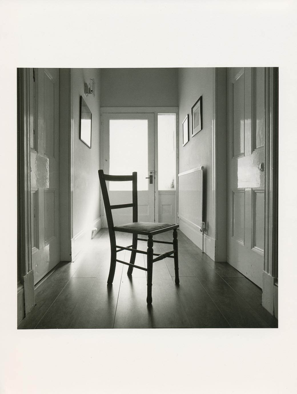
I really struggled with this when I started darkroom printing again just over a year ago. I'm starting to appreciate smoother prints with less snap but nicer tonality like this one on old Agfa Record Rapid:

chair.jpg


~
 
Back
Top Bottom