JeremyLangford
I'd really Leica Leica
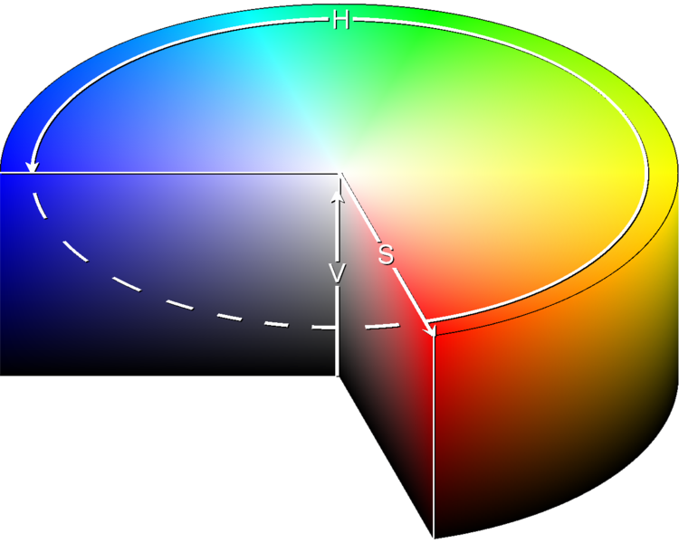
I understand that this is what we see as visible light.
But I'm trying to understand what shade of gray that different colors have when it hits Black and White film or when it is converted to grayscale. Here is visible light after I converted it to grayscale.
If Black and White film simply records different shades of gray, than how do we know what shade of gray a certain color will have? And if each color has a different shade of gray, than why can't we convert a Black and White image into color?
I've been trying to understand color theory and color as grayscale for a while and I just can't grasp anything from Google searches.

But I'm trying to understand what shade of gray that different colors have when it hits Black and White film or when it is converted to grayscale. Here is visible light after I converted it to grayscale.

If Black and White film simply records different shades of gray, than how do we know what shade of gray a certain color will have? And if each color has a different shade of gray, than why can't we convert a Black and White image into color?
I've been trying to understand color theory and color as grayscale for a while and I just can't grasp anything from Google searches.
Last edited:
bmattock
Veteran
But I'm trying to understand what shade of gray that different colors have when it hits Black and White film. Here is visible light after I converted it to grayscale.
They are not comparable. Color is wavelength, grayscale is intensity. You might note that lights do not change color if they are attenuated - such as with a neutral density filter.
To change color, you change frequency. To change grayscale range, you change intensity.
dmr
Registered Abuser
All we see in a B&W photo is the relative luminance or the value, and not the hue, or where on that spectrum the various shades of grey reside.
It's impossible to determine the hue from only the value information.
philipp.leser
Established
As everyone has said, the intensity determines the shade of grey you see in the end. The conversion you did on your color chart is thus misleading.
The hue has an additional effect which can be easily predicted by looking at the spectral response curve of your film which can be found in the data sheet. It's usually aimed to be pretty flat (i.e. ideally the hue doesn't affect the shade of grey), but there usually are deviations. Comparing the spectral sensitivity curves of ortho and pan film demonstrates this easily.
JeremyLangford
I'd really Leica Leica
Heres a picture of the standard Hue, Saturation, Value/Brightness digram that demonstrates how all colors are made.
When it comes to colors being recorded on Black and White film, if the different colors are on the same vertical value level, are they rendered the same tone of gray?

When it comes to colors being recorded on Black and White film, if the different colors are on the same vertical value level, are they rendered the same tone of gray?
Last edited:
bmattock
Veteran
When it comes to colors being recorded on Black and White film, if the different colors are on the same vertical value level, are they rendered the same tone of gray?
In a perfect world, yes. However, materials used to record those shades of gray vary in their capability to respond to the brightness level of different colors. The human eye also has different responses to the brightness level of different colors.
http://en.wikipedia.org/wiki/Bayer_filter
And to make matters worse, different human eyes are different. I have a common form of color-vision defect. I have several battery chargers that are supposed to signify the charge completion by changing color from red to green. I can't tell when it does that. But I can tell that one is brighter than the other - if I have one that is 'done' and the other 'not' so I can compare them. This would equate to different shades of gray if I were monochromatic - but only for me. A film camera would record the two colors as identical shades of gray - depending on the color sensitivity of the film.
dmr
Registered Abuser
When it comes to colors being recorded on Black and White film, if the different colors are on the same vertical value level, are they rendered the same tone of gray?
For an ideal film, yes.
For a real-world film, anywhere from sorta-kinda to no.
B&W films of different types have different spectral sensitivity curves.
Panchromatic films are fairly flat, but some of them are less sensitive to greens. Orthochromatic films are blind to red. "Ordinary" film, historically without any sensitizing dyes, is blind to reds, yellows, and greens to an extent, being most sensitive to blues and violet.
And then there are filters, red for that dark sky against the clouds.
JeremyLangford
I'd really Leica Leica
So our eyes see different wavelengths of light in the visible spectrum as different colors. And each wavelength/hue can have a different saturation and brightness. But when it comes to Black and White, the wavelength/hue and the saturation are both meaningless, leaving only the shade of gray or value of the color. Does all of that sound correct? What else should I know?
antiquark
Derek Ross
Yes, your description of B&W sounds OK. Saturation is zero, there is no hue, and only "value" has meaning.
What else should I know?
Don't ask, color perception is a huge field! You could be doing research for a long, long time if you wanted to know everything.
What else should I know?
Don't ask, color perception is a huge field! You could be doing research for a long, long time if you wanted to know everything.
Last edited:
pvdhaar
Peter
That very good TV program makers or movie directors of the days of black & white broadcasts and film would go to great lengths to have a consistent relation between colors present on the set and how dark/light it would appear on the screen.What else should I know?
They'd never combine different colors with the same brightness. Instead choosing near black-browns, dark-reds, medium-blues, light-orange and almost white yellows.. You'd be surprised at how effective such an approach (if followed consistently) is to suggest color where there is none.
JeremyLangford
I'd really Leica Leica
So after searching some, I found some pictures that are supposedly showing the spectral sensitivity of the human eye.
And here is the overall sensitivity of the rods (no color) in our eye. I guess it explains why night vision goggles make things appear yellow-green?
And finally, here is a picture showing the spectral sensitivity of Kodak Tri-X. As you can see, it is very similar to the spectral sensitivity of the human eye.
So I guess purple and red should seem less bright to our eyes if they are placed around something blue right?


And here is the overall sensitivity of the rods (no color) in our eye. I guess it explains why night vision goggles make things appear yellow-green?

And finally, here is a picture showing the spectral sensitivity of Kodak Tri-X. As you can see, it is very similar to the spectral sensitivity of the human eye.

So I guess purple and red should seem less bright to our eyes if they are placed around something blue right?
Last edited:
antiquark
Derek Ross
Something looks wrong with those diagrams, I've always understood that the human eye was most sensitive to the color green. For example, see this diagram:
http://www.ndt-ed.org/EducationReso.../PenetrantTest/Introduction/lightresponse.htm
dmr
Registered Abuser
Your eyes are indeed most sensitive to greenish colors, but your perception compensates, giving "normal" color vision in a variety of lighting conditions.
Chris101
summicronia
Most people's eyes are most sensitive to green, but as Bill said above, this is not universal. I tested my own eyes and found a great deal of green deficency:Your eyes are indeed most sensitive to greenish colors, but your perception compensates, giving "normal" color vision in a variety of lighting conditions.

bmattock
Veteran
Most people's eyes are most sensitive to green, but as Bill said above, this is not universal. I tested my own eyes and found a great deal of green deficency
I have found great solace with other color-blind photographers on Flickr. Amazingly, their stories are similar to my own. Many of them also see 'red' stoplights as 'green' and 'green' stoplights as 'bluish-white', and many of us come to a dead stop at single flashing yellow lights on rural intersections, thinking they are flashing red lights instead.
Even more fun, I have permanent monocular diplopia and massive astigmatism in each eye. Why I decided to become a photographer is beyond me.
Color is something I'd LOVE to understand. Most of ya'll see rainbows - I see two muddy streaks across the sky - one bluish, one yellowish. I know what they're supposed to look like, because I've seen photos, which apparently were not printed in exactly the right shades, because those, I can see the 'colors of the rainbow' in.
Calibrating my monitor is something I can never do, nor do I own a printer.
But I'm killer with B&W. And I see better at night than anyone I've ever met.
Last edited:
dmr
Registered Abuser
For those who want a not standard colo(u)r-blindness test, which seems to be a bit more rigorous than the common dot tests, surf here:
http://www.opticien-lentilles.com/daltonien_beta/new_test_daltonien.php
It will take a while but it is interesting.
http://www.opticien-lentilles.com/daltonien_beta/new_test_daltonien.php
It will take a while but it is interesting.
Chris101
summicronia
Thanks for that link dmr. I came out 70% deuteranopic, 20% deuteranomalous, which is inline with my own testing. At the eye doctor, they did a test where I would twist a couple dials until two color spots matched. That too gave me the result of a high degree of deuteranopy. My conclusion is that I am missing all or most M cones, and that any mid spectral perception I have is due to opposition colors.
dmr
Registered Abuser
The one thing about color which I have difficulty understanding is that transition from violet to red. The way I (we) visualize hue makes it continuous, as the violets become less bluish and more reddish and eventually pure red.
I know there's a discontinuity in there, wavelength speaking, if we're dealing with monochromatic light. I'm usually very good at understanding things like this, but this one fact always has seemed to be beyond my understanding.
Gabriel M.A.
My Red Dot Glows For You
B&W films of different types have different spectral sensitivity curves.
Panchromatic films are fairly flat, but some of them are less sensitive to greens. Orthochromatic films are blind to red. "Ordinary" film, historically without any sensitizing dyes, is blind to reds, yellows, and greens to an extent, being most sensitive to blues and violet.
And then there are filters, red for that dark sky against the clouds.
Correct. All films have a "sensitivity" for each color, if you will, of the visible spectrum. Some are formulated in such a way that people think of them as "being set to yellow filter" or "being set to red filter" etc etc.
This is one of the many things what gives different films a distinct signature. Some are better for lighter skin, others for darker skin, others for clear blue skies, etc. Many people don't or won't understand and cannot be bothered with these details.
antiquark
Derek Ross
The one thing about color which I have difficulty understanding is that transition from violet to red. The way I (we) visualize hue makes it continuous, as the violets become less bluish and more reddish and eventually pure red.
Because, the red receptors are also sensitive to violet light. Notice how the red response actually rises at the far left:
http://homepages.wmich.edu/~korista/web-images/human_cone_action_spectra.gif

http://upload.wikimedia.org/wikiped...Cone-response.svg/410px-Cone-response.svg.png

Last edited:
Share:
-
This site uses cookies to help personalise content, tailor your experience and to keep you logged in if you register.
By continuing to use this site, you are consenting to our use of cookies.