paulfish4570
Veteran
perfect use of my cow photo, stewart ... 
bobbyrab
Well-known
"here's one of mine I cocked-up a while back in Corfu Town" ... did you miss this bit, or was cocked-up not a familiar turn of phrase?
It seems I should apologies for a second time then, I thought we were to find the multiple circles in the second photo rather than the graphic.
airfrogusmc
Veteran
Don't tell Winogrand to not use the edges of the frame and I use the entire frame a lot including up to the edge. If it works with what I am trying to say why not? Oh thats right RoTs. LoL...
And in the last photo it also helps the girl is at the tip of an upside down triangle and she is very light.
thompsonks
Well-known
Though I have difficulty following discussions like this, I'll try to add something:
In the arts, rules are variables, with successive and overlapping rule-sets forming/dissolving over time. They might be understood as configurations of composition, narrative, technology, and symbolism, sometimes with one element dominant and sometimes another. Poussin might exemplify the artist whose paintings can be read by the rules, manner, and formalism displayed in all of them; Kandinsky or Richter, pretty much the opposite. You could view Durer or Bosch in terms of compositional rules, though that might miss what matters most, in the way of iconography and symbolism. In the last century sometimes rhythmic, rule-observant art has been respected (as when disruptive modernism shaded into art deco). But at other times an old order had to be mocked or violated (Guernica or early Rauschenberg).
IMO the missing point is that there's always a 'state of the art' with a constantly moving time-point. Think broadly of Kuhn's Structure of Scientific Revolutions, or of Bloom's Anxiety of Influence. Or Wittgenstein's useful & relevant notion of playing at endless language games. Besides a few constants of Gestalt psychology, 'what works' is this unending sequence of cultural and artistic conventions, departures, revivals.
In photography (because of its rapid development and short history), we can see especially clearly a series of workable rules/conventions superseded by timely revolutions and unravelings. The elaborate stylistic and compositional rules of pictorial photography 'had to' be replaced by at least two reactions – European modernism (esp. Surrealism) and American f64 precision. Family of Man humanism 'had to' be replaced in its own time by critical, ironic, and unsentimental styles (Robert Frank, William Klein); Ansel Adams 'had to' be followed by Robert Adams. Such styles and conventions 'had to' yield to the undercover formalism that rediscovers order in chaos (Winogrand, Friedlander), and/or the alternatives of Conceptualism. These are not just fads or shifts in taste, but are successive and overlapping period-styles in a rapidly evolving medium. Each has a distinct integrity or 'artistic merit,' and each is a developed and integrated system of aesthetics, social stance, and technology. But it's a merry-go-round that never stops; and photography in this way offers a condensed example of the changing rules and conventions that characterize every art-form.
A few Gestalt or design-school rules may apply to all the different period-styles I mentioned, but what makes art 'happen' in photography and elsewhere is not the rules or constants, but the dialectic of evolving art-forms within larger culture-forms. Notions that (a) there are definite categories or features of 'good' and 'bad' photographs (as advanced pretty crudely by Nick), or that (b) rules are important either to learn, or to learn and forget, are always subordinate to what's going on in the moving state-of-the-art.
A personal example came up in this thread: I made the photograph used by Stewart many posts above of the little bridge and the stairway that rises through the woods toward a light-source. I recently showed the portfolio in which it belongs to a number of artists and 'gallerists.' While I'm sure that all recognized the compositional patterns he pointed out, opinions were divided as to the value of the work in relation to 'standards.' Some elders and younger viewers responded with thumbs-up: the portfolio revived an old style with a refreshing new twist. But to others of an age or sensibility that departed from the conventional formalities of BW landscape photography into New Topographics and later styles, it was thumbs down for sinful regression to the rules or conventions of a period-style they were proud to have transcended. And this wasn't just subjectivity or 'personal taste,' because there seemed to be agreement about what was seen, compositionally/stylistically/technically. It was more a matter of where the viewer was situated in relation to developments in the photo world.
My own position is that I hope to recognize images and styles that are interesting for their freshness, and also the cliches of style and content that are up past their bedtime. I can't use any guidelines that are firmer than my education and experience. I have no more privileged clarity about what's good or bad than did the 1950/60 photo-magazine critics who dumped on Robert Frank, or the folks here who can't fathom Eggleston's alleged banality (gosh, is it almost as 'bad' as Warhol's?). So rather than focus on the Platonic Good(Bad) or on universal Gestalt principles, I just try to see old and new work and hold it behind my eyes, hoping to light a little spark of Weston's 'flame of recognition.'
And please excuse, if I've misunderstood what's going on in this discussion.
Kirk
Last edited:
Sparrow
Veteran
Kirk ... the other week in that 'brutal critique' it seemed to me many people were seeing the same features or effect in the shots but lacked the words to talk about what they were seeing ... so I thought a thread about the nuts and bolts of visual perception 'Looking at Pictures' would be a good idea
Unfortunately some folk have the idea that I'm telling them how they should be taking their own photos, and insulting their photographic heroes ... and although that's not the case, and I've repeatedly said that's not the case, their contributions have now made the thread rambling and very difficult to follow
It seems to me the problem with this thread stems from the use (at the start) of the word "rules" (or, "Rules"), as understood differently by different members. It should help to read carefully and pay attention to what is actually being said... Thanks for all the cogent comments. 
Sparrow
Veteran
It seems to me the problem with this thread stems from the use (at the start) of the word "rules" (or, "Rules"), as understood differently by different members. It should help to read carefully and pay attention to what is actually being said... Thanks for all the cogent comments.![]()
... you see the thing is, I didn't use the word, other than in quotation marks until post 118 ... So no that was not the case. The word was introduced by others long before I used the it, and even then just twice in the body of the text.
It was those who introduced it that went on to disrupt the thread by disagreeing with an argument I wasn't making ... persistently.
thompsonks
Well-known
Thank you, Stewart, I read your reply and went back to your OP. I 'get it' that you're offering a language for folks to describe what they see with more care, before they say what images or conventions (let's stop saying 'rules') they value. As long as we agree that languages of explanation are plural, work at several levels, and are relative to what's going on in a shifting art-context - I understand wheree you want to take us. Gestalt principles are important to seeing (both unconsciously and consciously) and are a firm foundation - if not the building itself.
I hope folks let you go on without much more debate over Rules.
Kirk
I hope folks let you go on without much more debate over Rules.
Kirk
Sparrow
Veteran
-----------------
... this logo, the yin-yang logo or the Tai-Chi symbol according to the interweb, demonstrates symmetry ...
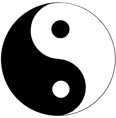
Yin-Yang par Sparrow ... Stewart Mcbride, on ipernity
... the swastika, Maltese-cross are rotationally symmetrical, Volkswagen, American-Airlines or McDonald's logos are symmetrical on their centreline, Mercedes and Chanel's are both rotationally and centreline symmetrical ... some people will no doubt think designers do this for no good reason ...
... while others think the viewer will naturally seek out symmetry and finds it perceptually pleasing ... the mind will seek out and divide objects into any number of symmetrical parts, it will find it pleasing to detect symmetry ... and pay particular attention to the point of symmetry.
As Lukitas observed of his photograph "Maybe that is what is wrong about this one: all the lines point to the middle, but there is nothing there"
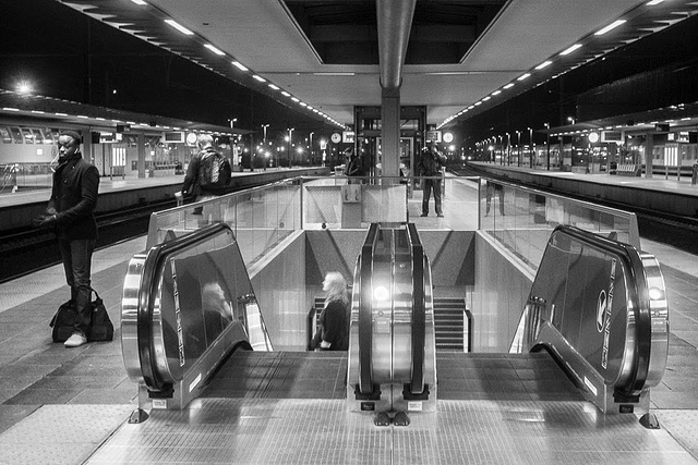
photo by Lukitas
It's not just in the abstract, there is one study that demonstrates the human face to be more attractive the more symmetrical it is, a quick look on the interweb reveals lots of information.
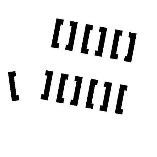
Here, although these are just two rows of six square parenthesis and one by itself ...
z par Sparrow ... Stewart Mcbride, on ipernity
... the theory predicts the viewer will try to form symmetrical groups and so you'll see three units (with two parenthesis forming each group) on the top row and two whole units with a half unit at each end ... and that you'll go on to connect the lone element to its closest partner, and interestingly the area between the two items becomes an area of particular interest
I'm sure every photographer will be able to look back at shots that drag ones attention to some boring part of the frame ...

No 40 par Sparrow ... Stewart Mcbride, on ipernity
... like the central column on this photo from a project of mine
--------------------
I'm always surprised just how much of the world is symmetrical, nature to a great extent plants in part, all animals that I can think of ... and almost everything manmade of note is symmetrical, yes I know there's Antoni Gaudí but even then you'd not wan't to live in one of them ... all those odd curves and angles would drive you mad ... and imagine decorating!
The other year when I'd just finished my Corfu book I found myself on the island for three weeks with nothing too much do. One gets bored with sunbathing in minutes, so I got in the car and went wandering around. It was a bit like letting my brain defocus like I do with my eyes when I started noticing the geometry of the place. No matter what age or style, geometry and symmetry were everywhere, not just buildings but in surface design and pictures too. No matter what the scale, material or media one looked at.

No 32 par Sparrow ... Stewart Mcbride, on ipernity

No 10 par Sparrow ... Stewart Mcbride, on ipernity
The more complex the symmetry the more we seem be attracted by it, all those Late Gothic cathedrals still being maintained astound people as much now as they did in the fifteenth century ... and are dripping with symmetry, they attract photographer like flies, even though the world already has more than enough photos of churches.
next ... Ground-Figure and Areas of Particular Interest
---------------------
Sparrow
Veteran
---------------------
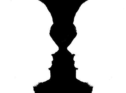
I expect almost everyone has come across the Rubin's vase effect ... this sort of thing

Ground-Figure mono par Sparrow ... Stewart Mcbride, on ipernity
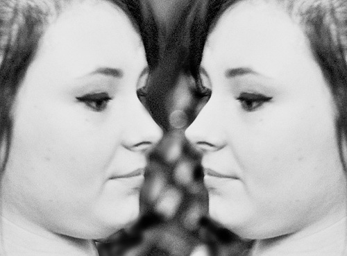
... once you've seen the vase it becomes hard to not see it, even in a realistic image its outline persists, for me it pops in and out on this version

Ground-Figure par Sparrow ... Stewart Mcbride, on ipernity
It dosen't need to be symmetrical, you can still see a face in the dark bit of this road sign, well I can anyway ...

map par Sparrow ... Stewart Mcbride, on ipernity
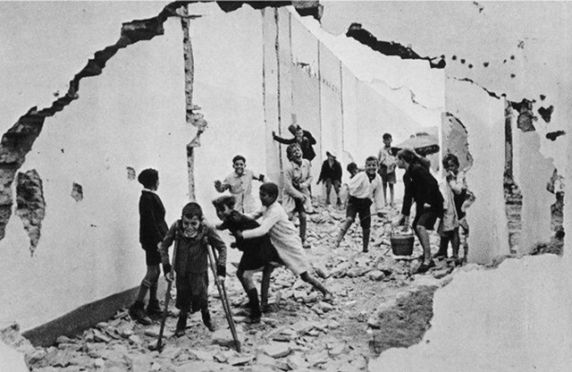
... just a bit of a visual trick really, I'm not sure if they are of that much use to photographers other than to point out how a viewers interest can be concentrated to some areas by a photo's layout, colour or value, Henri did it all the time, a figure framed by a door or window or as in this shot a hole blown in a wall ...

henri cartier bresson children par Sparrow ... Stewart Mcbride, on ipernity
... the ability of an image to sometimes make one area draw the eye often crops up in figurative art, some areas will somehow assume a particular interest to the viewer. Sometimes it's an actual frame like the Cartier-Bresson shot above sometimes just the natural line of the photo, or as in Lukitas's photo just the symmetry of the shot making the centre area pull in ones interest ...

photo by Lukitas
... once you look for it you see it all over the place, but it's one of those things you seldom see it at the time. Later on the contact sheet it stands out like a sore thumb, something like that chap who claimed to take photos of stuff to see how it looked when photographed
--------------------
airfrogusmc
Veteran
Stewart I think Ralph Gibsons work would fit in nicely with this discussion. A lot of his work was as much about the negative space as the positive space.
lukitas
second hand noob
Three times!
You flatter me Stewart. I'm red in the face now.
Cheers
You flatter me Stewart. I'm red in the face now.
Cheers
airfrogusmc
Veteran
Three times!
You flatter me Stewart. I'm red in the face now.
Cheers
Terrific image....
Sparrow
Veteran
--------------------
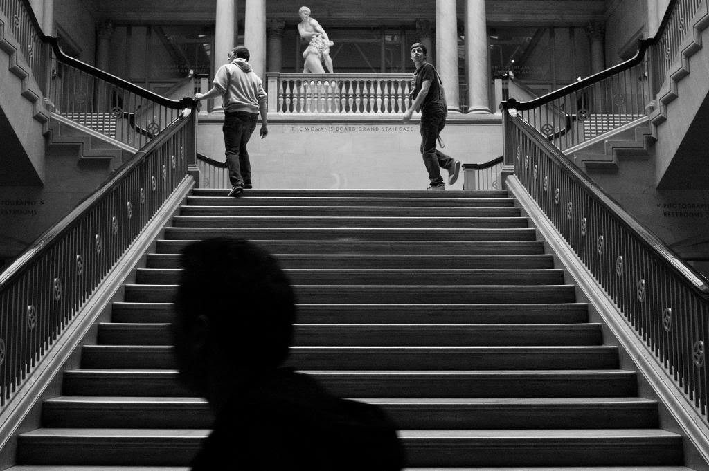
So while the Rubin's vase effect is of little use, mirroring images is easy enough with photoshop, but they always look a bit odd ... things that are absolutely symmetrical have an unsettling effect on the viewer, like those symmetrical human faces made from half a celebrity. Things which are almost concentrate the viewers attention in a particular area of the image ... so if you were to really study this photo, and have picked up on the ideas I've been banging on about ...

photo courtesy of airfrogusmc ©
... you will see the Rubin's vase and its negative space, the symmetry, proximity and repetition, the depth all encouraging you to like the photo, but you'll be aware of the line and light/shade drawing your eye back to that lighter rectangle and the four columns, and the small triangular group of three figures on the landings. So you'll probably like the photo, its got so many of the Principles we normally like.
Though you'll possibly feel the ground/figure area we're particularly interested in (the light rectangle, columns and figures) is divorced from the best part of the photo graphically (the stair and handrails), and there is the Closure effect drawing your eye up those four columns and out of the frame ... those give the shot a disconnected, unsettling feel to me ... and leaves me wanting to know about the shadow in the bottom of the frame
There are many things going on in that photo, one of the few bits of theory that helps in real world photography is to notice something in the three dimensional world that will be an area of interest to the viewer in the print ... this is one of mine a spot in a local town, this relies on a couple of the same effects ...

Woolshops, Halifax par Sparrow ... Stewart Mcbride, on ipernity
... not as many and not with the same intensity, like a lighter version
-------------------------
OurManInTangier
An Undesirable
Nice to see this thread back in play.
...and that staircase shot, very accomplished.
Sparrow
Veteran
--------------------------
... The Classical Principles:
I'm a mod myself (modernist) ... I have drawn pictures for as long as I can remember, my granddad would bring me 500 sheet pads from Woolworth's (Big Scribblers they were called) each week and I would fill them with drawings, finding drawing as easy as I found writing difficult. I was at grammar school before I found that there was a way to understand pictures other than just liking or disliking them ... one of the set books was John Wyndham's The Day of the Triffids and it was illustrate by a set of modernist drawings.
I was sold on modernism and it's tenets ... so from my point of view all of the Classical Principles are explained by the Gestalt and the colour theories of Munsell Rood and the like ... so this lot from earlier ...
Shape and Proportion; including Pi, the golden ratio and the so called rule of thirds and the like
Geometry; regular forms and I suppose Pi, the golden ratio again
Balance; positioning orientation and harmony in the elements
Field of View; the area within the image that holds your attention
Negative Space; the area that isn't Field of View
Eye-Line; how the viewer's eye finds it's way round the image
Contrast; or value, the difference between the light and dark bits
Repetition and Rhythm; repeats, patterns and rhythms
Illumination; lighting
Form; modelling, shading and like
Colour; the colours and their combination
Perspective;Perspective
... are easy for me to dismiss ... except there are some in there that I now realise are a handy shorthand for some effects.
----------------------
Sparrow
Veteran
----------------------
Form in Photography
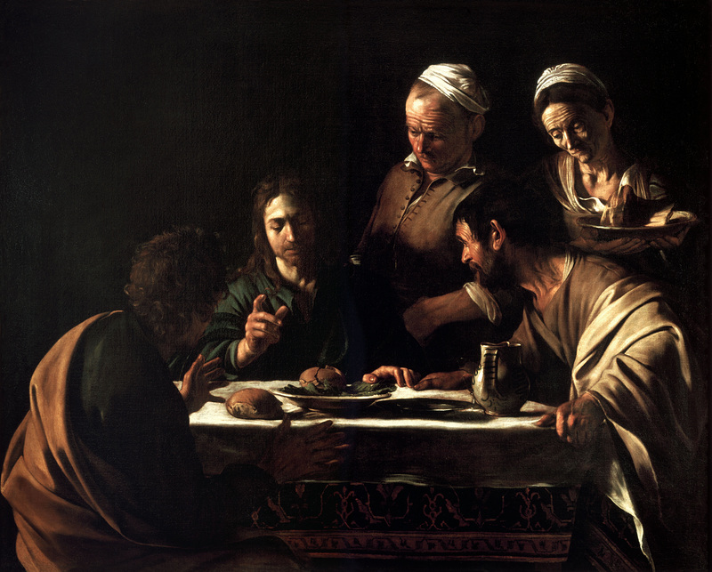
You'll hear and read words like Form, Modelling and even Chiaroscuro used to describe that three-dimensional effect caused by high contrast ... Depth and Contrast in modernist terminology, Chiaroscuro if you're talking about a Caravaggio ... it was used extensively in the renaissance (the bokeh of the day) along with perspective to create depth in pictures, perspective had come back into fashion in the Late Gothic period ... all of them involve tricking the viewer into seeing the three-dimensional represented on the flat surface of a print or painting ... this sort of thing ...

Supper at Emmaus-Caravaggio (1606) par Caravaggio
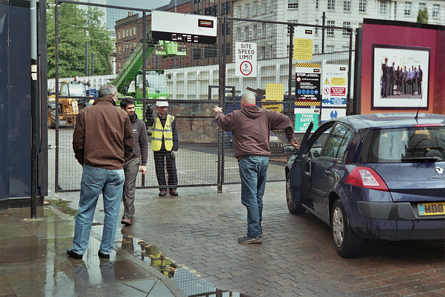
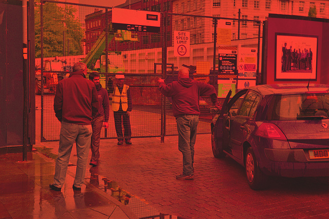
The problem being that we generally don't see the world in such great contrast. After taking a photo one can play with the contrast or abstract the image in other ways but it's not easy to see beforehand. There is one trick though, our eyes see colour less well in poor light so viewing a scene through sunglasses, ND filters or even just a dark red filter will help to visualise how a coloured scene will look in a monochrome print. I recall seeing a device from the thirties that was like a small telescope and had a dense ND filter and a standard FOV lens, called a Monoscope or similar, for photographers and filmmakers to visualise monochrome better.
You can turn this ...

Manchester Streat Closed par Sparrow ... Stewart Mcbride, on ipernity
... into this ...

Manchester with filter par Sparrow ... Stewart Mcbride, on ipernity
... it gives you an idea how the monochrome version will look, and as the light entering is of a lower value fewer of the colour receptors (cone-cells) are stimulated allowing you to see more of the low light monochrome receptors (rods-cells).
Using a dark red gell filter to look through in a figure-drawing class is a great help to understanding the shading, and if one has to produce a drawing or painting from a photograph it is a lot easier if you have both a colour and a black and white version to look at.
----------------------
airfrogusmc
Veteran
Also besides the wonderful light in the painting notice the people overlap thus forming a new triangular shape (classic triangular composition). That overlapping creates a sense that they are all connected and are seen, if you blur the detail, as one shape. Bresson used this overlapping sometimes.
I tend to think some people just see better in B&W and some see better in color. At this point in time I tend to be one that see's better in B&W.
Sparrow
Veteran
... yes, very interesting
Share:
-
This site uses cookies to help personalise content, tailor your experience and to keep you logged in if you register.
By continuing to use this site, you are consenting to our use of cookies.