Looking at Pictures the Psychology of Images ... or putting the Horse before Descarte

But your images should be closer to war and piece if they are to have real staying power as apposed to Dick and Jane😉

Where are those skinny gals BTW...
 
----------------

Conventions ... many years ago 1972 or 73 maybe, I'd just started my first proper job at a commercial design company as a junior. They did textile design and some print design, doing a huge range of design work ... and still using traditional methods back then. I was put under an old guy called Alfred Graham. You got all the simple or boring jobs at first.

Now and then you would get the chance to do some 'sketching' which in this context simply involved doing pretty pictures with charcoal and chalk on craft-paper. You would spend half a day drawing followed by half an hour of Alf showing you where you'd gone wrong ... I think I learned more in a couple of months of that than I had from anything before ...

... one day I was working on a diagonal pattern ... the brief was for a diagonal pattern in an Arts and Crafts style ... I did them 50:50 bottom left to top right and bottom right to top left, Alf dismissed the bottom right to top left sketches as unsaleable due to the 'negative angle' ... he said lines raising to the right were 'positive' and the other way 'negative'. I mentioned the effect to one of my lecturers he dismissed it as 'just convention' saying 'its just the way graphs are shown on TV not properly aesthetic'. In effect some responses are hard-wired and others learned, and the learned ones were less reliable.

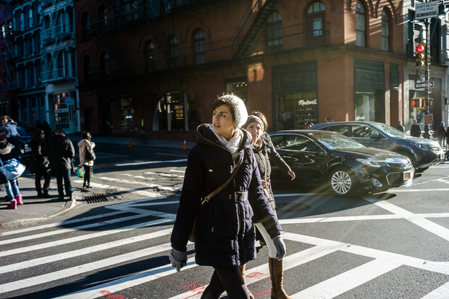
... so if Alf was right, all those diagonals on this shot should make it feel positive, exiting or pleasant ... (I'm assuming people can see those diagonals now)


tumblr ni6w19KxYl1qamvqvo1 1280 par , on ipernity

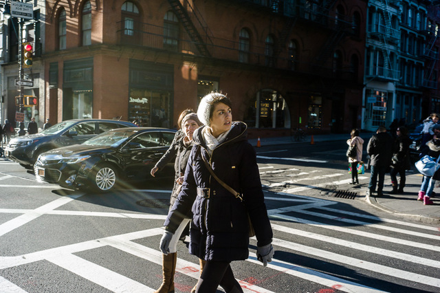
... but flipped over? ... negative, dull or depressing, simply because we see graphs on powerpoint that way round. I know how I see it and the argument is sound enough ...


tumblr ni6w19KxYl1qamvqvo1 1281 par , on ipernity

... but just how many effects are learned and how many natural is difficult to say, I've had some of the basic gestalt effects challenged as having been learned

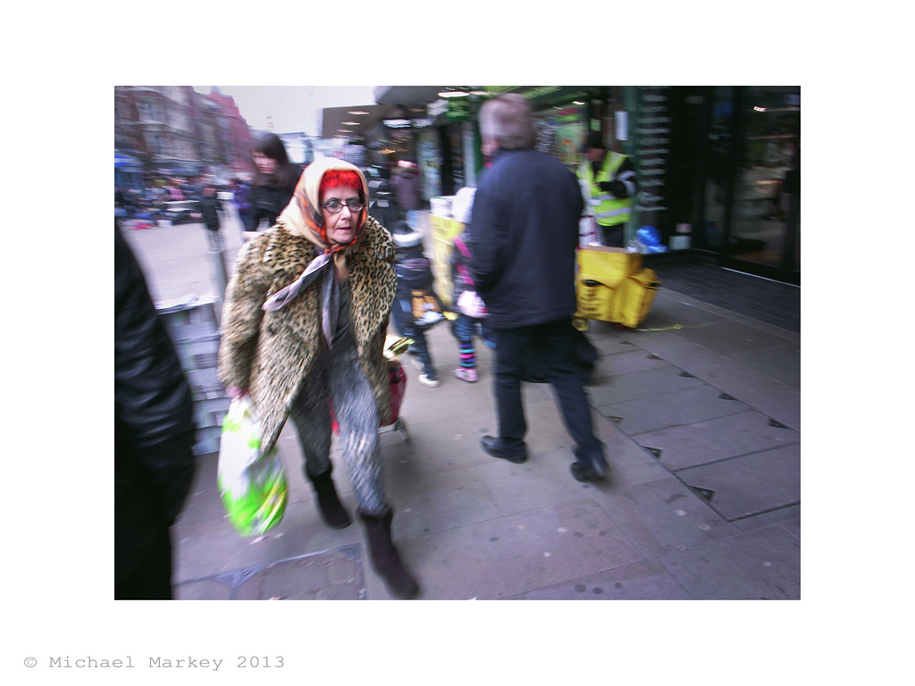
Take a look at this shot of Michael Markey's, I've always liked it because underlying all the frantic action it has a real melancholy feel, and I think that comes in some part from the diagonal composition, what do you think? ... it also has many of the other things I've been discussing erlier


Woman with Bag par Sparrow ... Stewart Mcbride, on ipernity

Oh, yes the thin women ... back in the seventeenth century female beauty favoured the more rotund lady, take a look at Peter Paul Rubens work ... but that all changed with the gothic revival, when the Pre-Raphaelites brought the medieval look back as the benchmark ... aesthetics is a movable feast, and old pictures may not be using the same vocabulary we use today

next ... Closure (or why you shouldn't cut peoples feet off)

---------------
 
I'm going to comment and say the first shot has a nice tension and the three women form one as the arm on the one in the back right is swinging like it would be on the same person. The look back really adds to the tension. And the repeating shapes are interesting. Nice analogy showing the horizontal flip to.

Mikes photo shows real motion, chaos and is very uneasy. THe color pallet also adds to that uneasiness. The woman seem to be very focused in her mission. Cat like in her pose and in her garb.

Thnats my 2 cents. I have a half a buck but wouldn't want to right war and peace so we will keep it as is.
 
The left-right thing... That's European cultural influence, stemming from how we read and write from left to right. It's so ingrained that we have a visual preference and expectation for that direction. Anything going right-left is moving against our cultural grain and feels awkward, creating tension not harmony.

Asian cultures that write and read right-left have the opposite preference (albeit diluted through the modern era's worldwide familiarity with European culture).

If you crop the feet of moving people on a street shot or any photograph that wants to convey a sense of motion, you destroy the sense of motion... Its like photographing a moving car without its tires.

Not some art school teaching but basic photography.

So no matter how you 'flip' that image of the women crossing the street, its not going to 'work' because they're in motion and the photograph has not captured that motion.

em ... we were talking about interpreting diagonals, and interpreting conventions in regard to that photo on this thread

If you feel the need to criticise it pleases do so in FrankS 'Brutal' thread not here, thanks 🙂
 
The left-right thing... That's European cultural influence, stemming from how we read and write from left to right. It's so ingrained that we have a visual preference and expectation for that direction. Anything going right-left is moving against our cultural grain and feels awkward, creating tension not harmony.

Asian cultures that write and read right-left have the opposite preference (albeit diluted through the modern era's worldwide familiarity with European culture).

... but how much of the rest of it is cultural? ... greeks shake their heads to say yes, how wrong is that?
 
If you crop the feet of moving people on a street shot or any photograph that wants to convey a sense of motion, you destroy the sense of motion... Its like photographing a moving car without its tires.

Not some art school teaching but basic photography.

So no matter how you 'flip' that image of the women crossing the street, its not going to 'work' because they're in motion and the photograph has not captured that motion.

I donno I don't need to see everything for my mind to fill it in. And I like the exercise in diagonals and the feeling of motion they can convey.

And thanks for proving my point about rules. Some have rules about not cropping this or that. This is a great example of that. Someone doesn't have to be very fluent to see that these woman are in motion and walking. My thought is always is if it's not necessary and I need to crop to either follow my style or the other information is not helping the visual statement then crop where I feel it is best. I have no problem with this crop.
 
Well, there's the rub...!

... and putting money down on counter .... not passing it hand to hand in the 'British' way?

Thirty years back it was easy 'they' banged it down on the counter and we felt offended, we both learned from the experience ... these days I speak enough Greek and they've meet enough Englishmen for us all to be unsure, but a convention is developing like they do, and the internet and globalisation is probably insuring the good guys always wear the white hats anyway 🙂
 
All great examples of why rules aren't the answer.

Quite so. Rules are the question.

From the time we were five and reinvented the rules of street football every day, rules fill our lives in so many ways. Sometimes I think rules are what being human is all about : rules about dress, social behaviour, ethics. As such they remain in constant contention. The most important ones are unspoken, only become visible when some comedian lays them bare by completely breaking them.
Rules can be classified along four corners : the forbidden things that are truly forbidden, the permitted things that one really can do, but it becomes interesting with the interdictions that are actually (conditional) invitations, and the permissions that are only allowed on condition that one does not take the liberty.

Rules are the question, not the answer.

Cheers
 
(Although I don't really see any rules being espoused here, more hinted at) My opinion is that we need the opposite of rules. The problem is not so much how to make a good photograph, but how not to make the same photograph (either your own or someone else's) over again. To get somewhere new, I think you need to get away from what you know will work.
 
I agree. Having a clear understanding how to effectively communicate your ideas and show a little piece of you, the photographer, at the same time is what is special in my opinion. This is a long journey.
 
I dislike the term, composition. Maybe it's just me but it seems to carry with it the idea that there is inherently "Good" composition and "Bad"...In the sense that you could have some arrangement of abstract stuff deemed "Good", on which you could hang the subject of your choice (like an armature) and have a good photograph.
 
I dislike the term, composition. Maybe it's just me but it seems to carry with it the idea that there is inherently "Good" composition and "Bad"...In the sense that you could have some arrangement of abstract stuff deemed "Good", on which you could hang the subject of your choice (like an armature) and have a good photograph.
I understand your sentiment entirely. But there is good and bad composition: inasmuch as cultural norms and hardwired biological reasons dictate what we find interesting and harmonious in a picture. Whether or not you like the idea, there are certain arrangements in pictures that are deemed "good".

In that sense, making pictures is no different to writing. To do either well you need to understand what governs their composition - i.e. their "grammar". (I'm deliberately avoiding the word "rules" as there is an implication of arbitrariness, and essentials of composition aren't arbitrary but have sound reasoning behind them.)

If that makes me sounds like I believe a "good" photograph follows the "rules of composition", you're dead wrong.

Knowledge of composition is only the start of making picture-making. We need to take this understanding of how pictures work in our culture, then twist, bend and ignore this visual grammar so our photographs communicate how we want. The key word here is "understanding" - surely it can only be helpful knowing why a picture with a left-right compositional flow looks more harmonious than a right-left flow (as in Stewart's diagonals examples)?

Following "rules" of composition blindly without understanding will allow many people to make better pictures - in exactly the same way that knowledge of grammar allows people to write more effectively. You'll create competent pictures or writing - but they are likely to be inoffensive, stereotypical and bland.

Some people have a flair for picture-making (or writing), and it is these for whom knowledge of composition (visual or language) becomes a tool for their creativity - to both use and deliberately abuse. For these people, composition is not about following rules but understanding visual language. Sometimes their images will be traditionally composed, other times not; in either case it will be done with understanding and deliberation, and will enhance their creativity.

A very few have an innate ability to make great pictures (or write) intuitively with no need to understand anything. I once met a teenager who showed me her very first photographs and asked me what to do to improve them: I replied "nothing" - they were that good!

The rest of us - me included - are benefited by an understanding of composition.

At the risk of repetition, I want to underline that having a list of compositional points and checking off a photograph against it is no way to take a good photograph. What will help is a proper understanding of composition - the visual language - that paintings and photographs we as a culture hold in regard and that end up in galleries and museums all have in common - and then making our own pictures armed with this knowledge (to create, not copy!). Which is what Stewart is trying to do!

As Stewart says, good composition isn't arbitrary. The rules - at least those of importance - have sound reasons for why they work: either cultural or psychological.

I've already explained why diagonals in a picture create harmony when sloping in one direction but dissonance when sloping in the other direction (because of culture); and why certain pairs of colours work together well (because of physiology).
 
Last edited:
... I'm pretty sure I've covered it, but I'll try a different approach ... the 'rules' are not some arbitrary dictate from the Ministry of Art ... they are simply your reaction what you see, the view out of the window, a painting, your cameras viewfinder ... anything you see whether you know it or not, it's simply psychology, the human reaction to the sense of sight.

Denying it is a bit like saying 'coffee is never too bitter ... and we don't need no salty, sweet or sour to know what tastes nice' ... and no you don't, but a chef does wouldn't you say? or a composer writing a composition ... which is how it got the unfortunate name
 
I agree with Weston and I personally think rules do more to hurt new photographers than help because they then dismiss anything that doesn't fall into the preconceived rule like the RoTs. They then tend not to see anything outside that rule when the are shooting themselves and they dismiss thiing they see from other for the same reason. Weston warned that when everyone follows the same rules the work all starts looking the same. Just have a look around in forum land. His words ring true.

There are people getting the RoTs etched in their focusing screens

Learning how to use the language frees you from rules.

But what did Adams, Weston, Winogrand, Newman or any of those dead guys know about photography...LoL...

Again they were all fluent with how to communicate and how to use the language to capture their vision and there personal ways of seeing which also included the way the composed or put their images together visually.
 
Back
Top Bottom