Jockos
Well-known
Hi all,
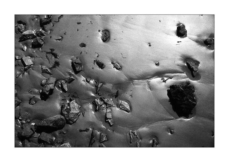
I'd like some negative input on my series "Marken vi går på", it's mostly pictures of dirt and trash.
I'd like to know what doesn't work for you with these pictures, and if you can point to which should be removed, deleted and/or burned, please do!
The album's here:
http://www.rangefinderforum.com/rffgallery/showcollection.php?cid=10305
I already know that the tonal scale is a bit off in this one:
http://www.rangefinderforum.com/rffgallery/showphoto.php?photoid=252638&membercollection=10305
Monitor wasn't calibrated.
They are in no specific order, since I could not find a sort function, but I'd love to hear how you would hang them (according to season, contrasting high/low key, man made vs. nature etc...).
I've never had a mentor or anything of the sorts, and mostly in the gallery here, I only get positive feedback. But what am I missing?
Thank you for your time!
Joachim
joe bosak
Well-known
From a quick run through - 257671 jumps out for me as an image I find interesting, lots of movement and contrast.
FrankS
Registered User
My favourite is the one showing wings on the ground. There is interest there. The other images just don't hold that much interest. Maybe if the lighting was more dramatic, skimming the ground at a low angle.
michaelwj
----------------
My favourite is the one showing wings on the ground. There is interest there. The other images just don't hold that much interest. Maybe if the lighting was more dramatic, skimming the ground at a low angle.
I'm with FrankS, there's not enough drama or interest. You can probably try some selective dodging and burning to liven some of them up. For instance, 252777, what is the subject? Although the tonality is good, it is even - I don't know what the point of the photo is, and I'm just as likely to look at the edge rather than the centre. If you don't have a really good reason for drawing the viewer to the edge of the frame, don't. You can darken some the feathers(?) on the edges, and lighten some of the central ones. 252772 (the leaves) and 252696 (the wood chips) works much better in this respect.
I think you need to find someone (at the gallery or elsewhere) who you respect and who can be honest with you to help you more. It is almost impossible online, and almost always comes off as us being rude or mean to you. You need the interaction of a conversation.
daveleo
what?
This is the best response that I can come up with .........
Look at the images of Jackson Pollack's paintings and images of Joan Miro's paintings. Both are "abstract" (I think they call Pollack's work "abstract expressionism" ?)
I do not like Pollack's work at all. Not at all ! Random scribbled frantic lines.
I love Miro's work. Just love to look at it.
Looking at your album, I see most pictures filled with random scribbled hectic lines . Just does not work for me. I cannot explain better than that.
02Pilot
Malcontent
I tend to like images like this, but since you asked for negative critique, I would echo the comment above about trying to find more interesting lighting conditions in which to shoot. Low-angle light can really liven up these sorts of photos, as can trying to find surfaces and objects of differing reflectivity, which will help to create visual interest.
If you will indulge me a sample of my own to illustrate my point, please consider this:
If you would prefer not to have someone else's work in your thread uninvited, let me know and I'll remove it.
If you will indulge me a sample of my own to illustrate my point, please consider this:

If you would prefer not to have someone else's work in your thread uninvited, let me know and I'll remove it.
Jockos
Well-known
My favourite is the one showing wings on the ground. There is interest there. The other images just don't hold that much interest. Maybe if the lighting was more dramatic, skimming the ground at a low angle.
Quick question: Did you enlarge to full screen?
Thanks for taking the time!
Jockos
Well-known
It does absolutely not come off as rude, it's what I asked for.I'm with FrankS, there's not enough drama or interest. You can probably try some selective dodging and burning to liven some of them up. For instance, 252777, what is the subject? Although the tonality is good, it is even - I don't know what the point of the photo is, and I'm just as likely to look at the edge rather than the centre. If you don't have a really good reason for drawing the viewer to the edge of the frame, don't. You can darken some the feathers(?) on the edges, and lighten some of the central ones. 252772 (the leaves) and 252696 (the wood chips) works much better in this respect.
I think you need to find someone (at the gallery or elsewhere) who you respect and who can be honest with you to help you more. It is almost impossible online, and almost always comes off as us being rude or mean to you. You need the interaction of a conversation.
The images are not supposed to stand on their own, as response to your question regarding the purpose of 252777. You do have some good points there, but excessive vignetting can look wierd too right..?
Jockos
Well-known
I tend to like images like this, but since you asked for negative critique, I would echo the comment above about trying to find more interesting lighting conditions in which to shoot. Low-angle light can really liven up these sorts of photos, as can trying to find surfaces and objects of differing reflectivity, which will help to create visual interest.
If you will indulge me a sample of my own to illustrate my point, please consider this:
![]()
If you would prefer not to have someone else's work in your thread uninvited, let me know and I'll remove it.
Good point regarding the light! I'll keep that in mind; I tent to shoot mostly overcast, because I prefer the tonality, but it seems so far that the contrast should be upped a notch.
Jockos
Well-known
This is the best response that I can come up with .........
Look at the images of Jackson Pollack's paintings and images of Joan Miro's paintings. Both are "abstract" (I think they call Pollack's work "abstract expressionism" ?)
I do not like Pollack's work at all. Not at all ! Random scribbled frantic lines.
I love Miro's work. Just love to look at it.
Looking at your album, I see most pictures filled with random scribbled hectic lines . Just does not work for me. I cannot explain better than that.
Basically, you'd like a more simple subject and less points of interest?
michaelwj
----------------
It does absolutely not come off as rude, it's what I asked for.
The images are not supposed to stand on their own, as response to your question regarding the purpose of 252777. You do have some good points there, but excessive vignetting can look wierd too right..?
Not vignetting as such - it can get repetitive. I mean more selective highlighting what you see as important, while darkening what may distract. It doesn't have to be over the top, in fact it can be quite subtle - but at the moment, they are too evenly illuminated. As others have said, different lighting at the time can change things, but you can subtly do it after the fact.
With respect to 252777, being in series is not a purpose. What is its part in the series? It has too much going on to link two stronger images, but is not strong enough to be a high point. Even in a series, every image has a purpose.
Maybe the best way forward is to organise the images in an order and then decide what is missing or what needs to change? Keep in mind that the first order probably won't be the final order!
Bill Clark
Veteran
Interesting photos. I like your creativity.
#252871 is a favorite.
I think the physical print would look better as the web doesn't show the value of your photographs.
Keep looking around to make more photographs!
#252871 is a favorite.
I think the physical print would look better as the web doesn't show the value of your photographs.
Keep looking around to make more photographs!
michaelwj
----------------
Forgot to say that you also need to choose the size of the prints too as it will influence other choices.
And also keep in mind that as Bill said, it's hard to really critique from small online images as opposed to prints.
Dan Daniel
Well-known
You are not obsessed enough. There are glimmers of obsession- lines, patterns, organic shapes, residue of time, etc.- but at the moment the collection is too scattered. Take one image that YOU like, figure out why you like it, and make ten more like it. Once you finish that, move on to another style, but not until you finish it. Stop letting the ground define what you shoot. You need to define what you shoot.
daveleo
what?
Basically, you'd like a more simple subject and less points of interest?
No. With abstract work, I enjoy interesting areas, shadings, blends, colors, opaque and transparent patches, textures.
Responding to your quote there: I see most of your pictures in that album to be too simple and have few, in fact zero, points of interest. *I do not mean that harshly* - I am responding to your wording.
EDIT: I am making a blanket statement about the set of pictures. That's not always reasonable. But I just could not comment on each one.
kbg32
neo-romanticist
I like what you are on to, but these image need more acuity. Blowing them up just makes them mushy. No sharpness, definition, contrast, etc..
Forget Pollack (his work is not random scribbled lines) or Miro.
Take a look at Aaron Siskind, Robert Motherwell, Carl Chiarenza, Minor White, and Robert Rauschenberg. There is beauty in abstraction. There is beauty in garbage.
Forget Pollack (his work is not random scribbled lines) or Miro.
Take a look at Aaron Siskind, Robert Motherwell, Carl Chiarenza, Minor White, and Robert Rauschenberg. There is beauty in abstraction. There is beauty in garbage.
nasmformyzombie
Registered
I like what you are on to, but these image need more acuity. Blowing them up just makes them mushy. No sharpness, definition, contrast, etc..
Forget Pollack (his work is not random scribbled lines) or Miro.
Take a look at Aaron Siskind, Robert Motherwell, Carl Chiarenza, Minor White, and Robert Rauschenberg...
I can't improve on this critique. I'm generally not all that keen on abstract images, but to me Chiarenza's work in particular is often quite interesting. No harm in being inspired by the work of others as long as it's a starting point for your own vision.
Another area to investigate is the work of the Surrealists. Man Ray always amuses me to no end. Not so much for abstraction but more for his subversive treatment of what (was) the ordinary.
konicaman
konicaman
Since you asked for it: The pictures with grass and ice flowers are simply confusing. Nothing to guide your eye or grab your attention, just a lot of details; about as interesting as a close up of cold porridge . The rest of the images I find quite interesting either as abstracts or because you can find a small story in them .
Jockos
Well-known
Sage advice! I really should get them all printed and try to arrange them once, maybe it'd be easier to make sense out of it all then.Not vignetting as such - it can get repetitive. I mean more selective highlighting what you see as important, while darkening what may distract. It doesn't have to be over the top, in fact it can be quite subtle - but at the moment, they are too evenly illuminated. As others have said, different lighting at the time can change things, but you can subtly do it after the fact.
With respect to 252777, being in series is not a purpose. What is its part in the series? It has too much going on to link two stronger images, but is not strong enough to be a high point. Even in a series, every image has a purpose.
Maybe the best way forward is to organise the images in an order and then decide what is missing or what needs to change? Keep in mind that the first order probably won't be the final order!
I'm thinking A3ish size, with an inch of border. Ideally, they'd get at least three inches of passepartout all around in the final version!Forgot to say that you also need to choose the size of the prints too as it will influence other choices.
And also keep in mind that as Bill said, it's hard to really critique from small online images as opposed to prints.
Jockos
Well-known
Certainly, I work 60-80h every week, so it's difficult to get that time and energy to get obsessive about art. I'm keeping it at an amateur level, while still appreciating the relief the hobby givesYou are not obsessed enough. There are glimmers of obsession- lines, patterns, organic shapes, residue of time, etc.- but at the moment the collection is too scattered. Take one image that YOU like, figure out why you like it, and make ten more like it. Once you finish that, move on to another style, but not until you finish it. Stop letting the ground define what you shoot. You need to define what you shoot.
Share:
-
This site uses cookies to help personalise content, tailor your experience and to keep you logged in if you register.
By continuing to use this site, you are consenting to our use of cookies.