No more racing for him

paulfish4570

Veteran
Local time
12:02 PM
Joined
Jan 22, 2010
Messages
9,816
R1-18-1-1.jpg


Thoughts on this shot?

Bessa R, BW400CN, Canon 50/1.8
 
I like it, but the contrast of the subject (dog's face) is too bright to allow me to look at it long enough. It may however just be my monitor. If so, ignore my comment.
 
I like the high key nature of it and the way the lead aligns with the diagonal road edge. And, maybe irrelevant, but I liked the title, and I like seeing it was about a happy looking rescued dog even more.

Perhaps a square crop would be cool?
 

Attachments

  • racer.jpg
    racer.jpg
    105.4 KB · Views: 0
Curious why you chose to cut the dog off mid-point. Even that done, but might be better to crop so there is less around the dog, assuming the dog is the only desired subject. Cute dog anyway.
 
paulfish: nice photo. keep it as-is. the reason not to crop the top is because the road at the top leads to dog's eyes giving me the impression that the dog will bolt if unleashed.

I like it.
 
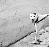
I dislike the image. For one, I find the image too bright. Next, the composition. What is the purpose of all the space around the dog, especially towards the top? If horizontal and the space was to the left then I could see the purpose as the dog has a place to run. Wy is the dog cut off half way? What purpose does that surve? However, as the image stands it is lacking.
 
Back
Top Bottom