photoshop question

back alley

IMAGES
Local time
5:47 PM
Joined
Jul 30, 2003
Messages
41,289
can you add colour to a b&w photo?

you know those those black & white photos with one object in colour, is that a colour original with all colour but for the one object removed or a black & white original with colour added?
 
I think you can add color to a B&W photo. Or you can take a color photo and remove the color except for one object.

Wayne
 

Attachments

  • Joe's camera Red.jpg
    Joe's camera Red.jpg
    24.1 KB · Views: 0
Last edited:
An easy way would be to start with the original colored layer
Then create another layer (CNTL J)
Convert that to B/W
Then use the eraser tool on the part you want to come out in color.
Flatten layers
 
Last edited by a moderator:
yeah. what ray said.

it's funny how you start composing a response in your head with the first post,t hen realize slowly that your response has been covered by each successive post. but you still feel compelled to post...

it is far, far easier to start with a color photo, but a more abstract effect can be achieved if you "technicolor-ize" a B&W image, too.

allan
 
You can "colorize" a grayscale photo by checking a checkbox in the Hue/Saturation panel. This is good for creating tint effects, but it doesn't really look like a color image -- instead it looks like a toned b&w photo (differing amounts of the same color all over.)

You also can apply a duotone, tritone, or quadtone effect. These let you tint the highlights one color and the shadows a different color (plus a third and fourth color for tritones and quadtones.) You can edit the curves that control how much color is applied to get various effects. Again, though, it doesn't really look like a natural-color image.

If you want to create a naturalistic look from a grayscale photo, you'll need to select and apply appropriate colors by hand, using the brush tools. A good way to do this is to create new layers on which to apply the colors; that way, your original grayscale image is protected, and you can use several layers to keep the colors separated so you don't mess up an area you like. It's almost exactly like hand-coloring a print using photo oils, and requires the same artistic knack.

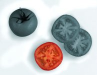
To create the effect you mentioned of one color object within a grayscale photo, the only practical way is to start with a color image. An easy way to proceed from there is to select the object you want to keep in color, invert the selection, then create a new hue/saturation layer that affects the rest of the image. Lower the saturation in this layer to zero, which will remove all color and leave the grayscale values behind. Tip: The selection you made originally is saved as a mask, which is visible as an icon in your adjustment layer. If you click on this mask icon, you can paint with a brush to add or subtract from the mask. This lets you add more color areas to the image, soften the transition between color and non-color, etc. I think it's easier than adding a separate layer for the grayscale image, keeps the file size smaller, and has just as much editing flexibility.

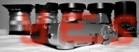
I'm attaching a lame but quick example. I agree with those who have said this effect is overworked, but sometimes when you need to create a quick illustrative or graphic effect it's handy to have these tricks available.
 

Attachments

  • tomato_comp_flat.jpg
    tomato_comp_flat.jpg
    32.3 KB · Views: 0
Last edited:
rool said:
But don't do it please. It looks really ugly most of the time.

Sorry, but I gotta agree with rool on this one. I was at a large art festival earlier this month and one photographer had a very large booth with nothing but photos done this way. My reaction was that's a solution looking for a problem. Admittedly, I have seen some nice photos with this technique applied. But usually it just looks forced to me. Like the photographer didn't know how to use standard photo techniques to draw attention where desired in a picture. Also makes me think back to when desktop publishing became all the rage in the late '80s and everyone went wild with as many different fonts and font sizes as possible simply because they could. I think some photoshop actions tend towards this problem. Now, alternatively, what I really like are the color images where due to the lighting only some part is obviously color and the rest looks b&w until you look very closely. That strikes me as being much more artful.

Sorry, Joe, I know this isn't what you were asking. But I just felt the need to share on this fine Friday afternoon! :eek:

-Randy

P.S. No offense intended, Roland, regarding your holocast memorial shot!
 
it's not an affect i often like and most times it reminds me of really bad greeting cards.
i'm doing some pre-wedding portraits tomorrow, kind of a last minute thing, as a favour to the father of the groom.
it was originally requested as some casual shots. then it turmed into a portrait in their wedding outfits and then into a colour session. i told them i only shoot b&w.
i will do some b&w shots and handle the processing by myself and the colour i will hand the film cans to them when the session is over or i may use my little digital and do some post processing and then give them a cd with the shots for a local lab to play with. (and to make that all b&w except for the flowers shot)
 
It's possible to do this to good effect. I sometimes use it subtly to tone B&W images. The following image was B&W but I wanted to tone it a dark blue to better convey the feeling of the waves. I use the presets in the Photoshop duotone mode, and sometimes just a simple hue/saturation layer.
 

Attachments

  • Fairfield wave war.jpg
    Fairfield wave war.jpg
    99.6 KB · Views: 0
I don't think anybody objects to the toning effects, like the one Roger made. They're subtle and still look "photographic." (I've also found in my work as a graphic designer that if you're doing a layout with mostly color photos and have one monochrome photo that you want to include, it helps to tone it subtly so it has some appropriate color cast to it -- it helps it fit more harmoniously into the overall layout.)

The grayscale-plus-one-colored-object effect is different in that it IS so obviously an "effect." It's been used so heavily in advertising by now that it's hard to apply it without having the picture look commercial. Still, if it IS a commercial picture, sometimes it's a good solution.

The company for which I work has its headquarters building decorated with huge photos showing our products in use in a variety of home and commercial settings. The product/package is always quite small within this large environment; the environment is shown in a cool-toned grayscale, and the tiny product within the scene is the one small island of color. I have to admit that it works well in this context, since there's a certain logic to it. I think the keys to being successful with it are to use it only in situations in which it IS visually logical, to keep the color element very small, and to make sure that the surrounding monochrome scene is well-toned enough to hold its own in terms of visual interest.
 
It's a technique I think sometimes works and has a place. Anyone remember Oscar's Coke-can series -- B&W shots with just the Coke can in col? I enjoyed those.

I used the technique recently in this col shot of a lighthouse against a very dark sky, just before it started raining. I tried it with and without the touch of col and decided I liked it better with. I desaturated the col some to try to keep it in balance with the rest of the image. Others might not like the effect though. It's a matter of taste.

Gene
 

Attachments

  • 20060903-1764g--lighthouse-clouds-night.jpg
    20060903-1764g--lighthouse-clouds-night.jpg
    152.2 KB · Views: 0
Experiment. Take heed of what others tell you, but see for yourself. rool says that it will look ugly--likely so, but so what? Try different methods, have fun, but get experience by experimenting.
 
Hi...

What a great thread! I've just begun studying Photoshop 7, and my teacher reminds me to think in layers-layers. I lover Roger S's shot of the waves in reply #10. Re: a color object in a b & w photo... sure it can be effective, like in a wedding album.

Seems to me, that Photoshop effects are best used with discretion.
Cheers,
mike
 
Back
Top Bottom