Please critique, urgent

G

Goldorak

Guest
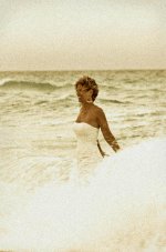
I need to collect people's opinions on these photos.
I need your criticism for a project, not for my own personal pleasure so please be harsh and bad if you feel like it. I do know these will either please or unplease so don't be shy. And if you like them, why?

Thanks for your time!
 

Attachments

  • Web-NES_6679.jpg
    Web-NES_6679.jpg
    36.3 KB · Views: 0
  • Web-NES_6966-2.jpg
    Web-NES_6966-2.jpg
    41.4 KB · Views: 0
  • Web-NES_7024.jpg
    Web-NES_7024.jpg
    39.9 KB · Views: 0
Thanks for your honest critique. That's exactly what I'm looking for.
 
I like the first best. However, the bride's elbow is clipped a bit. If possible, there should be more breathing room there. Otherwise, I'll go with HuubL's comments regarding grain and horizons.
 
#1...I like the shot but would prefer it centered more...
#2...Good, centered better...I would like to see her face...
#3...Better...I didn't notice the horizon at first only after reading the other review...

I don't have a problem with the grain...second shot could also use fill-flash...overcast day???
 
The first is the best one for me. I think if you are doing a project and these pictures are part of a group, you should watch the colors and the tones to get them consistent. The colors of the background in the 2 last pictures don´t match, and it looks you took them in a row.

I like the expressions, regards
 
would help if we knew what the project was for? i.e., potential wedding photography, magazine add, wedding dress add, etc

as well, i dont find that the grain adds to the images. if it's a series of images to be used together then i'm not fond of one of them having a colored tone and think that consistency might be a better bet. in #2 i'd like to see her face more.
 
I quite like the grain though I associate grain with atmosphere and nostalgia, which might be considered a slightly awkward fit to what look like staged wedding shots. Fill flash utterly destroys atmosphere, and so would have further exagerrated the clash between the natural and the staged I reckon.

I reckon the feel makes these photos a bit different/original. I like it.
 
Goldorak,
the pics obviously are from the same series like your poll posting yesterday. What do you expect? There was not so much outpooring interest and such a follow up post is unlikely to draw more attention.
The shots are overexposed or the scans suck, the grain looks artificial and as someone already mentioned they might work much better in B&W. High key is difficult and if you loose additional detail in the presentation of a 30-40kb file it's not possible to accurately judge anything.
 
Goldorak ... eh eh eh ... great nickname ... you just brought me back 25 years ago...
concerning the pictures, I don't like the grain at all, does not match the mood of it.
#1 is very good, #2 horizon line bothers me being so close to head, #3 is good but too centric.
 
Thanks for taking the time to comment, everyone.

Goldorak,
the pics obviously are from the same series like your poll posting yesterday. What do you expect? There was not so much outpooring interest and such a follow up post is unlikely to draw more attention.


Icebear, in case you didn't know, I followed with a new post and poll because it was impossible to Edit the original post and add a poll to it.
Besides, I tried to upload the same 3 pictures, but the forum's software doesn't allow this (uploading same images), hence the reason why I had to upload 3 different pictures.
Clear now?
 
Back
Top Bottom