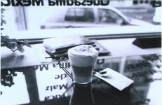
Please Critique

mw_uio

Well-known
Local time
4:07 PM
Joined
Nov 6, 2005
Messages
514
Hi Friends

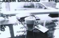
F3HP / 24/F2.8, set to aperture priority. F stop not recorded
Week of Nov. 13/06
Location: Quito, EC in a cafe
Time: late afternnoon

Film: BW400CN
Scanner: done at Kodak Pro Lab in Quito, Kodak RFS 3000 Film scanner

My thoughts are it is average. The print I got back was done on Kodak Royal digital paper. (not sure if this should be printed on this type of paper, maybe something else?)

Cheers,

Mark
Quito (UIO), EC
 

Attachments

  • 10 x  15 cm (4 x 6 pulg.)_01_Photo001163805138.jpg
    10 x 15 cm (4 x 6 pulg.)_01_Photo001163805138.jpg
    451.2 KB · Views: 0
mw_uio said:
Hi Friends

F3HP / 24/F2.8, set to aperture priority. F stop not recorded
Week of Nov. 13/06
Location: Quito, EC in a cafe
Time: late afternnoon

Film: BW400CN
Scanner: done at Kodak Pro Lab in Quito, Kodak RFS 3000 Film scanner

My thoughts are it is average. The print I got back was done on Kodak Royal digital paper. (not sure if this should be printed on this type of paper, maybe something else?)

Cheers,

Mark
Quito (UIO), EC
Seriously, this is a quality photo -- technically fine and even possibly usable as a promo shot for the cafe you bought the drink at. I've heard Quito is interesting to visit -- are there many nice coffee places or restaurants there?
 
I would agree that it is an average photo. exposers fine.
I am assuming that the coffee is your subjuct, I keep getting distracted by the car in the backround as well as the lettering on the window. There seems to be a lot of dead space around the mug, I would suggest making the subject larger in the frame next time. If you use the rule of thirds, you should do fine.
 
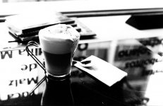
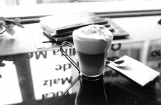
what woodphoto says....also For me to grey ..no real black or white ....and the highlights seem blown out ... here are some quick attempts on your image hope you do not mind ....
Regards ,
Charley
 

Attachments

  • 1.jpg
    1.jpg
    83.2 KB · Views: 0
  • 2.jpg
    2.jpg
    88.4 KB · Views: 0
The photo is too busy and it does not help to have the window view not being level but crooked. It is an innovative view though. Such a photo would be stronger if it had been taken at 2.8 or 4.0 but not at a smaller aperture,with focus on the cup of cappucino. A Sepia toning may actually help here since Coffe is bown-black.

Raid
 
It's a nice photo, well done.

The coffee is good and sharp and clearly the subject in context.

I would agree with Charley's second crop (right edge at edge of paper napkin) rather than the full frame (?) as originally presented.
 
I have reservations as it is too formula based but does not have any particular anything. What is the point of the image - and i dont mean this in a rude way - why did you take it?

It is not visually captivating, but does not tell a story or leave quetions either. It is a reasonably well executed, well, I dont know.

Might seem that I am being cruel, but thats not my intention. I am just trying to figure out what made you take it. The images seems to be for its own sake - which is fine if it is visual dynamite. Very pleasant but leaves me asking, 'so what'.

Please feel free to tell me to sod off, but believe it of not I am trying to be constructive. Having said that, if you took it for a friends coffee shop brochure it would start to make sense.

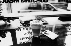
FWIW I think the original is far better than the modified images posted by Shiro Kuro, as they have blown highlights and are 'soot and whitewash'. Your original has a far better tonal scale (absoute black and perfect white are not obligatory) and the car on teh street gives a worthwhile context.
 
Last edited:
I agree Blacks and whites are not mandatory ..... I wonder how close your photo looks to the scanned image you uploaded ..is this the look of BW400 CN ?
Regards ,
Charley
 

Attachments

  • 1.jpg
    1.jpg
    133.3 KB · Views: 0
  • 2.jpg
    2.jpg
    147.1 KB · Views: 0
Nice photo, but the first crop by shiro_kuro looks instantly pleasing for some intangible reason. I don't like the centering of the coffee in the original, but centering both the coffee and the spoon & napkin makes more sense to my feeble mind. Cropping the top and left side to retain the aspect ratio somehow makes it "flow" better. or something. The napkin leads to the spoon to the coffee to the magazines. I guess my eye likes to be led by the hand.

The original includes too much, perhaps. The coffee, spoon and napkin are the focus, but gets lost in the expanse of counter and glass.
 
The first thing that I had to get past was the nasty (to my eye) colour cast in the scan (the besetting sin of C-41 process BW done wrong). I took a copy and changed the image mode to greyscale, just to settle myself down over that. I don't mind that there are lots of elements in the photo, so to me it isn't really "too busy". But I do find the plant on the left distracting, and the coffee perhaps a little too centred. To my taste, a pan to the right to exclude the plant might have improved things (depending, of course, on what's out of frame to the right).

...Mike
 
Back
Top Bottom