mw_uio
Well-known
Hi Friends
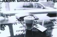
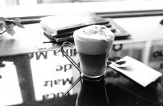
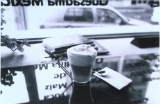
F3HP / 24/F2.8, set to aperture priority. F stop not recorded
Week of Nov. 13/06
Location: Quito, EC in a cafe
Time: late afternnoon
Film: BW400CN
Scanner: done at Kodak Pro Lab in Quito, Kodak RFS 3000 Film scanner
My thoughts are it is average. The print I got back was done on Kodak Royal digital paper. (not sure if this should be printed on this type of paper, maybe something else?)
Cheers,
Mark
Quito (UIO), EC
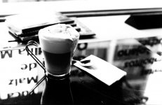
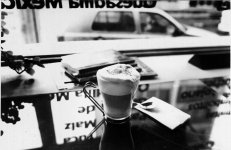