Some input, please?

rbiemer

Unabashed Amateur
Local time
3:26 PM
Joined
Sep 17, 2004
Messages
5,092
Folks,
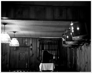
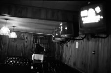
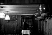
I posted a photo in my gallery and after reading a comment about it, I'm wondering if I made the better choice in how I presented the shot?
I've attached two versions here. One is obviously the cropped version and the other is the full frame. In the cropped version, I also rotated the photo some as I wasn't sure about the tilt of the ceiling; which was what the comment was about, in fact.
Any suggestions? Feel free to play and repost this photo.
Thanks,
Rob
 

Attachments

  • Empty TV Rom cropped.JPG
    Empty TV Rom cropped.JPG
    145.2 KB · Views: 0
  • Empty TV Room uncropped.JPG
    Empty TV Room uncropped.JPG
    141.8 KB · Views: 0
Here it is, with a little more straightening and some of the dark top cropped out.
 

Attachments

  • TV Rom cropped.JPG
    TV Rom cropped.JPG
    53.8 KB · Views: 0
I have to say, the room with all that symmetry, all empty and bland freaks me out a bit...

Here's what my mind makes me see:
 

Attachments

  • TV room.jpg
    TV room.jpg
    64.8 KB · Views: 0
The uncropped photo has more content and context, because you can easily see the booths, which are unoccupied. The leather (or vinyl) also beautifully reflects the light. The original is more clearly a photograph of an empty space.

When the photograph is straightened and cropped, you lose the seating area, and it becomes a photograph of a ceiling and a television on a cart. In my opinion, the ceiling of this room has very little to tell the viewer, so the point of the photograph becomes unclear and somewhat uninteresting.

If you have the opportunity to visit this place again, and to see it in the same quiet state, I recommend that you try the first photo again, but straight this time. You could also try standing on a chair or short stool, and then pointing down slightly at the seats. I imagine that this is a diner, so there are probably tables in there, too? This viewpoint might amplify the emptiness of the space.
 
I also wanted to mention that I like the tones in this photograph. They are very smooth, and the dynamic range is really excellent. Great exposure!
 
Thanks, folks. Yeah, I didn't like the TV turned on and instead of just switching it off, I cropped it out. The tilt to the ceiling is real(but it was "helped" by my posture when I took this--I was tilted a little myself by then:rolleyes: ) and the room itself is a back room of one of my local watering holes. The bar also has OTB(off track betting) so the bank of TVs are for having all the different horse tracks on when the punters are in full force. This was late and the tracks/OTB were done for the night and so, the usual crowd was either long gone or in the bar itself celebrating or commiserating as appropriate. Definitely a shot I couldn't do in color; the room is warm and inviting, usually.
 
Michiel said:
I have to say, the room with all that symmetry, all empty and bland freaks me out a bit...

Here's what my mind makes me see:

Interesting spin Michiel - whose reflection?

- John
 
BJ,
I was slowly typing my response to the other folks while you were posting. Didn't mean to ignore you. Most of the things you mention I will be able to re-do. I have seen this room like this lots. And I'll not be shy about just reaching up and turning the TV off. And take some shots of the room before I have any shots;) . The thing that finally caught my eye were the TVs along the wall. And when I go to this bar, I almost always walk into the place by this room, so I should've "seen" this rather sooner than I did.
And thanks for the kind remarks about the tones and dynamic range! As usual, when I'm shooting at night or somewhere dark, if there are any other people around I get to hear, "Hey, pal. Your flash didn't work." I've mostly given up trying to explain about that.:D
Rob
 
I like the full frame much better. The tilt adds to the composition as well as the only lit TV (the others are silent). I also like the detail on the booth seat and the two lamps.

The cropped version does nothing, there is nothing left that caught my eyes.

Michiel: It took me a while, but that's just creeepy!!!!
 
Michiel said:
I have to say, the room with all that symmetry, all empty and bland freaks me out a bit...

Here's what my mind makes me see:
Now that's a lot creepier than my original!
shadowfox said:
I like the full frame much better. The tilt adds to the composition as well as the only lit TV (the others are silent). I also like the detail on the booth seat and the two lamps.
The cropped version does nothing, there is nothing left that caught my eyes.
I'm still not sure about the lit TV; it seems a distraction to me.
I was back to the bar again yesterday and only had a P&S camera with me(color film in it) so I shot some other stuff there.
I'll be shooting this again and trying the various suggestions.
Rob
 
Michiel said:
IM very HO the TV that's turned on in the full frame distracts from the lines that make the photograph (the crop) interesting.
what he says:D the TV on draws attention and is too bright to the rest of the picture
 
Back
Top Bottom