So the next time your significant other buys a new dress astound her with a few well chosen accessories.
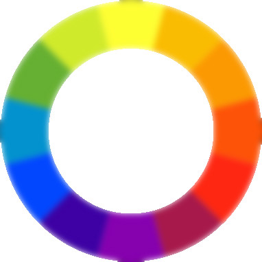
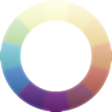
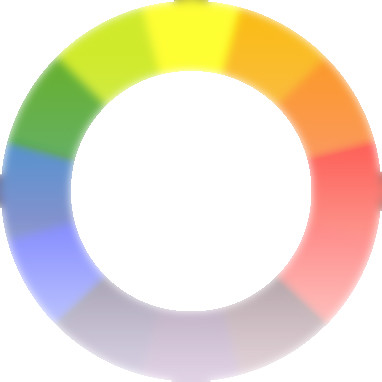
Whatever colour the dress is any small items, earrings, bracelets and maybe shoes should be chosen from the dissonant shade.
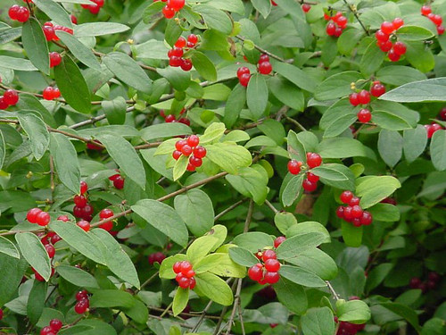
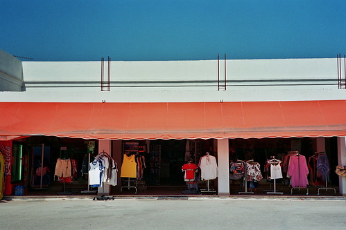
e.g. navy blue with orange/red, or a red dress with lime green earrings.
Larger accessories, scarves, handbags and the like, should be chosen from the harmonic shades (those either side) or from the dissonant shade modified by the natural order
eg so that same navy coat would need dark-green or pale-apricot scarf, or a British Racing Bentley turbo must have red or the tan leather seats or a navy overcoat with a cerise lining
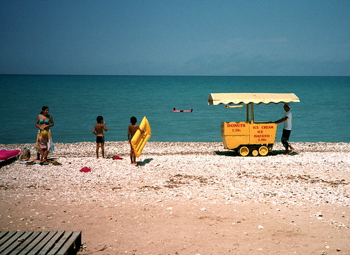
The same applies to all colour-combinations, fashion, interior design, whatever
only a starting point and remember you must see the shades must be side by side, tiny differences really matter the human eye can differentiate about 5 million green shades, and it's impossible to remember colour.
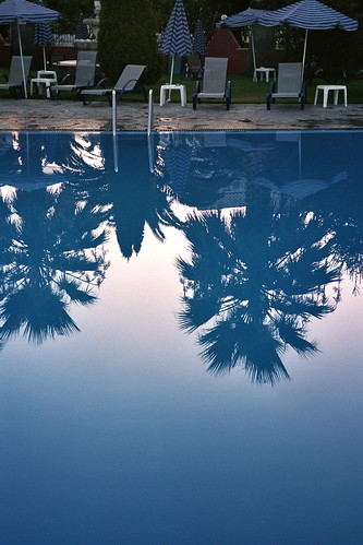
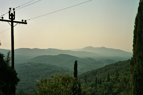
Coming back to photos; knowing this is one thing using it is different again. The figurative artist gets to choose colour-combinations and composition, starting with a blank sheet he can combine colour and line in any way he pleases.
In contrast the photographer is stuck with a world crammed full of stuff and he must choose as much what to miss out as what to include.
So in essence, whereas a painter can lead the viewers’ eye around, in most cases a photographer has to make do with giving them a gentle shove in the right direction. As with composition, when one knows to lookout for a certain type of colour-combination you get more of them cropping up in your contact sheets.
...THE END...