T
Todd.Hanz
Guest
model 337, good commentary...I like your honesty and eye, we could use more of that here.
Todd
Todd
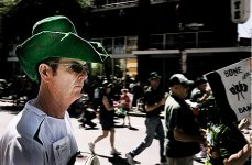
Aziz said:From a few weeks ago: D.C. (Chinatown/Penn Quarter area)
nightfly said:Thanks Rick.
Last summer there was a Richard Serra installation at the MOMA in Manhattan where that was shot. You can't really see it in the web version but the sign at the bottom of photo says "Please Do Not Touch" which I thought was funny as the one guy in the foreground is reaching out to touch the other guy as he appears to be walking away.
Thanks. I try 🙂Bertram2 said:The first one , really good !🙂
Todd.Hanz said:not me bro, thank the recently retired Pixtu for this mess 😉.
BTW, anyone can start one of these threads. If you get here on thurs. before the masses and don't see it started, just open an old one-copy the rules- paste them in a new thread box and viola'.
Todd
lZr said:
Downtown
Bessa R and Skopar 35/2.5
TriX in Diafine

Just to be sure:
Does that mean this one ends definitively next Wednesday and won't be continued?
And any of us will start a new one then ? Which will last another 7 days ?
Thanks,
Bertram
another from a recent shoot...
and yes, before anyone mentions it, I photoshopped the hell out of this one 😉
love it or hate it?