Godfrey
somewhat colored

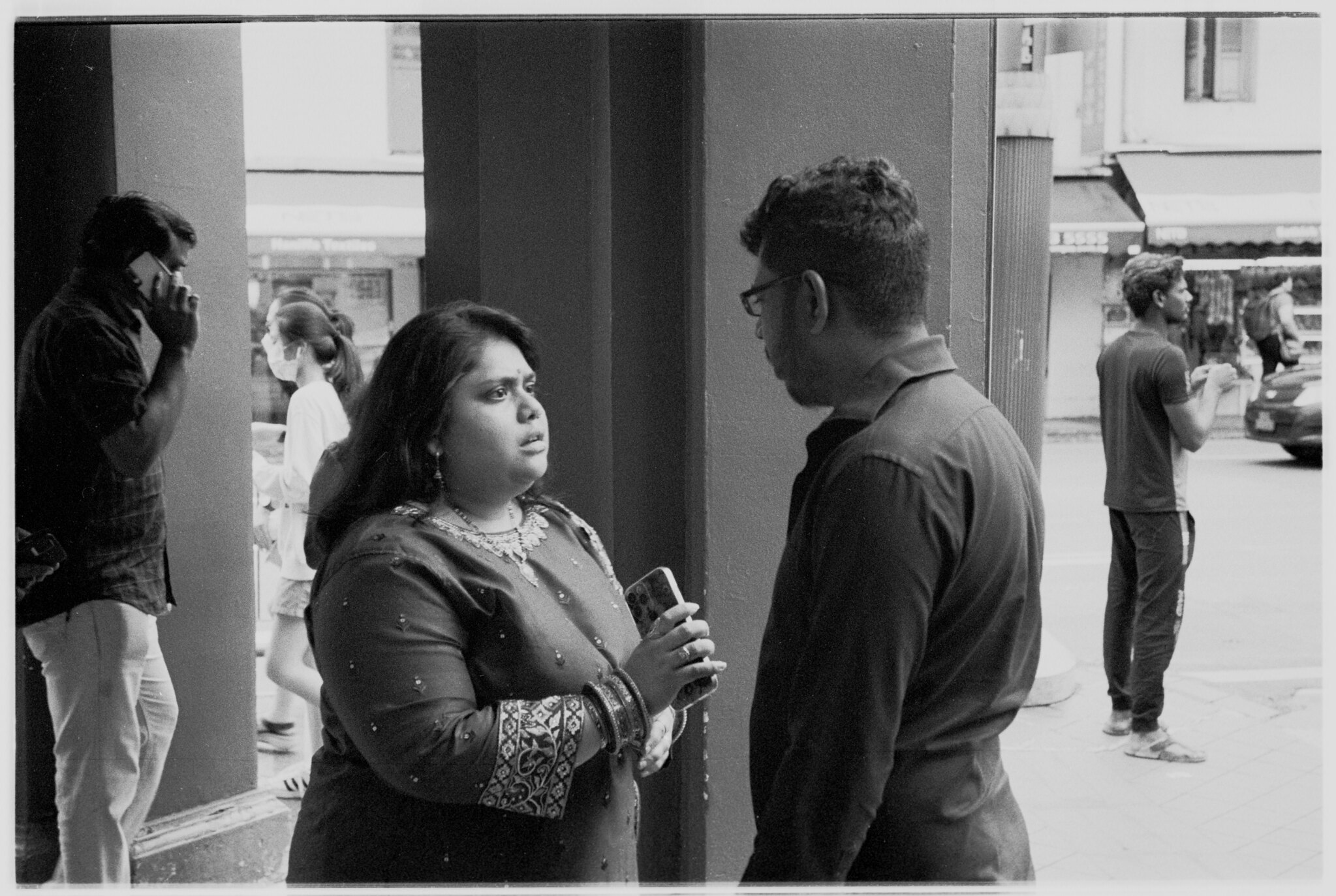
Happy Fall - Santa Clara 2022
Leica M10 Monochrom + Color Skopar 50mm f/2.5
Green filter
ISO 160 @ f/4 @ 1/160
Enjoy! G


gelatin silver print (color skopar 50mm f2.5) leica lll
https://www.flickr.com/photos/erik_van_straten/52534956145/in/dateposted-public/
Erik.


Don´t forget my pictures are scans of analog prints of pictures made with mostly old to very old lenses, often uncoated.Computer displays do differ by a lot, but there are standards that allow color management to do a reasonably high fidelity job. If you calibrate and profile your monitor and then apply the color profile tags in your JPEG images when you output them from your image processing app, most modern browsers will render the image pretty darn close to what showed on your original display, presuming that whomever is using the viewing system has calibrated and profile their display as well. 🙂
All my systems are set up with calibrated and profiled displays... With very little variance, what comes out of my printer looks virtually identical to what I see on the screen, whether it is scanned film, scanned prints, or digital capture originals. And what I see on other systems looks virtually identical as well. Similarly, my goal in rendering scanned original prints is to replicate on screen what the print looks like in my proofing box (controlled lighting and intensity for viewing prints).
And of course, if the display JPEG of your photo matches what you think it ought to be, then what I'd like to see isn't really important. 😉
I like a little more range to the B&W tones in most images, but that's my aesthetic preference.
G

Erik, Care to elaborate? How do you think the two versions of the 50/2.5 Skopar are different? I have both versions, though I use the LTM version far more (and love it). And that’s a terrific photo, btw.There is not only the Color Skopar 50mm f2.5 (LTM), but also the S Skopar 50mm f2.5 (Nikon RF). Optically they are not for 100% the same.
gelatin silver print (s skopar 50mm f2.5) nikon s2
Erik.
View attachment 4815048
In my eyes the Contax version is even sharper. I think they recomputed the lens. Also the coating is different, but that will not make much difference. Bokeh and such is the same.Erik, Care to elaborate? How do you think the two versions of the 50/2.5 Skopar are different? I have both versions, though I use the LTM version far more (and love it). And that’s a terrific photo, btw.


