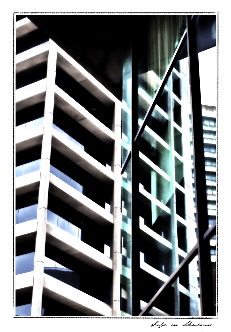
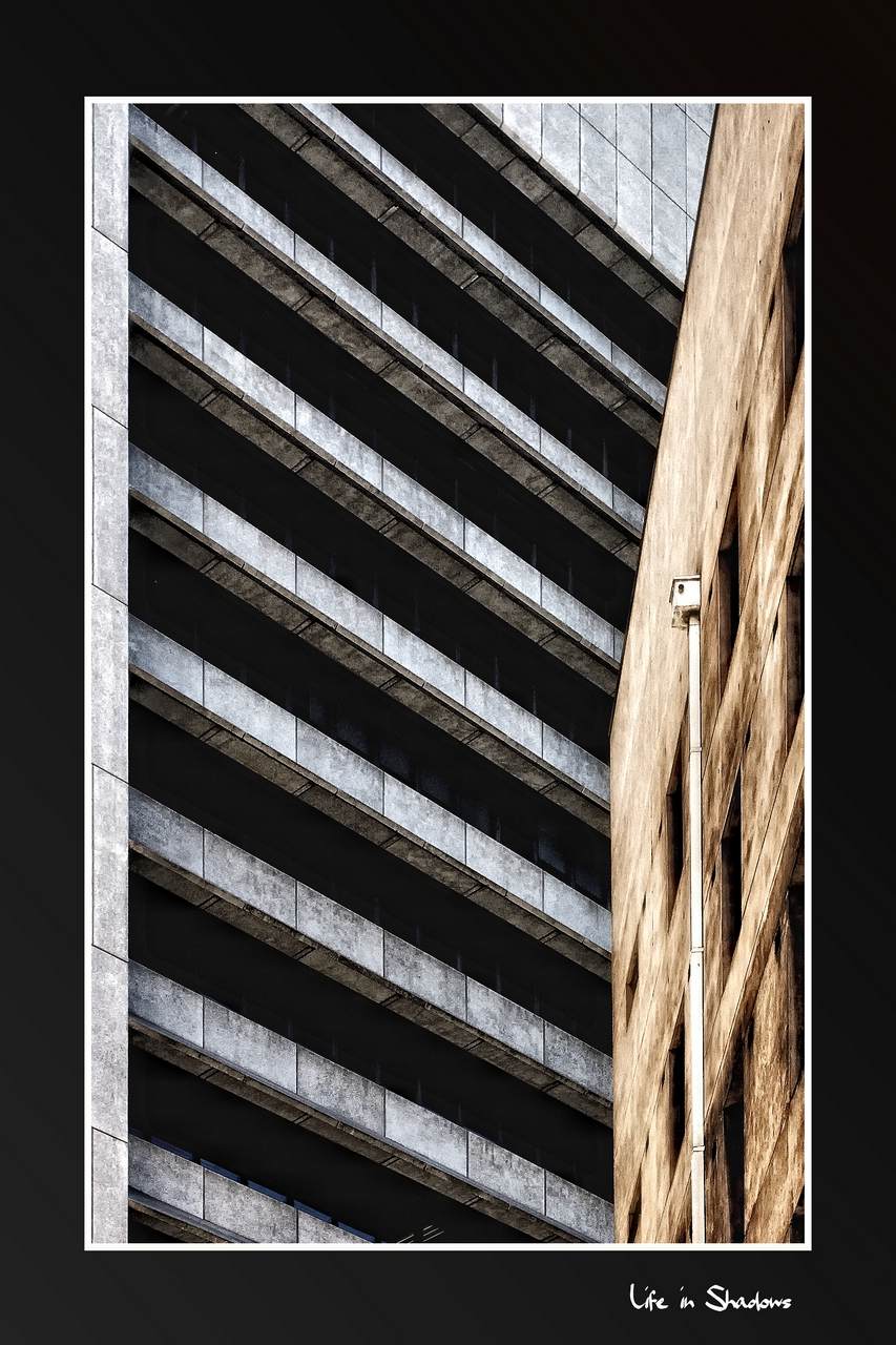
The blacks are black, and the light greys in the foreground are perfectly toned.
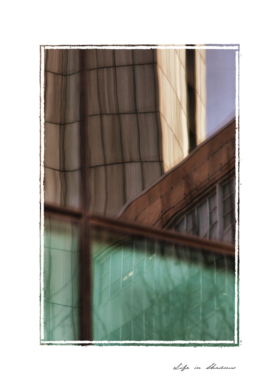
I like the different lines and their directions, the diagonals from the concrete, the vertical ones from the wood in very different shades, and the horizon being just slightly off. It's an abstract, but a great one. Being busy is part of it, IMO.
Again, I suggest to print it before you think you did anything wrong. Paper will tell you differently than screen. Depending how you print, tones might change again, and certainly be richer - remember you are seeing 8 bit grey tones in your published jpeg.
If you had the same picture with a nude jumping off into the water, the guys here would love the picture, and nobody would complain about exposure. 🙂
Roland.