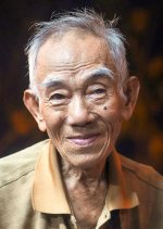
When I see threads like this, I always wonder what I'd see if I were looking at each person's rendition on his own monitor! Most of the versions here look too contrasty to me, with too much black in the face but I also see that in general people don't mind empty shadows as much as I do.
For looking at pix on the web, I downloaded a Chrome add-on called Image Histogram that offers a right-click menu item to give a histogram for any webpage image, and often I'll turn that on if I see something I like or don't like, to see what's going on. Here, there's quite a bit of bunching up near black in most renditions that the original color version doesn't have--so much that I think the facial tonality ends up being exaggerated in a way that looks too dirty for my taste.
I only work in PS, so I'm not much help here, but with portraits I always end up separating highlights and shadows and working on them separately, bringing facial bright areas down and enhancing their contrast a bit, and pulling shadows up. That pulls things away from the ends of the histogram and puts them more in the middle, which is actually the way our eyes see things--look around you and see how many shadows there are that are so deep you can't see into them, and how many faces are so bright you are blinded by their whiteness being right next, on the grey scale, to the pure white of the sun--that just doesn't happen.
In Windows PS, Ctrl-Alt-Shift-~ selects highlights above mid-point, and Ctrl-Alt-I inverts that selection for working on the histogram's lower half, if I'm remembering that right. I do that in layers so I can keep messing around until it looks right. After I think I have it right, I'll throw it up on the web and check how it looks on every computer I have access to, but usually my Android phone gives the best, most average version, which I've confirmed by looking at various greyscales on the web, so I give that the most weight.
On my phone, the first example in Kuuan's post #13 is my favorite version so far.


