Are my scans okay in replicating Ektar/Portra?

GarageBoy

Well-known
Local time
12:17 AM
Joined
May 29, 2013
Messages
838
So I'm finally trying to get some color scans in but I'm not sure what they're supposed to look like

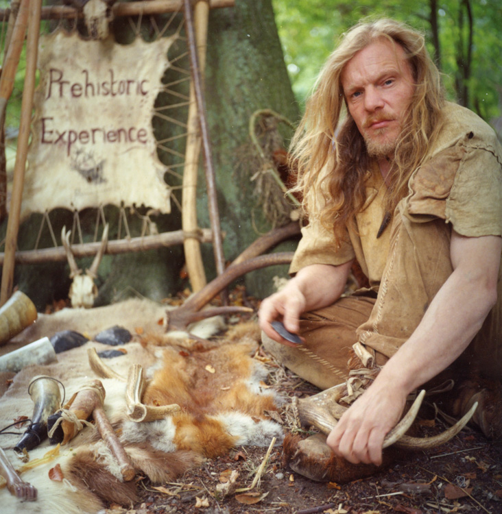
I'm using Epson Scan - setting the levels so they don't clip, letting epson scan invert and then using GIMP to apply an S curve

Here are the results (Ektar 100)Top photo is straight scan, second is S curved
Now I understand the blue shadows complaint of underexposed Ektar

Am I in the ballpark or should I change my work flow/ mess with hue/saturation/color balance


I don't know about Portra 800 but your Ektar looks ok, the first one may be underexposed. I find the auto color, auto tone in PS very often nails it pretty well
 
GarageBoy, I find that Portra 800 is not quite that muted, but really once you've scanned, the difference between a muted and saturated film is pretty minor, as you have already changed the colour by scanning it.

Generally speaking, if you're happy with them, then they're good. There is no right/wrong colour, and if you are happy with the results then you're done.
 
Most of what you have done looks OK. The Portra 800 looks like it was taken under strip lighting, which has a green yellow and quite unpleasant colour spectrum so all bets are off with getting good colour under those conditions, looks slightly underexposed too as there is a fair amount of noise in the mid-shadow area.

Here is what Portra 800 looks like for me:

116816209.jpg


Looks like you're doing well though...
 
Thanks, I have a few Portra 800 shots of people that look ghastly white; I'd love to replicate the skin tone in your shot, Photo_Smith

The subway shot is FL lights, so I expected the colors to be way off, didn't expect underexposure, though
Camera was a Nikon N2000 in AE mode, no exposure comp
 
Okay, tried this again
Did some auto white balance in GIMP in some of these
Why are my photos so dull and grey?
And in my mixed light shot, where my friends are backlit by incandescent and lit by daylight, why is it so blue? (rather than them being neutral and the background being extra yellow)


I can only say that you can do much much better than this, but not sure if you can do it only with GIMP. I use ColorPerfect, which makes negative color easier than digital color, in my experience. Look it up. Here are a couple of samples, first from Portra, second from Ektar

8400508182_10b5f9991c_c.jpg


8765538978_7b03421bcc_z.jpg
 
Pick something that should be white/gray/black but isn't totally blown out or zeroed.

Slowly adjust the color until its more accurate. With luck, a simple adjustment gets you close to what you want. Mixed lighting is a pain though and that often is the case with low light shooting.

Note that if the light hitting the scene is tinted in the first place, your negative may not have enough detail in all color layers to get you something neutral and natural looking.
 
Back
Top Bottom