Brutally honest critique thread

tumblr_nklnisOBU61qamvqvo1_1280.jpg

I like images that simply play with color composition. This is one. Adding this to a series of similar ideas would be nice.
 
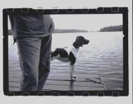
That is stunning. Usually I don't think I'm a very good critic because I usually focus on if the picture is saying something, if it conveys something human, something that makes me want to look again... not on compositional rules or anything like that. That being said, I think that your pictures satisfies both of these sides of photographic critique:

1. On the one hand it says a lot. That bit about your dog frames the entire reading of the picture. In general I'm not a believer of the dogma that says that an image should speak for itself. Bourdieu and Foucault (as well as a postructalist like Barthes) tell us that there's nothing objective about a picture: it really depends on who looks at it, who has the power to decide what a picture says, the own psychological experiences of the viewer, etc. In other words: once you, as an author, make a statement about the picture you frame it and invite a specific reading. This picture wouldn't be as powerful if it weren't for that framing. For instance, within that reading of the dog, the blurred river (or sea) acquires a different meaning (heaven? ethereality? the fact that everything passes with time, that time cannot be held in place?).

2. On the other hand, composition wise, I love it. The picture emphasizes symmetry in everything, except for the dog. Thus that break in symmetry draws focus. Once again, this is connected to your narrative framing. Technically speaking and composition-wise I don't think I have much more to say. As I said, I'm a bad critic of these things 🙂

Hope this helps!

Redseele, thanks a lot for your in depth critique!
Also Frank, Andy, Paul: Thank you!
 
Stand-alone vs. Part-of-a-series photographs

Stand-alone vs. Part-of-a-series photographs

I'm having an interesting (and educational) response to a lot of what I see in this thread. From time to time, there's an image that is what I'd call a 'stand-alone' image (i.e.: the kind of image that would look good decorating a wall in your house). Examples here are Daveleo's 'Pieta', Hsg's 'yellow umbrellas', Huubl's 'dog on dock', and Nightfly's 'study in orange'.

And then there are images that seem like they might fit well in a book of images that tells a story or shows a photographer's take on some subject or other. Some examples of this type of photo in this thread are FrankS's 'man carrying clothes rack', Helenhill's 'couple in New York diner', Keith's 'girl and tutu in closet', and Lawrence's "Myrtle Beach".

For some reason, I find it much easier to offer up critique comments for the first group than the second. I think its because for images in the second group, I want first to see the whole series (the series I imagine to exist or should exist) before I bother thinking about any technical aspects. Maybe its because I get the feeling that for images in the second group, technical issues are not nearly as important as the story itself? As an example, what kind of critique would one image from a young unknown photographer named Daido Moriyama receive here?
 
And then there are images that seem like they might fit well in a book of images that tells a story or shows a photographer's take on some subject or other. Some examples of this type of photo in this thread are FrankS's 'man carrying clothes rack', Helenhill's 'couple in New York diner', Keith's 'girl and tutu in closet', and Lawrence's "Myrtle Beach".

Agreed as far as my own image goes. It might work as part of a story but isn't strong enough to tell its own story.

As an example, what kind of critique would one image from a young unknown photographer named Daido Moriyama receive here?

I think it depends on the image. Anything from Farewell Photography would probably get short shrift.
 
Thank you Jamie Pillers and FrankS on your feedback.

About stand-alone or series, I think one should aim for stand-alone images always. A series of stills are always going to be not as good of a story telling medium as video.
 

11500004 by lukas.boutholeau, on Flickr

Right. I consider this one of my best shots, please be very brutal. I'd like to offer my critique to others but I don't I am experienced enough to offer anything substantial to some of the people here, let alone you giants that produce wonderful work here.

First of all, the image size is too small. Secondly its too busy, with three layers, but unfortunately none of the layers has anything of interest.

It has a graphic design but its straight vertical lines that makes the image feel divided in many sections.

Usually with street shots, cropping the feet is a bad sign.
 
Redseel's Photograph:

FrankS comments focused my attention on this photograph. The visual center of gravity, for me, is the girl's right pupil, though her gaze seems directed beyond her partner, almost abstracted, while his gaze, beneath a strong brow, seems intently upon her face. Similarities in the flow of the hair leads my eye down to an incomplete triangle where their hands will never touch one another. I like that the frame is cut at that point. His broad frame vs. her bird-like frame. the total "disconnectedness" of the fuzzy, passing couple, commerce and life swirls beyond and around them. But I can identify with the fans where this was first posted. Even the conscious inclusion of frame markers left and right (auto and quarter-man) act to circumscribe their small universe.
 
Great metering here! I'd like to see a version with not so much black, and another with a lot more black. I guess that says I feel like this composition is sitting in the middle of two possible stronger ways to compose it.

My thought about photographs of other people's art... the composition of the photograph has to add something new. Otherwise its just a record of someone else's work. I think your photograph goes beyond that with the tonal range you've chosen... I like that a lot. 🙂

Thanks for the comments, Jamie.
I feel similarly about making pictures of other people's art but .... The final image here has a lot of my interpretation of the actual scene that I photographed. It looks nothing like what came out of the camera, so I feel comfortable that I contributed a lot (be it wonderful or horrid) to what you are looking at.
 
Hsg, can you expand on 'Usually with street shots, cropping the feet is a bad sign'?

Are you associating it with too little context in the photo? Or something else? I'm having a hard time correlating this with the work I've seen from well respected street photographers.
 
Not Hsg, but I dislike it too. Cutting off people at the ankles or shins does them violens, it looks painful, and bad. nightlfly's photo I liked above does it, but what made the picture interesting to me was the tensions in it and that was one of them, The way it pushed the merging figures at the viewer, so it didn't bother me as much. Sometimes there's no excuse for it, though.
 
no, the couple are defined by her eyes. she does not care where they are; nor, i hazard to guess, does he. they could be in a jungle or on a mountain or in a pasture, and her eyes would BE the picture ...

Almost. This is a good shot, but less DOF or with no people in the background, it could be brilliant. IMO.

... there is also that woman's svelte nature ... her elegance, and the contrast with her companion and surroundings, oddly the image is so redolent of that SE bit of Manhattan, even though I haven't been there in years I can hear the echo of it and almost and smell the place
 
HuubL, sorry I can't get my hands on that image, but here's another image with the same lake, dock, and dog.
 

Attachments

  • image.jpg
    image.jpg
    24.5 KB · Views: 0
I have a couple of rolls of b+w 120 (Hasselblad) of this dog, Buddy, shot the day before we had him put down due to kidney disease, that I haven't contact printed yet. That was 3 1/2 years ago.
 
All in all I would call this a first draft' image. There's a lot going on in terms of your subject- suburban architecture and environments. The street is HUGE in your shot- partly the wide angle lens and framing, but also it brings out the primacy and dominance of the automobile in the public space. Dang, you could build houses in the middle of these streets and still run cars between the houses.

Driveways and garages being the closest to the streets- telling about priorities and how we want to interact with others, how much consideration we want to show others compared to how much our private convenience is what matters.

The oak tree shadow and shadow hints at either the age of the development- planted as a stick when the houses were built- or possibly a survivor from the previous land use. It's one of the disconcerting things for me in suburban environments- the presence of 'nature' and natural elements, but always tentative, isolated like this oak.

The palm trees- Mexican fan palms, are they?- speak of another place, Los Angeles, but living in the Bay Area myself I know how common they are everywhere. I still find them confusing, and your image inclusion of them.

The people- so dwarfed by the road!

Well, I'll stop. I am not 'reading' the image, I am reading the landscape you show in your image. As an image itself, I find it underexposed in the main area, the homes. The tree shadow is compelling but not particularly strong. The flare you are playing with may be the most interesting thing for me to see you explore. The way the supposed center of such developments- the houses- is hard to see because of the dawn/evening sun dominating. I could see this image as a breathing space image in a series, but it doesn't do much for me on its own.

The subject matter, and what you are doing to it, playing with all these different elements of the environment, is interesting to me. I hope that you keep working this area.

Thanks to everyone who critiqued this photo. I appreciate your comments and critiques, including, particularly, the suggestions on cropping and adjusting exposure. And I especially appreciate Dan Daniel's "reading" of the photo as well as his critique.

A couple of responses to more specific comments:

@Pherdinand: The "empty" quality you describe I see a little differently. These suburbs have a different spatial scale than most cities, and one of the things I'm trying explore is how these spaces can be used as canvases for light, shadow, and other photographic qualities. But I appreciate your point.

@fireblade: You asked about fav photographers of suburbia. The work of many of the photographers associated with the "New Topographics" exhibit in the 1970s resonate with me, particularly Robert Adams and Stephen Shore, although I'm not trying to copy their approaches.

Thanks again to everyone who took the time to look and comment.
 
This is a fantastic thread. Here's a picture I took about a year ago walking in Manhattan. For some reason (that I hope someone can help me understand) it is by far the picture with the most likes in my Flickr Photostream. I am open to critiques and comments 🙂


A Manhattan couple by Mahler_seele, on Flickr

This photo leapt out of the thread for me. The intensity of interaction of the couple and her striking look in particular conveys a sense of something serious being said here. I like the use of selective focus as well, to set the couple off from their surroundings. My comment here is that an even shallower dof would have made the couple stand out even more and added to the drama of the shot. Also, I appreciate the processing here; this is technically a very good image. So much for being brutally honest....🙄 I can see that some might want the car on the right cropped out, but that doesn't bother me -- it's part of the environment depicted in the shot and I don't find it distracting.
 
This is a fantastic thread. Here's a picture I took about a year ago walking in Manhattan. For some reason (that I hope someone can help me understand) it is by far the picture with the most likes in my Flickr Photostream. I am open to critiques and comments 🙂
A Manhattan couple by Mahler_seele, on Flickr

Thank you everyone who commented on my photo. I never really realized (or paid attention) to the fact that I had cut their hands in the framing. Actually, I think that I like it... body language is a form of communication but here the mutual stare is so strong that I think the hands would distract.

The reason why I framed it like this was that it was a picture taking in a hurry. It was a street shot. It was actually taken in Chelsea-Midtown West, around 35th st. 🙂
 
Back
Top Bottom