Good day for digital-darkroom work. I now have shots of my test box on Portra 160, Ektar 100, as well as Fuji 200. The films are a bit different and processing with NLP produces some differences in the converted images. Fuji negatives have always converted easily for me with NLP on Auto Pilot. Ektar not always so.
Let's look at an Ektar negative.
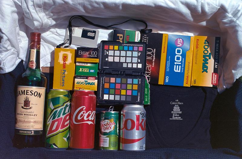
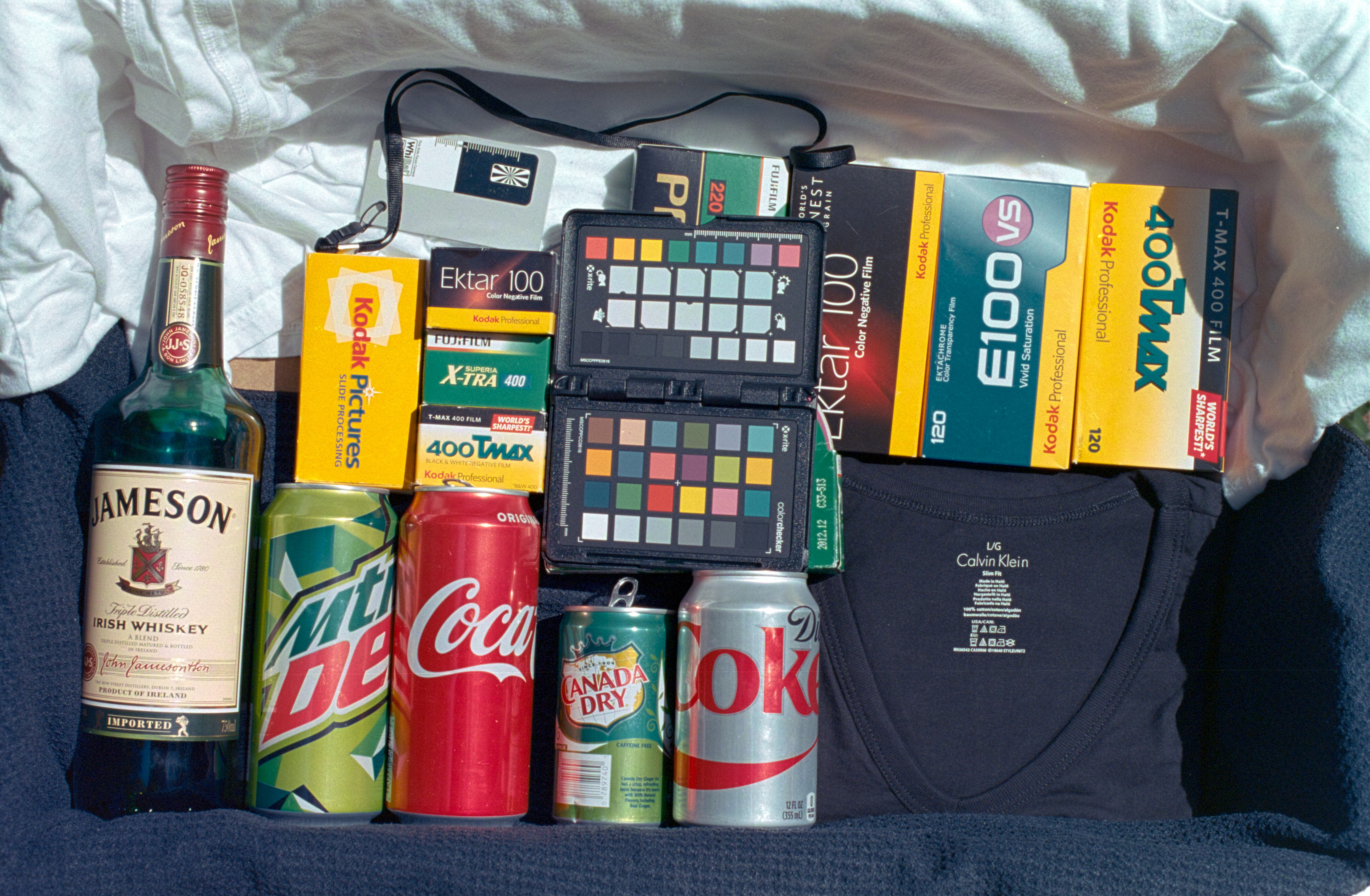
The shot: full October sunlight in NH. Metered camera exposure at ASA 100. Cam-scan with Sony A7 and a good macro lens. Open in LR, WB on the film rebate. Then NLP Frontier 3 Std and Auto-Color Neutral. This conversion is always too bright; adjusted brightness down. Here's that automatic result:
...
There are some colors I don't like. Kodak yellow is too mushy, Coke red is the wrong hue. Blues and green look OK. Neutral is pretty neutral. Free of casts.
In a converted NLP image, you don't dare touch most of the sliders (they are backwards and have unexpected consequences), but you CAN use the Targeted Adjustment Tool. Using the tool on Kodak box, I changed sat. Then adjusted sat and hue on the Coke can. To get the Coke red hue, I found it easiest to drive the sat way up, then I could judge hue more easily. Adjusted hue, and finally adjust sat to get what I wanted. Happy to receive any comments. Does this look right? Believable? Desirable?
I'm pleased with this result. I want my Ektar images to have quite vivid colors.
...
All of you are welcome to process the RAW file, and post results & comments.
Click HERE to download the raw file (25MB).