SolaresLarrave
My M5s need red dots!
I hadn't used it much because of accessibility (in my neck of the woods, Ilford is just exotic), but this is the best C-41 B&W film there is. As other Ilford products, it renders beautifully contrasty prints.
chris91387 said:Rich, fantastic pictures as always!
but i'm wondering about any toning on your uploads? they have your "look" to them which leads me to believe that they had some sort of toning done.
also, were these scans of actual prints of of the negatives? i'm guessing negs.
- chris
Allan, it's the station in the Castro. 🙂kaiyen said:Yes, with the right work on contrast, XP2 can really do well. I find it super flat as straight scans, and I need a harsher curve to get it right. But once I do that, it's great.
One thing, and this is not just for Rich...my laptop is 1024x768. Your image is 640 wide. With the all the stuff on the left, I have to scroll. Can folks use slightly smaller images so those of us stuck on XGA on smaller laptops don't have to scroll?
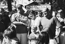
Rich, I hope you know that I like your work very much. I presume that's BART. I love stairwells and escalators.
allan
vrgard said:Okay, guys, based on Rich's results and the other positive comments, I bought a roll of IP2 Super and gave it a try yesterday afternoon. Was surprised with the results in that they all came out a bit dark and too contrasty for my tastes. And lightening the scanned images then brought the grain up. Maybe it was just the Walgreen's processing but they've done me right with the Kodak BW400CN in the past. Not sure what to make of my experience except to say that it's made me gunshy of using this film. Anybody have any thoughts on what may be causing the difference versus Rich's nice results?
Thanks,
Randy
Rich Silfver said:Randy, sorry to hear about your results. The prints and negatives are pretty dark/contrasty (something I personally kind of like) - but the scans are fairly easy to adjust as the grain is very fine and there is a lot of details in the negatives.
Did you scan yourself or Walgreen's - and do you got a sample image to post (maybe a larger one as an attachment)?
kaiyen said:Rich,
Can you elaborate a bit on your "adding a duo-tone" method? Perhaps I"m just not familiar with the terminology (I know duo-tones for printing...).
allan
vrgard said:Hi Rich. Yeah, these are just the Walgreen's scans. Haven't taken the time to scan them myself yet. Here's one example of the extreme contrast I was referring to. Just a couple of kids getting ready to dive into a couple of pumpkin pies in a pie eating contest at the local Fall Festival. And here's another example with the 'proud' parents watching their kids bury their faces in the pies.
Actually the XP2 Super negatives I scanned myself on my Epson 3200 scanner. Didn't have a free CD-coupon with me at the time 😉vrgard said:And yeah, I'm sure I could get better results scanning the film myself. Just got used to getting decent results from Walgreens so was surprised. Particularly since Rich also used Walgreen's scans although it might be a different machine since it was a different Walgreen's store.
Rich Silfver said:Allen, in photoshop you can add a 'tone' to your b&w images made up of a number of colours (up to four).
You can mix up your own tones (and save them for future use) and apply the finished 'mix' to your image. Then you convert back to RGB and you have a toned jpg file.