Flickr. Am I the only one who likes it?

I don't mind so much the change. For me, it's the front page that is so cluttered. Comments overlap photo's & every ones photo mingled along with everyone else's like a huge collage of sorts. I don't think people would have left flickr if given option to choose ones layout. I'm glad many of you like the new look. Like the gallery here. At 1st I wasn't thrilled but now I love the layout.
 
Which begs the question, what did we pay for? I was never under the illusion I was paying for the layout of the site, but the removal of limitations that were in the free account. I think if Flickr shutdown there would be a far greater and far more appropriate outcry. The changes made are to make Flickr viable again - as we've seen, there are alternatives - and to pay for the enormous expense required to host and serve millions of photographs.

Flickr hasn't forced us to accept the changes either really, as one can opt out of using the service entirely or downgrade their pro account to free and be compensated.

The problem here is forced change, especially if you have paid in advance (former "pro" accounts).
 
always hated the clunky old Flickr. it was reminiscent of early 2000's, big white areas that could have been used better.

new UI is great, all the old sections are still there and easy to find, havent noticed speed lags or other issues (didn't browse extensively in first days).
 
From what I've read, Pro accounts can renew before august and have unlimited storage space, not just the 2gb of storage with free accounts. This could be useful as a cloud based backup solution, and also for uploading lots of video footage, which can eat bandwidth.

-Joe
 
Do you have a link for that? A friend of mine would love to get his money back.

German flickr: upper right corner. hover over your image. Click "Einstellungen". Then you will find the options under "Ihr Flickr Account".

They will refund the remaining amount (2 EUR in my case 😛) to the credit card where I paid the amount with. That credit card does not exist anymore and you can't change it. So they will put it on a paypal account identified by my email-adress. Don't have that too so I don't think I will get my 2 EUR back.

I write this not because I'm interested in the 2 EUR but maybe someone else could have the same problem and is more interested in the remaining amount.
 
I like the new design mostly, aside from the manner in which it was foisted upon its userbase without warning. Equally, I can understand how longtime users would not like the the new design, as it is a large departure from the old one, as well as embodying a new site philosophy imo. The change in strategic focus from user-centric towards advertising revenue and site traffic is not for me however, and has completely turned me off flickr.
 
Its grown on me. As others have said I did not like the way it was foisted on users with no warning or choice - this is their business model and we have to fall into line or leave. Also there is no choice. It is all well and good to have a terabyte of space but who needs it? I don't. I do not upload videos and I could upload thousands of full res images and still have lots of space left. I cannot see that this offers me anything I want or need.
 
I've paid for my membership for a number of years, but I've never had high expectations for such little money. I figure that I was paying for server storage. No problem here regarding not being in the loop when changes were considered. My photos are still there. I can see them easily and when desired, I can share some images. Also, I can still organize my images in a way that works for me. So, I'll keep my paid account.

That said, I can understand a desire to be able to format the presentation. I wouldn't use Flickr if this were my prime interest.
 
Some good comments on the redesign down here:
http://www.theverge.com/2013/5/20/4...he-new-flickr-with-one-terabyte-of-free-space

sarahayla:
They are claiming that “Flickr had become about words, little images…” and now they have “a clean homepage…all the emphasis on images.” This is sadly, so wrong in my opinion. “Little images” is in fact all I see with the NEW design. There is no longer the option to display 4 large images on your photostream’s first page. Instead, all my work is bunched together in a convoluted mess.

GregFatbert
There’s a cultural divide going on here. On the one side you have the tech people, the “this makes Yahoo viable again” people, the folks who spray their shorts when they see the 1TB free storage. A culture that values quantity over quality. No restraint. OMG now I can upload 36 megapixel images of my cats!!

On the other side you have people that create beautiful photography. They value white space and good clean design so their work cam be displayed well.

Flickr was the last place on the internet for such thoughtfully created images. Now it’s aimed at being the next pile of smartphone vomit.
 
I think it is a major upgrade and I do in fact like it a lot.

I think a lot of those who are complaining just don't like change...

I agree that Flickr needed an upgrade. But the loss of ability to control the way my photostream is displayed is a deal-breaker for me. I've also found that it's harder to interact with other photographers, and that the tile view takes a long time to load (particularly on an iPad). So I don't think this is just whining by stodgy die-hards.
 
I like it. I might even just go to the free except that I hate ads.

That said, I think Flickr is the easiest to upload to. I've been thinking of adding more pix in the gallery here, but getting the size right is a pita and it's quite simple to just choose the appropriate size in flickr and posting the link.

I know change like this is always jarring - the best thing is for us to see how we feel about it a month from now.

Tom
 
I don't like it because, bluntly, to anybody with any design sense it's blatantly offensive.

And it functions poorly.

And it's counter intuitive.

And it's harder to use.

I'm honestly at a loss to think of one actual improvement made in the update - and I can't. I sort of like the display on black - but even that would have been better if it were grey instead of black. I honestly have no idea what they were thinking.
 
I'm pretty happy with it. I think I will upload all my photos at higher resolution to cater to ipad folks. Maybe 2048 or 1600. I just uploaded the Flickr Android App - it also looks pretty nice - especially the way it handles contacts photos. You would think this will all improve over time. One big advantage for me is the amount of traffic under new Flickr - it's higher -as people can see a lot of your photos at once in larger format. This is a big plus so far.
Before people were just staying on the landing page, then you had thumbnails which don't show off your image well. The new format gives a good impression of what you are about ... I've put a lot of time into Flickr - got a lot of good feedback from it - I'm staying and keeping my Pro account ...
 
It is clear they just rammed this through. There was evidence of beta testers complaining in big numbers before this went live, and their concerns were swiftly ignored. A poorly implemented and hastily developed cool idea is always a ticking turd bomb.

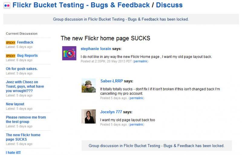
Actually I got to witness the beta test forum.

And you're on the mark. Everybody who got to preview the new layout hated it, with the exception of two people (one of which said they weren't going to bother posting their criticisms because they had been in a previous test and knew they would be ignored), and one that thought it was just "meh".

This screenshot pretty much sums up the whole "testing" process:
flickrbetta19_zpsfb2772f1.jpg


There was no acknowledgement by the staff of any of the faults in design. Many of the testers "sneaked" out of the test by erasing their cookies to get the old design back - that's how much they hated it.

The new layouts were launched immediately after "testing" ended, which probably explains why they were so buggy the first few days. So I think to say it was rushed out the door was fair. The upside of this is that maybe that means they're going to change it some more and we're not stuck with everything that's bad about the layout currently.
 
Back
Top Bottom