Sparrow
Veteran
----------------
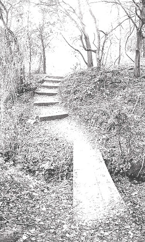
... out of interest one quick'n easy way to abstract any image file is to play with the Contrast and Brightness controls ... wind the contrast up until the photo looks like a photocopy/xerox or a silver lith print and then play with the brightness, or use Photoshops Threshold control and slide Threshold Level too and fro ... and you'll get this sort of effect ...
 ---
---
 ---
---
... much easier to sort out the light and dark areas ... chiaroscuro effects (strong contrasts between light and dark) almost always help to understand form and depth
... back in the olden-days we would put stuff through the copier or a fax-machine a few times and play with the light/dark controls ... which got us into trouble a few times, on cost grounds, with the thermal paper and toner
---------------
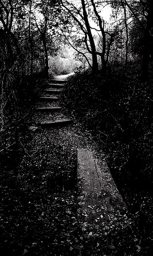
... out of interest one quick'n easy way to abstract any image file is to play with the Contrast and Brightness controls ... wind the contrast up until the photo looks like a photocopy/xerox or a silver lith print and then play with the brightness, or use Photoshops Threshold control and slide Threshold Level too and fro ... and you'll get this sort of effect ...
... much easier to sort out the light and dark areas ... chiaroscuro effects (strong contrasts between light and dark) almost always help to understand form and depth
... back in the olden-days we would put stuff through the copier or a fax-machine a few times and play with the light/dark controls ... which got us into trouble a few times, on cost grounds, with the thermal paper and toner
---------------