Redesigned Website-Feedback Please :)

You may need to work out some kinks there. I haven's seen your old site, but a couple things I noted.
1. Ugly overlay on the gallery plugin you're using for photos, I don't like, icons too big and roll onto the side menu.
2. Might want to add some kind of bot protection to the Contact page if you don't want countless spam.
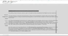
3. About and News section are totally whack for me. See attached photo. Text scrolls outside the frame.
 

Attachments

  • Screen Shot 2017-01-21 at 8.21.36 PM.jpg
    Screen Shot 2017-01-21 at 8.21.36 PM.jpg
    259.5 KB · Views: 0
I closed it after seeing two pages with wedding rings. I'm not into weddings business as OP is.
 
Everything worked ok for mac - Mac with 10.9.5 and Safari.

I'm not so sure I get the distorted photos. Rock & Roll, California and the New York photos are great.

I am also not so sure that combining what you do for fine art and what you do for commercial make sense together. The wedding pics are nice, along with corporate stuff, but corporate types might not appreciate the fine art photos if they have any political sensitivities one way or the other.

Others might have a different view on this.
 
I closed it after seeing two pages with wedding rings. I'm not into weddings business as OP is.

Thanks for feedback everyone. Regarding the different types of galleries -- each one has an admin slider that allows me to make visible or invisible. So if a potential wedding client wants to view that work I can turn it on for them. And conversely if an advertising client is going to look at my work I can turn the wedding gallery off. And I can also put the gallery they're interested in, in the top position so it displays first.

Because I just redid the site, and Google and others are indexing the pages, I've left most of my galleries visible. However, they're supposed to be able to see each gallery whether visible or not. I also added key words to every photo -- 452 or so.

I used to have my wedding work at danwagner.com and my other stuff at danwagnerphotography.com However, due to the added cost of hosting two sites, and the fact that I've reduced the number of wedding I shoot -- I decided to have danwagner.com point to danwagnerphotography.com.

Also, as wedding photography is now more highly regarded than as a creative branch of photography then it was before 2000 or so -- it hasn't been a negative factor for advertising clients. One reason, is that many of these clients also hire event photographers. What's important is that all forms of photography are high quality -- which they are.

I'm going to work on how the scrolling issue. Hopefully, the people that host the site can provide some suggestions. Thing is, depending upon one's screen size and how large their browser windows are, and which browser is being used, the pages will display a bit differently. I think I can nonetheless make some improvements.

The biggest benefit of the redesign was changing from Flash to Html5.

Thanks for the feedback, and keep those comments coming! :)
 
I think the wedding photography criticism is asinine. It's your work, put it on your website.

I'm not crazy about the blocks of gray that frame the site...it looks kind of awkward. Maybe a less visually cluttered design. And I think the signature wordmark looks cheap—a bit like a handwriting font, although it appears that's not what it is!

However, the scrolling is quite smooth for me, and I really like your photography! Are those "squeezed" pictures taken with an anamorphic lens? I probably would crop out the vignette, which looks a little gimmicky—calls too much attention to the equipment rather than the images—but the images are terrific.
 
Very clean design when viewed on an iPad -- except that there is a note at the bottom "We use cookies to enhance your experience" that stays on top of everything and I can't get rid of it.

If I were you, I'd either have your (protected) email address or the email form, not both. Having only a form is probably better in terms of protecting your account.

One more thing: I didn't understand why you have a link to your tumbr page. Is your website not showing enough of your work?
 
Hi Dan. I think it looks great and it functions well on my desktop. I could not find anything I would change. Nice job.

The mix confused me somewhat. Specifically, seeing the assignments and events work there prompted me to assume your offer those services, but I see no promotional info.

John
 
I think the wedding photography criticism is asinine. It's your work, put it on your website.

I'm not crazy about the blocks of gray that frame the site...it looks kind of awkward. Maybe a less visually cluttered design. And I think the signature wordmark looks cheap—a bit like a handwriting font, although it appears that's not what it is!

However, the scrolling is quite smooth for me, and I really like your photography! Are those "squeezed" pictures taken with an anamorphic lens? I probably would crop out the vignette, which looks a little gimmicky—calls too much attention to the equipment rather than the images—but the images are terrific.

The blocks of gray -- because I have square, wide, and 35mm image dimensions, it's very tough to find a scheme that works for black and white images and these sizes. Part of the problem is technical. The blocks work better with images that fill more of the page.

By workmark -- logo -- it was actually done by an advertising art director by hand - calligraphy. It's been my logo for many years. I suppose I could go with type. It would help my upper margin - which is wider than I wanted to accommodate the letter g.

Yes, the squeezed shots were taken with an anamorphic lens on a Sony A7 converted to B&W infrared, and many with an infrared flash. I played with the vignette vs no vignette and just liked them with. This is one of my experiments that I like to do from time to time. I'll keep it up for a while and then perhaps make this gallery invisible or change the order. We'll see. :)

ALSO, I just redid my Tumblr blog: http://danwagnerphotography.tumblr.com/

Thanks for the feedback and I'm glad you like the photos.
 
Very clean design when viewed on an iPad -- except that there is a note at the bottom "We use cookies to enhance your experience" that stays on top of everything and I can't get rid of it.

If I were you, I'd either have your (protected) email address or the email form, not both. Having only a form is probably better in terms of protecting your account.

One more thing: I didn't understand why you have a link to your tumbr page. Is your website not showing enough of your work?

Thanks. I'm glad the iPad version is looking good for you. The cookie note is so the site is in compliance with European regulations. You should be able to remove it by clicking on X in lower right corner. It's supposed to only display once.

The link to the tumblr is for SEO and because most of the other photographers who host with this provider and use their templates (which are customizable) have blog links. But I understand where you're coming from. Perhaps I'll make this link invisible - it would make for a cleaner menu.
 
Hi Dan. I think it looks great and it functions well on my desktop. I could not find anything I would change. Nice job.

The mix confused me somewhat. Specifically, seeing the assignments and events work there prompted me to assume your offer those services, but I see no promotional info.

John

Yeah, it's hard to show a lot without showing too much. I have wedding info service pages with testimonials, faqs, and package info - but that would really make things busy, and I'm not pursuing that kind of work as much these days. I'll probably just turn sections of the site on and off as needed. The site doesn't really bring me leads for work -- pretty much it's always supported my other promotional efforts.


Emraphoto -- thanks :) It was a fun project. I'd like to do more. I have a converted Nikon D300 that I haven't tried much yet.
 
I went there not to do what you ask (Rebel:me) but to look at what you shoot.
I like what you shoot. I especially like the "Rock" picture, it is almost a cultural comment!
 
I went there not to do what you ask (Rebel:me) but to look at what you shoot.
I like what you shoot. I especially like the "Rock" picture, it is almost a cultural comment!

Thanks. I checked out your site -- beautiful beautiful guitars! Which one is the "Rock" photo? I'm sure I'll say "duh" when you tell me. :)
 
I have that text out of frame thing also (Safari on latest MacOS on 13" Retina Macbook).

But much more important: great photography.
 
Great images and I don't mind the mixing of art, commercial and wedding photos.
However, ditch the oval mask - I find it annoying - takes away from the images.
 
Overall a very nice job. A few areas you could improve:

1. Text frames are out of whack in both Microsoft Edge as well as in Firefox (I can't comment on your text frames in Chrome, as I had freeze up issues for several weeks with Chrome. Recently I removed it from my computer).

2. The oval mask on the photos detracts from your photos.

3. Add protection to your Contact page to eliminate the possibility of spam.

One last thing: excellent photos!
 
Sorry if this is not what you want to hear but I find it very difficult to navigate. :(
 
Back
Top Bottom