thanks for your comments on my photo everyone! your thoughts and reactions are valuable to me. now here are some of mine...
Todd.Hanz: great shot. nothing particular more to add. it works. the grain and the motion only enhance it.
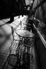
Rick Waldroup: the photo feels cluttered to me. too many little visual pieces without any clear subject.
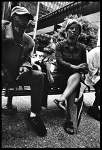
Mike Da Re: these two people may be interesting subjects (i assume you they were interesting enough to compel you to take their photo) but the viewer can't see that because their backs are turned. it's hard to get a good photo of someone's back, unless perhaps there's a particularly compelling composition that they're in, but this is just an average sidewalk scene.
lZr: it's a good setting for a photo but it would be better utilized with a compelling individual coming toward the camera. there's nothing here to keep my interest.
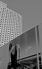
nightfly: the exposure looks quite nice but essentially this is a picture of another (large) picture. why did it grab your attention?
Aziz: closer would be better for your photos here, i think. or a different composition / crop. your subjects are interesting enough but i don't think the images are doing them justice.
Bertram: very cool idea. i'd like to see this with a more prominent subject though.
wray: first image... love the colors but not the composition but too much empty space. second image... much better, but it suffers a bit from the feeling that it's slightly posed.
BillP: i like that first image (classic storefront, relateable human experience/activity, your hidden reflection... "hello!") but the other two don't work as well for me... probably because i didn't see a clear relation between the individuals and the background and then the background was distracting me.
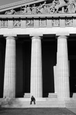
mccurleyphoto: the last image has some potential but it doesn't quite get there. i'd say you need to be closer. the first two images didn't have any people, or even signs of people, so i'd be hard-pressed to consider them street photograhy.
JeffGreene: the composition is pretty good but the subject is not all that memorable.
Anupam Basu: great photo. your subjects fill the frame perfectly and you waited for the right moment to take the shot. i looked it up on flickr to see what lens you were using - good use of the 21mm.
NB23: your image isn't displaying for me.