Tri-X in HC-110 with intent to scan

mfunnell

Shaken, so blurred
Local time
9:30 AM
Joined
Sep 23, 2006
Messages
2,595
Given that this seems to be the season for personal projects, and because it rather suits my circumstances right now, I recently decided to embark on a "film a week for a year" project to settle myself into a routine that works for me as a way of using film in this modern world (something it seems I've talked about much more than I've actually done, dropping C-41 film off at a minilab rather more often than developing my own silver film).

On the basis of cost and a number of other considerations (which I won't bore you with), I decided this would be based on Tri-X as film and HC-110 as developer, neither of which I'd ever used before. For a bunch of other reasons I settled on this as my basic approach, at least initially:

Tri-X shot at box speed (mostly in my M3 and mostly using my Elmar-M 50mm/f2.8)

HC-110 dilution E at 20 degrees Celsius for 8 minutes, agitating continuously for the first 30 seconds (inversion then rotation, repeated as needed) then for 10 seconds at each minute mark from 1-7; stop by flushing with tap water; fix in Ilford Rapid Fixer 1:9 (also at 20 degrees) for 5 minutes with agitation each minute; flush with tap water then final rinse in distilled water then leave to dry.

Scan with Nikon 5000ED (with SA-30 adaptor).

Photoshop for adjustments then print.

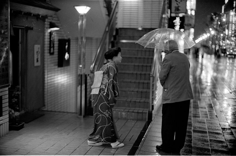
I've run a couple of rolls so far, and I've been pretty happy with the results. The negatives looked good to me. The combination of film, development and scanner settings produced fairly low-contrast results with a full tonal range, which was my intent, with adjustments made in Photoshop to produce the effect I want in final prints.

However, I'm pretty new to all this, and so was wondering if anyone has any hints, tips, suggestions or other commentary they'd like to provide to help me along.

Any such advice would be greatly appreciated.

For what its worth (low-res web images being what they are), here are a couple of example shots from my first couple of rolls:


Thanks in advance for any and all advice.

...Mike
 
#1 is beautiful. I think you should give advice instead of asking. I'd just keep at it , these are lovely.
 
your modesty becomes you. i agree with ducky. i think you're getting better blacks (more pleasing overall contrast really) than i do scanning tri-x dev in rodinal on a nikon 4000. less grain aliasing too. well done and well on a good path.
 
Last edited:
Tri X and HC110 is a classic combination, which, along with the keeping qualities of the HC110 makes it an attractive combination.

Your results seem to be what I would expect, and the rest is up to you. ;-)

I switched to Xtol for several other films, including Tmax, but nothing wrong with a classic.

Your scanning seems to be working well, you have the right kit.

If you are looking for a comparison, I would try scans of the chromogenic films with digital ICE turned back on to see how you like them.


Regards, John
 
Last edited:
You're off to a darned good start, Mike. Looking forward to more stuff from your project (a neat idea, I might add).

HC-110 is my go-to developer when working with conventional b/w film.


- Barrett
 
Thanks, everyone, for the kind words and indication that I don't have rocks in my head (at least regarding this topic). I'll leave the chemistry and scan part of things alone for the moment and perhaps concentrate more on the printing. I'm getting results I really like printing with pigment ink on Hahnemuhle Photo Rag and Innova Smooth Cotton but haven't done so well with cheaper ink and paper combinations. That's probably the next thing for me to work on.

...Mike
 
I'm really impressed that you're getting such good results this this combo at that dilution and time. My standard procedure for Tr-X @ 400asa in HC-110 has always been dilution B for 7 minutes (same temperature and agitation as you). That'd give a dilution E time of 10.5 minutes, so I'm (pleasantly) surprised that yours aren't under developed. I'll have to give it a try myself.

Here's a couple of dil B shots for reference:


Your developing and scanning look great Mike. You know, if it ain't broke ...

But while I am typing, let me describe my process, as I have worked out some differences between developing for wet printing and developing for scanning - although the negatives can be used either way, I am trying to optimize the effect.

For direct printing, I develop trix in hc110 dilution b for 6 and one half minutes at 68F. I have been doing that for years, and I can tell, when I shoot if I should give it a slight push or pull, which I then apply on the fly.

For scanning, I develop in HC110 dilution h (unofficial half strength of dilution b) for 13 minutes, applying the same push/pull compensation to control contrast. I have found that with my normal dil. b scheme, I get oversized grain (grain aliasing?) in the scan that does not show up in wet prints. By using the longer development and more dilute developer, I get better looking grain in scans. There is still plenty of it, but it seems less 'clumpy'.
 
mr_phillip: Those are gorgeous photos. I'd say you've got things pretty dialed-in as well. (I'll be remembering all this when my own developing setup is running again...I do miss it.)


- Barrett
 
Thanks mr_hillip and chris101: I'll keep that information in mind for future reference and experiment once I've got my baseline process settled end-to-end.

I like the two examples mr_phillip shows, especially the "viewing the photos" shot.

...Mike
 
Some really nice results here from Mike and Mr. P, and some good suggestions on dev. times. I've only used HC110 in dil. h, and not all that much, but I'm sitting up and taking notice. Mike -- Please post some more!

I've been doing a kinda sorta similar project, only focusing instead on Tri-X and T-Max400 in Rodinal. I like the look I'm getting shooting those films at iso 250, and cutting back on the frequency of agitation. I scan w/ an Epson V500 and then do final adjustments in PS. Here are a couple of recent samples, both shot w/ Tri-X at 250:

3696400241_6af88a2e58_o.jpg


3640821704_3bdc54d36b_o.jpg
 
My standard combination, too. Tri-X rated at 400ISO and developed in HC-110 "B" for 5.5 minutes at 20 degrees Celsius. Initial 20 agitations and then one inversion per minute. I scan with a Coolscan 4000ED (SA-30) using Vuescan and usually scan as color-negative film.

114479824.jpg


113893864.jpg
 
Mike, what printer are you using? OEM inks, or third-party?


- Barrett
Sorry Barrett, I missed this question earlier (must have moved straight to mr_phillip's photos). The good results I've achieved so far have been using my Canon Pro9500, genuine inks and Hahnemuhle Photo Rag and Innova Smooth Cotton paper. Not-so-good results with Ilford Galerie Smooth Gloss (which I like for colour), whether using the Pro9500 or dye ink with my Canon i4500. I've achieved barely adequate results (good enough for 4x6 only) with Canon Photo Paper Pro on the latter.

Next stop is some Harman baryta paper and Crane Silver Rag to find a semi-gloss result I might like. I still need to find a cheapish "everyday printing" option. I've been work-printing on A5 (halved A4) Photo Rag but that isn't cheap.

...Mike
 
Last edited:
Let me know how this goes. Have you had luck with any gloss/semi-gloss paper on either Canon?

This was the issue that led me to ditch both my Epson printers (2200 and Lyson-inked 1160) about four years ago, for my current HP 8750. I needed good quality b/w and color prints on satin and glossy paper as well as the occasional matte print (since finding a good setup for glossy/satin, I rarely print matte anymore).


- Barrett
 
Barrett,

I get good quality colour prints on many kinds of paper from my Pro9500 printer - which is why I was rather surprised by my failure on Ilford Smooth Gloss (and Smooth Perl, and Canon Photo Paper Plus Semi-Gloss, for that matter) when printing B&W.

So, in the spirit of experiment I just now ran a couple of test prints on A4 sheets of Harman Gloss FB AL and on Crane Museo Silver Rag. I did this without soft-proofing or tweaking - just "printed it straight" to see what would happen. The following are my initial impressions (that is, subject to review on further looking at prints or revision after any tweaking I might want to do or think of, based on this and further testing):

Both the Crane and Harman paper produce what are, to my eye, at the very least "acceptable" prints on the Pro9500 (I didn't bother with the little dye printer) - and that is a lot better than the plastic papers I tried.

The Harman paper printed "dead neutral", while the creamy colour of the Crane paper base gave an overall "warm" look to the print.

[EDIT; for subsequent clarification]This is a legitimate "photographic" warm look: not a nasty-though-subtle colour cast of the sort I got from most papers on the dye printer.[/EDIT]

(To get some sense of how I see this: Photo Rag looks just slightly warm, and Innova Smooth Cotton looks slightly less so, probably because it uses OBAs). Note that if you want a warmer tone, Harman produces an equivalent warm-tone paper, but I've not used it and don't have any.

The Harman paper shows obvious stronger contrast than the Crane paper, though not (by eye) quite as strong as Photo Rag (although it is probably objectively better because of its overall "whiter" white). This looks like it could be easily adjusted by a minor tweak before printing in Photoshop for the Harman paper, but I'd have to experiment before coming to a conclusion on the Crane paper.

The surface of the Harman paper is dead smooth, while there's a "pebble sheen" on the Crane paper. This works well for some colour photos, but I'm not so sure about it for B&W.

Overall, the Harman paper has a look that's, at first glance, quite close to a wet print where the Crane doesn't look like that at all. A bit of work on the Harman would probably improve the resemblance.

As an aside, the Crane paper came out of the box (opened fresh) with a pronounced curl at the edges, which led to some ink rubbing at the edges. You'd probably want to flatten it before using it for serious purpose.

My initial thought is that, for me, the Harman paper looks like a keeper whereas the Crane is more problematic for B&W work, even though I've liked some prints I've made with larger sheets in colour. Quite possibly I won't make the effort on the Crane paper and reserve it for colour.

...Mike
 
Last edited:
Mike: Gotcha.

Up until my current printer (I now have two 8750s, one mothballed as a spare), I dealt with lots of gloss differential and bronzing in my gloss/semi-gloss prints. With the Lyson inks in the Epson 1160, prints made on Lyson's Darkroom Gloss paper really did look like ferrotyped fiber prints...but the ink clogged the printer almost daily, and had me pulling my hair out. It was like having a race car that could easily whip anything else on the track, except for this little quirk that would kill the engine when shifting between 3rd and 4th gear...

Anyway...I'm liking the images you and others have put out in this thread. Obviously, scannable negs aren't that hard to make from conventional b/w film. Keep it coming, people.


- Barrett
 
Last edited:
Barrett,

It sounds like you were one of the early adopters of inkjets for photo printing. Which means your suffering was for a higher purpose: our benefit ;) :D

(I've recently read Nash Editions about the really early days.)

...Mike
 
Last edited:
... I get good quality colour prints on many kinds of paper from my Pro9500 printer - which is why I was rather surprised by my failure on Ilford Smooth Gloss (and Smooth Perl, and Canon Photo Paper Plus Semi-Gloss, for that matter) when printing B&W. ...
That's weird because I get the BEST B&W out of an Epson 7800 on Ilford Smooth Pearl.
 
That's weird because I get the BEST B&W out of an Epson 7800 on Ilford Smooth Pearl.
That could easily be because you've profiled correctly for that paper and I haven't: I've been working from Ilford-supplied canned profiles rather than the custom profiles I have for some other papers (like the Harman and Crane I mentioned). The canned profiles seem to work fine for colour but perhaps they're not good enough for a critical eye on black and white.

[EDIT]Silly me, I hadn't really thought of that until I saw your post.[/EDIT]

I've not (yet) invested in gear to do my own ICC profiles: I've sent out for custom profiles (from Image Science, in Melbourne) for some papers I use reasonably frequently and have "had issues" with. Perhaps I've discovered new "issues".

...Mike
 
Last edited:
Back
Top Bottom