You are using an out of date browser. It may not display this or other websites correctly.
You should upgrade or use an alternative browser.
You should upgrade or use an alternative browser.
Monochrom 246 and Leica SL in New Mexico
- Thread starter Vince Lupo
- Start date
- Latest activity Latest activity:
- Replies 253
- Views 43K

rfaspen
[insert pithy phrase here]
Roads Less Travelled -- takes me straight back to NM. I've seen that exact view so many times and I knew then what I know now. I like places with few people; and then the people who do happen to be there are wonderful "real" people. Ah, nostalgia.
I am so enjoying this thread and the photos. Could honestly be a book. And I like that they were taken with a Leica too 😉
I am so enjoying this thread and the photos. Could honestly be a book. And I like that they were taken with a Leica too 😉
markforce
Member

Loving it.
Vince Lupo
Whatever
Roads Less Travelled -- takes me straight back to NM. I've seen that exact view so many times and I knew then what I know now. I like places with few people; and then the people who do happen to be there are wonderful "real" people. Ah, nostalgia.
I am so enjoying this thread and the photos. Could honestly be a book. And I like that they were taken with a Leica too 😉
Many thanks! I feel the same way about New Mexico -- that's why I come back so often (and I just talked my wife into our returning here in June). Honestly, if I could abandon everything back home (except my wife of course 🙂 ) and stay here, I think I would.
Vince Lupo
Whatever
Loving it.
Thanks Mark -- interesting way (at least I think it is) how I took this photo. I wanted to shoot this from an elevated position (like 10-15 feet up), but of course how was I going to do that without any kind of ladder? Figured this out on last year's trip -- I have a small Manfrotto travel tripod that fits nicely in my suitcase, so I extended all the legs and the column (I think the legs extend to about 54", plus the column), put the camera on self-timer mode, activated the self-timer, then hoisted the tripod with the camera attached as high as I could straight up. Had to guesstimate the composition a number of times until I got what I wanted.
airfrogusmc
Veteran

Love this vInce and the portraits are terrific. Very productive trip so far I'd say.
jsrockit
Moderator

Another wonderful one. Actually a lot of nice ones on here. Who cares about the camera? 🙂
Vince Lupo
Whatever
That portrait was very enjoyable to make -- I had walked by his shop the previous evening, and noticed all the leather goods in his small shop (saddles, boots, etc). I went in the next morning, we talked for a little while, and asked if I could take his photo and offered to make him a print on the spot with my little battery-powered Canon printer (which is a huge ice-breaker when you're trying to photograph people you don't know). I took about 5 shots, and I think this was the best one.
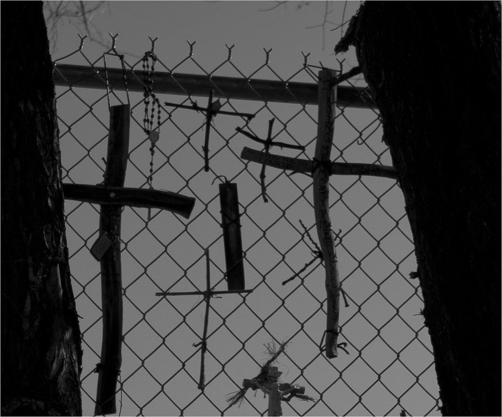
You see silhouettes such as these as you travel the backroads, so nothing really too unusual:

Home on the Range #1 by Vince Lupo, on Flickr
You see silhouettes such as these as you travel the backroads, so nothing really too unusual:
Home on the Range #1 by Vince Lupo, on Flickr
rogazilla
Level 2 Newb
Thank you Vince for sharing. I have been going back to the monochrom thread and went from page 1 to now on page 70 over the last 2 weeks.
It further reinforce my believe that it is the photographer that makes the photo.
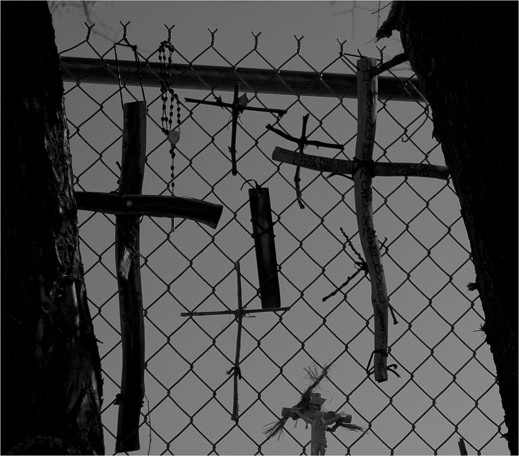
Take the images you posted here from both SL and Monochrom. It is really your vision that makes the image. Looking at both from the medium (my computer screen) it is YOU who makes the picture interesting and amazing. The only difference I can see is the sun is a little brighter and there is the slightly brighter reflection on the fence on the monochrom and missing on the SL but I assume that's just the sun start to set. Not a reflection on the cameras themselves.
The sharpness was not really a factor until you crop the pictures but looking at the images as a whole, it didnt really make a difference to what the impact has on the viewer.
It will probably go back to when you print the pictures and to see if the sharpness translate to the print and the size of the print you normally print.
Both cameras are great in your hand and I look forward to hear your thoughts when you make the final decision 🙂
Roger
It further reinforce my believe that it is the photographer that makes the photo.
Take the images you posted here from both SL and Monochrom. It is really your vision that makes the image. Looking at both from the medium (my computer screen) it is YOU who makes the picture interesting and amazing. The only difference I can see is the sun is a little brighter and there is the slightly brighter reflection on the fence on the monochrom and missing on the SL but I assume that's just the sun start to set. Not a reflection on the cameras themselves.
The sharpness was not really a factor until you crop the pictures but looking at the images as a whole, it didnt really make a difference to what the impact has on the viewer.
It will probably go back to when you print the pictures and to see if the sharpness translate to the print and the size of the print you normally print.
Both cameras are great in your hand and I look forward to hear your thoughts when you make the final decision 🙂
Roger
Vince Lupo
Whatever

FranZ
Established
Vince,
I use polirazation sunglasses to, the kind that clip on my normal glasses.
With my sunglasses, I can see the LCD Ok, but, when I take them of and turn the clip-on sunglasses 90° I see nothing!
So, the useability of sunglasses with your EVF is dependant on the angle the sunglasses polarization lines make with the EVF's.
Maybe you can get a par of sunglasses which work the right way with your EVF.
Hope this helps.
Hsg
who dares wins
One shot from a couple of hours ago. Leica SL, ISO 50. Processed in the bar of the Hotel Eklund, Clayton, NM!
A Man's House... by Vince Lupo, on Flickr

Looking at the images posted in this thread, I couldn't help but feel that most of them seemed underexposed, so I looked at the histogram of a few and my assumption was correct, a majority are underexposed.
Below is the histogram for the image above as an example. All the data is on the left of of zone five with very little in zone five, six and seven, in other words no midtone and highlight detail. Another important point about the histogram of this image is the combed histogram effect, which is the gaps in histogram that shows clipping of data.
Since its virtually impossible to judge image quality with underexposed images I thought I'd share my observation.

Vince Lupo
Whatever
It is entirely possible that they might appear a bit dark (I had this same issue last year when I was out here), but as I stated in my very first post of this thread, I am working on a small laptop in a variety of circumstances (hotel rooms, cafés, restaurants), and under a variety of lighting conditions, so they may require some tweaking afterwards. I've calibrated the laptop screen a number of times but have never really been happy with this screen (it's a glossy 15" screen). I am sure that I will have to adjust all the images when I'm back home and looking at them all on my 27" screen under consistent conditions. So you might want to consider all these photos 'placeholders' of sorts. Plus generally I think it's hard to judge image quality of a 72 dpi image on a screen - I ultimately judge with a print from the high-res version of the image.
And honestly (and as a separate point) I don't live and die by the histogram.
And honestly (and as a separate point) I don't live and die by the histogram.
airfrogusmc
Veteran
With the original MM you should slightly expose to the left or "underexpose" (kind of a lame word to use in this case I think) as compared to many other digital cameras. I think the mood is well achieved here with fine detail even on the shadows and with this example posted I really don't see any important blocked shadows and the nice whites (window) that aren't off the scale.
These all look properly exposed on my monitor and I'll bet they make wonderful prints.
These all look properly exposed on my monitor and I'll bet they make wonderful prints.
Vince Lupo
Whatever
My only other frame of reference with me out here is my iPhone screen, and they all look okay to me (in other words, they match what I see on my laptop). The only one that frustrates me is that 'Paradise' photo. I even went back at a different time of day to see if I could improve it, but didn't work. The scene faces north, and I think it needs a completely cloudy day, which out here can be a bit of a challenge to get 🙂
Before I left on this trip I calibrated and compared images on my laptop screen to the same images on my 27" iMac. When I started to work on the shots out here, they all looked kinda brown to me, so I recalibrated my screen and adjusted the white point. They look more neutral to me now. And perhaps as far as 'hitting all the zones' goes, it may just be my personal aesthetic approach/interpretation of a given scene, which may not necessarily result in having tones in every single zone. Honestly, I never look at the histogram - I go more by feel and what I think corresponds to what is in my 'mind's eye'. Even with this what some might consider a 'seat of the pants' method, I've generally never had an issue with blocked shadows or blown highlights in either CCD Monochrom or Monochrom 246 files and their resulting prints. Most likely the way I'll continue to work, though I'm sure many won't agree with that particular working method. Oh well.
Before I left on this trip I calibrated and compared images on my laptop screen to the same images on my 27" iMac. When I started to work on the shots out here, they all looked kinda brown to me, so I recalibrated my screen and adjusted the white point. They look more neutral to me now. And perhaps as far as 'hitting all the zones' goes, it may just be my personal aesthetic approach/interpretation of a given scene, which may not necessarily result in having tones in every single zone. Honestly, I never look at the histogram - I go more by feel and what I think corresponds to what is in my 'mind's eye'. Even with this what some might consider a 'seat of the pants' method, I've generally never had an issue with blocked shadows or blown highlights in either CCD Monochrom or Monochrom 246 files and their resulting prints. Most likely the way I'll continue to work, though I'm sure many won't agree with that particular working method. Oh well.
icebear
Veteran
LOL doing an off screen analysis of a 353.3 kB post is really solid😀
I have no experience with the handling of highlights of the M246 or the SL for that matter. I use the histogram a lot to check for overexposed highlights on my MM. Every camera has it's own optimum working point and the photographer decides which zones are important to him. So taking simple rules like "expose to the right" and throwing out some technical judgement about excellent photographic work is a little besides the point🙄 but no suprise😎
I have no experience with the handling of highlights of the M246 or the SL for that matter. I use the histogram a lot to check for overexposed highlights on my MM. Every camera has it's own optimum working point and the photographer decides which zones are important to him. So taking simple rules like "expose to the right" and throwing out some technical judgement about excellent photographic work is a little besides the point🙄 but no suprise😎
Vince Lupo
Whatever
Worked all day today on the 'west side' of Santa Rosa for a story for the Guadalupe County Communicator newspaper. All shot with the SL, as the paper wanted to have the option of running some photos in colour.
I have a bunch of photos to go through - these are the first two I was able to do:

John, Santa Rosa by Vince Lupo, on Flickr

Steve, Santa Rosa by Vince Lupo, on Flickr
I have a bunch of photos to go through - these are the first two I was able to do:
John, Santa Rosa by Vince Lupo, on Flickr
Steve, Santa Rosa by Vince Lupo, on Flickr
uhoh7
Veteran
Great images 🙂
I don't know about the 246, but the straight MM, if you follow the idea, should easily out resolve both SL and 240 at base ISO, or am I missing something?
Note the little branch which comes in from the top near the roof, the further one: the degree of OOF is clearly different. Focus is not the same on these two shots. Critical focus on the 246 is just slightly missed, I think.
I don't know about the 246, but the straight MM, if you follow the idea, should easily out resolve both SL and 240 at base ISO, or am I missing something?
Detail crops of each photo from roughly the same section:
Monochrom 246:
Chimayo 246-1 Crop by Vince Lupo, on Flickr
SL:
Chimayo SL-1 Crop by Vince Lupo, on Flickr
Note the little branch which comes in from the top near the roof, the further one: the degree of OOF is clearly different. Focus is not the same on these two shots. Critical focus on the 246 is just slightly missed, I think.
Vince Lupo
Whatever
I don't think so - I did a few other 'side-by-side' comparisons, and the difference was consistent. Now of course I'm going under the premise that when I'm in focus in the viewfinder of the 246, the lens is actually in focus with respect to the sensor.
As far as the CCD Monochrom 'out resolving' these two cameras at base ISO, that's doubtful too. Here again, I can see it in the prints (at least between the CCD Mono and he 246 Mono), and to me the prints from the 246 appear sharper, and reveal more shadow and highlight detail.
A bit of an update on the SL vs 246 'shootout': I shot with the SL all day yesterday, and I found myself missing the optical viewfinder of the 246, as well as the more straightforward usage of that camera. I'm having this feeling that I might stick with the 246 after all, but there's still another week to go, so we'll see.
Vince Lupo
Whatever
One of the 'pep talks' I have been going back to is this short Jay Maisel video. Has been very helpful to me when I come out here: https://vimeo.com/116692462
Similar threads
- Replies
- 26
- Views
- 6K
- Replies
- 6
- Views
- 338