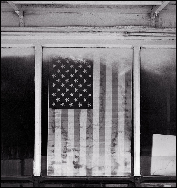
I haven't checked this thread for a while, and must say I am impressed with these recent additions, especially the composition of the farmhouse with the American flag. Congrats on the movie poster, although IMHO the original has a mood/feeling of desolation that the poster lacks. Wording, text placement, and layout do make the poster work for the required theme of fear. I mean all of this in a good way, so please take it as a compliment. In high school I took a lot of art and art history, but then in University I studied engineering, then worked in IT, and now work in a bank. These are not powerpoint slides with charts and graphs so my ability to express myself is breaking down... 😉


