Brutally honest critique thread

It's a wonderful photo (OP) Only problem is it looks too light on my monitor -- I would "print" it differently so it had more drama - you know darker overall, but still brighter on the man and his stuff. I would've ran across the street to shoot this shot -- but as a square, because that's my jam.
 
Trying to find out what is wrong with this one.


The biggest problem with this image is that three quarters of it is wasted space, filled will clutter that distracts, the man's back and the pole in the background especially. Shoot 45 degrees from the front side waist level in landscape format perhaps will give better results. Personally I would include at least part of the front wheel too.
 
As I've been shooting my mouth off, I'd like to offer one up as well:

tumblr_ni6w19KxYl1qamvqvo1_1280.jpg

I'm distracted by the bluish-colored people on the left. I'd like to see the image cropped so the main subject is looking over her shoulder out towards something off-frame, that only she can see but we can't. This would add a bit of mystery to the image.

~Joe
 
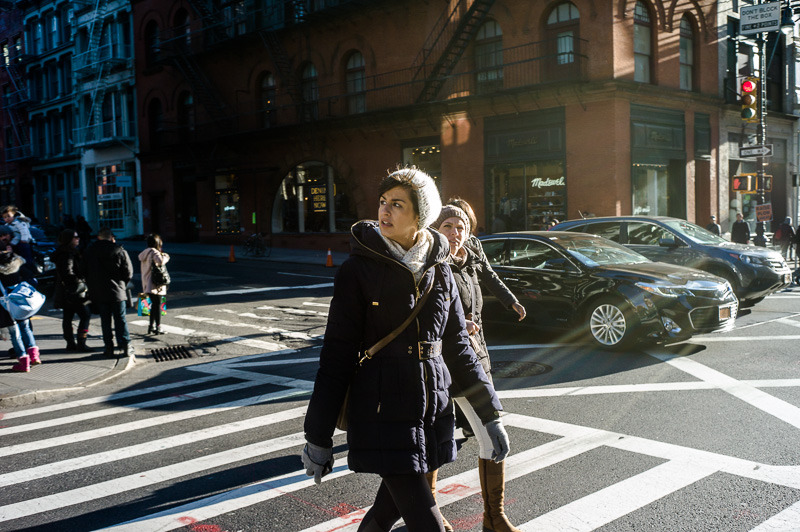
My main concern is the angle you chose to approach the subject. I understand you wanted to get both the older ladies and the younger woman on her phone but I can't help thinking that with all those grey heads bobbing back and forth towards each other you could have got your point across by standing in front of the younger woman to ensure the phone was in shot and have the gossiping heads behind. Maybe even having the older ladies in the foreground and waiting/positioning until the younger woman and her phone could be seen through a gap in the heads of the ladies or off to one side as she appears to be currently. From the angle that my last suggestion would have given you'd also have made more of the similar body shapes e.g. hands clasped over handbags, legs crossed in the same direction ( again a case of seeing possibilities, working the scene and hoping your luck holds out until you feel you've really got what you wanted.)

Already we seem to be seeing how important it can be to investigate as many aspects of a scene as we have time to do

Thanks Simon, your ideas are useful. I was treading very softly taking these photos as I didn't want to distract anyone with my large camera (5D/24-105mm). Original image @70mm.

I would've felt more confident using something more discreet. I only made one other picture of this group, @65mm from a different angle, without the lady on her mobile:

16634247766_02cc4165c4_o.jpg


Greg - thank you.
 
Dirk, I find your picture difficult to critique because I like it:
- composition/framing
- the old man wholly in the shade, with its more muted colour (symbolises age), in contrast with the b/g sunshine-bright colours (symbolises youth)
- the shadow line and the curve of the street leads us into the b/g

I find the b/g person with red bag an eye-magnet. Would prefer not to be there, but I imagine you may have missed the opportunity if you'd waited for him/her to go.

I would like to see this image converted to bw. I think it might be even better in bw, but I admit to personal bias.
 
nightfly, I wish you'd pointed the camera down a little more to include feet, while hopefully still including that red traffic light top right. Her face is centred so it looks like a grab shot.

I'd try cropping 16:9 to just above the girl's head; this would make her more the centre of attention, the aspect ratio would give a more cinematic feel, and I think it would be more balanced.

The blue colour of the building on the left does not look natural. Shade is blue, but not that saturated a blue. Also wondering about the skin colour on her face, it seems a bit green to me, maybe I'm wrong on that..
 
Please let me have your honest critique.

El Viejo by FilmFlamMan, on Flickr

I stared at this image for five minutes to try and find something intriguing... it’s BORING.

I looked at your Flickr pics too... BORING (except for “Choosing Melons”).

If you want to change your photography... change your camera.

Or better yet, take a Valium... and R E L A X.

You're too uptight.
 
Please let me have your honest critique.

El Viejo by FilmFlamMan, on Flickr

I like the color, the patterns, the lighting, and the graphic quality of this photo. It is pleasing to the eye, but I don't know what you are trying to communicate with it/what you want to tell us about the old man. To tell you the truth, I don't know if that is really important, as I'm not a street shooter. Overall, I like the image.

- Murray
 
I stared at this image for five minutes to try and find something intriguing... it’s BORING.

I looked at your Flickr pics too... BORING (except for “Choosing Melons”).

If you want to change your photography... change your camera.

Or better yet, take a Valium... and R E L A X.

You're too uptight.

Is that really the best you've got George? If Dirk needs a valium perhaps you need to buy a line or two and snort enough to stoke up the imagination! What a drab, pointless, unhelpful little poke. Harsh criticism is something we're all up for here but thats just f**cking pointless. The advice to improve his photography by buying a new camera - genius. Just genius.

I'd suggest those five minutes could have been so much better spent with even less thought. I'd bring up your thought on 'Choosing Melons' as his most interesting shot over pictures like Cabezas Yucatecas, Sea Wall or On....but I can't be arsed, its BORING.


I agree totally Simon ... that post was way to personal for me. I thought this was about critiquing the image, not the person who took it!

I'd be hesitant to post anything in this thread after seeing that crap! 🙁
 
I agree totally Simon ... that post was way to personal for me. I thought this was about critiquing the image, not the person who took it!

I'd be hesitant to post anything in this thread after seeing that crap! 🙁

Don't be hesitant Keith, I'm hoping..and kind of expecting🙂eek🙂 this thread to come to life with some insightful comments, shared knowledge and open honesty. One thoughtless comment shouldn't derail us.

We've had some threads recently that started to go a little wayward yet ended up becoming extremely interesting and a little provoking perhaps partly due to that loss of direction. Hopefully that will continue here.
 
Please let me have your honest critique.

El Viejo by FilmFlamMan, on Flickr

Dirk ,
I think in this sort of situation I would of approached the guy to see if you could of got a portrait of him and spent some time with him. The shaft of light in the back of him may of been a good way to light him ,as it is now it just looks flat with not much going on.... I would of also of waited for the person in the background to exit the scene ....
 
Hi Dirk,

I mentioned I'd like to see your image in bw - trying to be constructive here, I want to show you what I had in mind. Your image talks to me about ageing:

16660384322_d096ae7e60_o.jpg


...as if he is acknowledging defeat by the hill before even attempting it.

Cheers,
Lynn

PS and I agree with Simon and Keith. That comment was not in the spirit of this thread IMHO.
 
Back
Top Bottom