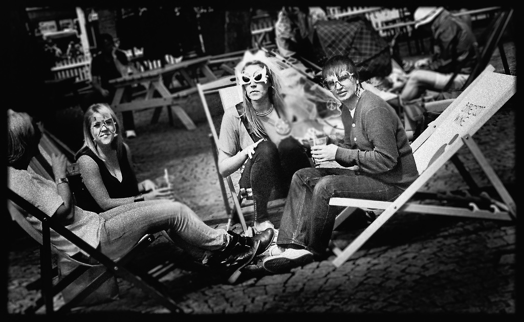
Brutally honest critique thread

OK ... this is what's really going on here ...


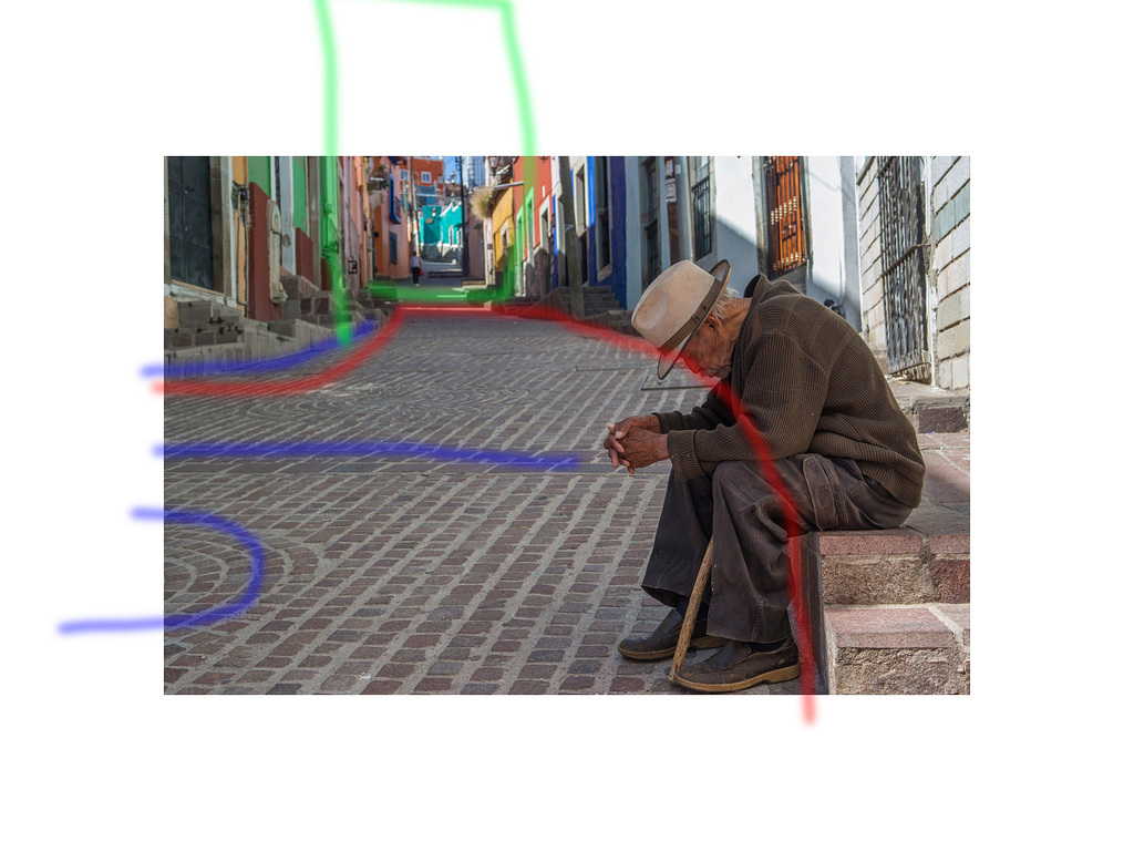
16560315916 d5318ed306 b par Sparrow ... Stewart Mcbride, on ipernity

... the strongest eye-line, the red one runs your eye right round the frame, a good strong line and a nice shape ... unfortunately it contains little on the photos that is of interest, in fact it actively distracts you from the subject (the chap) and the sunlit buildings in the mid distance

... and unfortunately the features it contains the, blue-lines, all draw the eye out of the left of the frame due to the eye-line and the (gestalt) completion of the paving.

... the long focal length and the landscape format are also a bit of a problem, it contracts the perspective, causes a claustrophobic feel and cuts off an area that may have helped add interest, the green-rectangle. A portrait orientation may also have helped ... but as we all know things happen too quick for these 'should-have' suggestions folk trot out (a good reason to fire a few different versions off if one gets the chance)

... the photo is a bit sharp for me taste, but that's me, the photographer however should commended for not falling for the bokeh trap, we can at least see where the composition leads our eyes, and the colour is just right for that midday mediterranean feel

Things you could try; removing those bright lines that are across the road may alter the main eye-line somewhat, and making the shadows darker might help alter the eye-line to enclose the subject, and reduce the patterning of the paving.

PS ... sorry Frank, I just do honest, I get into enough trouble as it is
 
I personally dislike when I read someone suggest to make a photograph B&W. Its worse than when people would add "crop suggestion" notes on flickr. If an image doesn't work, its usually because the composition or exposure is off, or it's lacking interest; not because it is in colour. A monotone treatment when used as a remedial crutch is a bit desperate IMO.

Nothing personal Lynn.
 
As I've been shooting my mouth off, I'd like to offer one up as well:

tumblr_ni6w19KxYl1qamvqvo1_1280.jpg
Thanks Frank. I'm inclined to agree.

I was taken in by the color, the flare and the look on the woman's face but I can see that it's not enough to carry the photo. I feel like it's too centered and there isn't enough going on in the rest of the frame.

Don't agree there, the centring and the cleanliness of the whole image is what brings calm into it, most street shots are too visually crowded AFAIC.

The light: cool, including the flare, the blue and orange hues in the background too.

But, the cut-off feet and the third walker almost completely obscured by the second one still clutter the image up too much to my liking.
 
Harry, no offence taken! I see it differently: not as a crutch, but as a more effective interpretation. I think colour is the most important thing in a colour photograph. In some cases (like this one), I think the bw works better because IMHO the strength of this photo rests in its shapes, composition and lines, light and shade, rather than the colour. You're quite welcome to disagree 🙂

Cheers,
 
Right Frank ... here we go


49a88a44969e766ad64de0894045099e par Sparrow ... Stewart Mcbride, on ipernity

First off you broke the "don't put stuff close to the edge" rule, and we all do that at our peril, had there been more ground to figure you my have got those two horizontal lines (that I put on), on the third nodes (and to all those who bleat about this yes, yes I know there are no rules, especially the rule of thirds, and the few that there are there to break) and that would have given some environ to the sides ...

... the main lines I see, red-lines, have quit a nice shape a bit of a swag-like drape at the sides and a bit of repetition going on with the flags (are they). Those and the straight features, blue-lines, all conspire to draw the eye to the subject of the photo ... sadly in doing that they make the man's bottom the subject and discourage us exploring the flags and the rest of the photo

Aside from that, and that bit of a bicycle doing that distracting negative space thing, the photo is technically perfect as one would expect from Frank, good blacks nice tonality and bags of crisp detail with a thin enough DOF to soften what background we can see.
 
I might have missed this in an earlier post, but what about starting a new thread for each posted photo- perhaps tagged as BHC "brutally honest critique" or the like.

It'll prevent images getting lost in the pages of responses & will allow "bumps" if a photo missed critiques.

Just a thought.
 
Please let me have your honest critique.

El Viejo by FilmFlamMan, on Flickr

i dunno guys..i quite like this shot the way it is... I mean, could start talking about needing one step back for better "framing" or that extra person far, far away, but that is just hair splitting, they don't really kill the shot
Maybe a bit cliche- an old guy in a "timeless" environment - but it's pretty darn well done, i'd say
Sorry for not being brutal, just honest
I could be brutal, in exchange, with criticizing some of the "brutal critiques" it received, hehe
 
Here's one to get your teeth into. Taken with Retinette 1a. No post processing of note.

https://www.flickr.com/photos/schlapp/14326216962/
huuuh, that is interesting 😀 i am looking forward to the brutal replies soon 😀
i like it, tho i think it's one of those "lucky mistakes" -honestly, did you plan it like this?
I wouldn't associate a deep meaning to it but it's interesting looking and decorative - good shot in my book.
But no, it's not street photography 😀

EDIT: post processing and/or camera type is totally irrelevant unless your point is to prove what a camera/film combo can do. Again, just my view.
 
... and to be fair, I'll add one of mine to the fire ... I'd be interested to know how anyone reacts to it, it was made as a pastiche and has plenty of stuff to critique I think 😀

glasses girls par Sparrow ... Stewart Mcbride, on ipernity

So the girls are wearing funny glasses and the photographer has caught their attention. Big deal. I don't see anything particularly noteworthy about this snap other than the impression that they are all going to slide off the edge of the frame, Winogrand style.
 
Trying to find out what is wrong with this one.


Just about everything 😀
Subject: Not able to identify. Could be the tilted lamp post!
Message: "My engine is misfiring, wtf?!" or maybe, "I've dropped my protheses in there, somebody fish it out for me!" or maybe "Is that a cricket?"
Composition: Several mistakes and no, in this case it's not helping that it "breaks the rules".
Technicalities: not enough contrast, motion blurred, badly focused, framing messed up
Artistic merit:
-Would i hang it in my wall: No, the cat would get too stressed.
-Would i see it gladly through the RFF Postcard project: yes maybe if it gets wet and crumpled through transport it would improve a lot.
-Would i buy it if it's in a photo book: now let's get realistic...


Last remark: You were being sarcastic by posting it, right?
 
... and to be fair, I'll add one of mine to the fire ... I'd be interested to know how anyone reacts to it, it was made as a pastiche and has plenty of stuff to critique I think 😀


glasses girls par Sparrow ... Stewart Mcbride, on ipernity

Hm.

Too much grain to my liking, too much contrast too. What's that with the weird fogging in the center of it? Severe case of overdeveloping is what comes to mind...
 
Generally on RFF we are a supportive, chummy-chummy group, and polite to a fault in our responses to pictures that are posted. When someone does come along with a harsher than normal for RFF critique, it is somewhat jarring and unexpected. This thread is only for those willing to have their images shredded if they deserve to be; kind of a tough love reality check.

I don't mean that a great picture should be unfairly insulted, the poster should not be personally insulted, just that in this thread, no allowances need to be made to consider a poster's feelings. In fact, if you have thin skin, you probably shouldn't offer a pic to be critiqued here.

I'd like to start by requesting that Ned critique this image of mine: Street Vendor

49a88a44969e766ad64de0894045099e.jpg

Decent picture as it is, no crop necessary for sure.
 
Thanks for the criticism. I do appreciate it. Allows me to clarify for myself what I like and don't like about the photo.

For me the cutting off of the feet matters not at all but it's interesting that it bothers people. Something to think about. I like the girl and the light but the rest of the frame is wasted to me. One of the advantages of the rangefinder is the ability to see out of the frame. I generally like to put things at the edges and use the whole frame and this one I don't do this very well.

Again, thanks, move on to the rest. I really like this thread.
 
This is an image I have posted in the past.

It was a mistake to begin with. I had a loose roll of 120 in my bag that I thought was 25. In fact it was ortho 25 😱
This image was taken on the tripod with an R25 Filter (red). I'm lucky to have an image at all.
I struggle with working with it or abandoning it completely.
I have since spotted the scan which had many dots from poor devoloping conditions.
What would you do?

Run Away! by Adnan W, on Flickr

Andy, I consider that one a "mood" piece, and don't mess with it. Especially don't try to "fix it", unless you want to nudge it slightly in some direction, keeping the mystery about it.
 
Back
Top Bottom