critique my photos, be honest!

Back on your first photo and description of why it captured your attention -

I like your concept you were attempting to capture. Its interesting to me that no one really picked up the intent of the photo until you described it.

Part of this may be due to the number of focal points in the image. All the faces are drawing much more attention than the cutter itself. Maybe a lower camera angle, showing less of the salesman - almost table level and upwards - would have highlighted the action and item while still capturing the crowd? Or perhaps an image like this would work better as part of a series focused on the topic?

oh, I am very grateful for this Brian, thank you very much for picking up my description and taking it into account. You also appease 'the shame' I feel of having put this pic up for critique.

I find your points how it could have been better very accurate.

Above all it gives me backing for what I try to do generally during my 'extended travels'. You make me understand that for it to have any value that it would need to be shown in series with words of explanation ( even though, so far, mistakenly, I have thought that photos shouldn't need that )
 
Regarding the group photo, I agree with the others that it it quite bland since it lacks a strong 'focus.' I am posting one of my photos that ***IMHO*** illustrates a group photo with a singular focus. I am not asking for critiques for this photo (but feel free if you must), but I do believe it is a good example of a group photo that works because it obviously highlights a single person in the photo.

med_U23043I1425487580.SEQ.0.jpg
 
Am enjoying these posts much more than the "brutally frank critiques". Certainly well presented and the responses are a little kinder than on the other critiques.

happy to know that, thank you for letting us know. The 'original thread' had attracted me for it's 'promise' to get 'frank' critique, but as it unfolded posting there did not feel right anymore. This is my egoistic effort to 'get what I want' nevertheless, and at the time is intended as a trial of a 'better' alternative for any other poster wishing honest critique.
 
Seeing these details as they happen, Live, in the viewfinder, is a matter of practice and BEING AWARE of those things.

Like from now on you'll be aware of it everytime you'll be composing.
Some people will go on a lifetime without knowing this stuff. Which is ok.
But if they're aspiring to be good at this sport, they have to know these basics.

I dare say that lately I have been more aware of these details.

The pics shown so far date back a few years, I just had taken up photography using manual lenses, that time on an APS-C digital camera, my 'focus' had been above all achieving focus and I had been happy enough whenever I had success 😉

Having said that I hope I will be able to come up with more recent samples which prove that better awareness
 
We have a forum for this sort of thing already. Its called the "Critique/Salon" forum. Its located near the bottom of the forum list on the home page. 🙂

Oh! If it is agreed that this thread better fits there than please, any admin, have it moved there!
edit: But isn't this already posted exactly there?
 
About the original image, I agree with Daveleo. You had a very good idea about the crowds gathering to watch the vegetable cutter. You also captured an ideal moment to show the viewer what is going on - that the slice of cucumber is flying off.

The problem is really with your actual subject - the crowd. Others have said that the details don't line up to make the image work. I would add that their expressions are full of "dead ends" - eyes don't lead you anywhere and/or the expression doesn't have a clear and/or consistent emotion.

I originally couldn't see anything to like about this photo until you shared your idea, now I "get it". I think if you have the opportunity to keep going back and working it until the proverbial stars align, you will eventually get a hit. You need the people in the crowd to convey what you see/feel internally or the viewer remains lost.

As far as the other images, I don't like the first portrait personally. It does have strong "figure to ground", which is good. However, I think the expression looks slightly strained/posed. I am not sure what the "3rd hand" means (but this could be a great element, I just might not understand), and the blown highlights in the top right are distracting to me.

The "smoke portrait" is great - it has an interesting perspective, it is intimate, mysterious, and uses the tones in the smoke and skin on the left of his face to "blend" them together to the viewer, which contributes to the mystery. Very nice.

Thanks for opening yourself up to critique! It is very brave.

slowly but surely I understand better what makes the fist pic that weak and how difficult it is, as pointed out by Pherdinand, to make a successful photo of a group of people.

I am afraid I can't go back for another try, but the world is one big photo opportunity and hopefully I can take the one or other lesson right here.

the 'third hand' must refer to the hand of another person sticking out from the back on the right side of the main guy.
I had waited for mention of the blown highlight. In my original, first version posted on flickr the face had been very dark, that spot already blown, a backlit high contrast situation. the version shown is a later edit that lit up his face, but possibly there are no details in that highlight to recover. Still it should be 'downed'. ( just recently started trying partial PPing, there not yet )

happy that you like the smoker Zak! I though it also had some technical issues, but here they don't seem to disturb much.

oh, I don't feel all that brave, just grateful for the opportunity
 
..
The other thing that I prefer about this one photographer/one thread format, is we get to see several of the photographers pictures and develop a better sense of their work.

this is exactly what I wished for, Frank I am very happy that you find this good too!
 
Regarding the group photo, I agree with the others that it it quite bland since it lacks a strong 'focus.' I am posting one of my photos that ***IMHO*** illustrates a group photo with a singular focus. I am not asking for critiques for this photo (but feel free if you must), but I do believe it is a good example of a group photo that works because it obviously highlights a single person in the photo.

med_U23043I1425487580.SEQ.0.jpg

Keith thank you very much for showing the effect of a 'singular focus' in a group photo, your good sample makes me understand!

- pardon me, but my first thought, when I saw your photo, was that I don't like anyone posting photos in 'my thread'. This because I want this to be a sample of how the honest critique threads could work better, and I regard it important, as explained earlier, that every member has his own thread with his photos only. Now however I understand that example photos of others that make a point like yours should be allowed!
 
haha, thank's for that!
I am not sure if you are being sarcastic, most likely you are, but this very well expresses why indeed I thought it to be somewhat interesting, but comments make me doubt it, and I am grateful for that
...

You are not the first one here to whom I have to answer - I wasn't sarcastic, I was honest.

The picture is great to show something about people. Not just another exercise with geometry, lights, shadows, focus and else which makes it visual.
It is fairly simple to accept it as great one, if trying to think what is in the picture in terms of people.
In common words - this picture tells you the story and it is not as simple as someone might think of.
I forgot then I last time seen reaction of faces like those...

what a pleasant surprise!
I knew that showing this photo here was daring, it does have some technical issues too. For what it's worth I get rather spoiled with views, favs and comments on my flickr, and I find it quite gratifying if that comes from local people of the places I 'travel'. This was not one of them and I was curious if there is anyone out there that has some appreciation for it.

"Not as simple as someone might think" ..this pic may have the same problem as a lot my photography in general: How can anyone recognize, or who will see that it ( probably ) is not just another travel pic, but that it shows something peculiar?
In so far I consider the other pics shown a bit 'weaker', but imo they also have something there, I already hinted at it: I had been living out there at the camp with the pilgrims and Saddhus for weeks, sharing food, days and nights. This had given me an angle, access to these people which is not all that easy to get. ( the 'Pro did it with the help of an translator, a stack of 'handout money' and model releases filled out, sometimes also signed by the translator..one time when he got threatened I watched him frantically waving his credit card ) Photographically I should have done better though, nowadays I hopefully would ( but most likely wouldn't again put up with the life style )
 
the recent 'brutally honest critique' thread has drawn a lot of attention. It also has exposed issues, but the possibility to get 'honest' critique sure is intriguing. Not sure what to expect and if I shall like it, but I think the only way to find out is by trying 😉

now my trouble: which photo to choose? oh, now I found one! I know I know, if you say I should not go by flickr standards you do have a point, but I choose it because I admit it surprises me, as I just found out, that it has not received any fav nor comment:

5407872867_fd72a93e1c_b.jpg

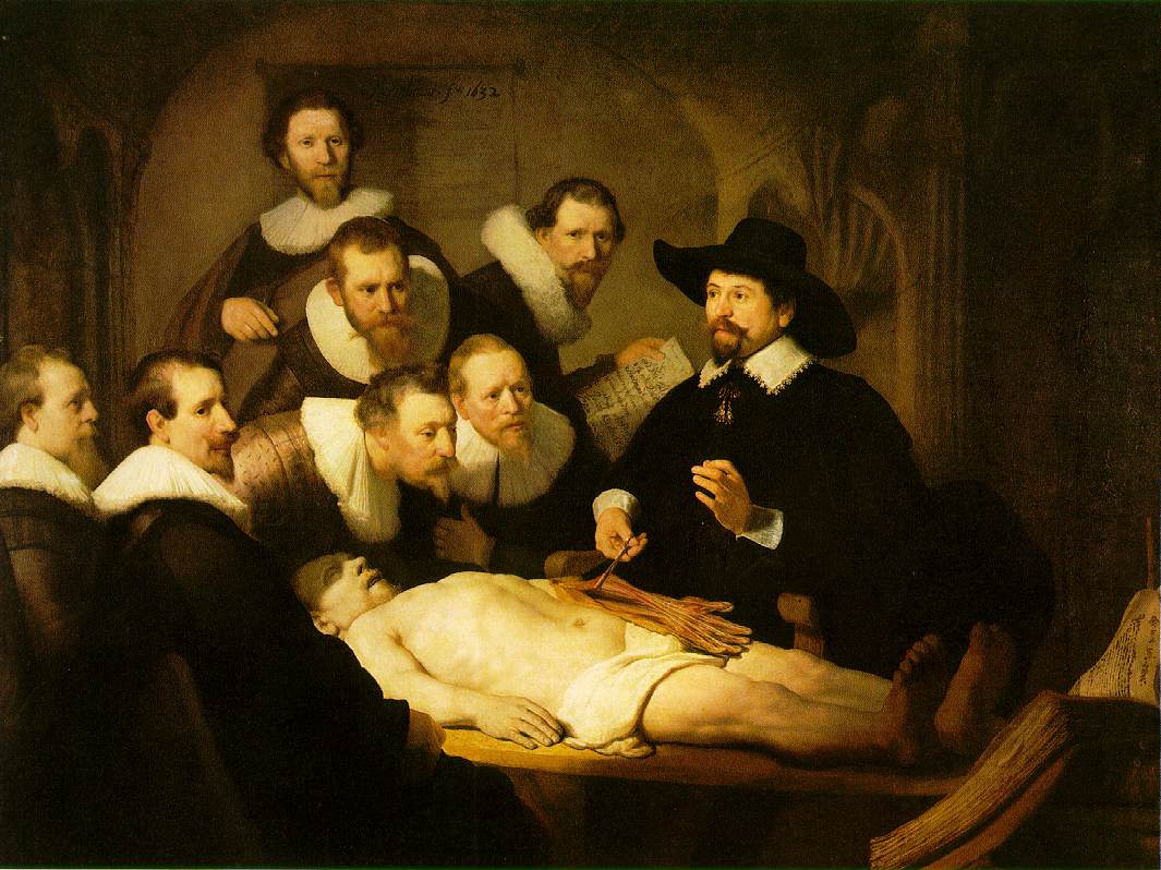
This photo of yours reminded me of Rembrandt's - The Anatomy Lesson Of Dr Tulp.

nicolaes-tulp.jpg
 
It's interesting to me that this group of people are so captivated by this veggie carving demonstration. Except for the blinking lady all eyes are intently focused on the tip of that knife blade. (no focus point?)

Look at the faces. Example, the guy on the far right seems to be absolutely stunned at what he is seeing.

Is this group of people just imagining what they can do with this knife? Is it the talent of the carver that holds their interest.

Is this photo too easy? Could this have been taken in NYC, Paris, or London where we can't focus our minds on anything for more than a few seconds? Is there something about THIS group (politeness, genuine interest, paid participants?).


How long did they stand there? Did they buy what he was selling? If not, why waste so much time watching?

I agree with dressing the image up with contrast, vignette etc.. Make it look like a real B&W print 😎

[FONT=&quot]Thank's a lot Thardy for your interesting observations and queries!

yes, focus point is weak. Looks like I missed focus, anyway should have stopped down further. Might have used the lens wide open, did that a lot then and by the look of it sure did that with the 2nd color [FONT=&quot]pic [/FONT]that I shall add now where [FONT=&quot]the faces sure would need more sharpness[/FONT], there one can see that it was a low light situation.

the onlookers sure look quite stunned[FONT=&quot], [FONT=&quot]certainly they are quite [FONT=&quot]drawn[/FONT] in. [/FONT]I [/FONT]find the apparent couple in the middle[FONT=&quot], [/FONT]their body language interesting. She is all up front while he is turned towards her, showing his participation of her exposed interest but not turned towards the presenter, showing hesitancy, his arms bound [FONT=&quot]on his[FONT=&quot] back[/FONT][/FONT]possibly weary of having to forge out the money to purchas[FONT=&quot]e[/FONT] while his face shows that he is quite intrigued himself, albeit a bit skeptical. ( and contrary to an earlier critique I find her fake CC shirt an interesting feature, combined with him looking dressed up 'for the event' )

I did not see anyone purchasing, only stopped there for these fast, two pics

Just now I did re-edit adding some punch, did not have the original RAW file but had to do with the file seen downloaded from flickr. So also with the color pic
( I hope that these new uploads won't offend anyone's eyes anymore and that I don[FONT=&quot]'[/FONT]t [FONT=&quot]come across of 'defending' the image, but of plain[FONT=&quot]ly explaining wh[FONT=&quot]y I find it interesting[/FONT][/FONT][/FONT] )

5407872867_34fb27ccaf_b.jpg


5407872861_082b09be38_z.jpg

[/FONT]
 
btw. the once mentioned 'postcard Saddhus'

2912878850_a89b985a1b_z.jpg

if you google images for "Sadhu" and/or "Saddhu" you will see quite a number of photos of the guy seen to the right. Sometimes together with his colleague who that day wore Saffron, more usually they cater to a different target group
 
Hi Kuuan. Thanks for for stopping back. My comment about focus point was that I see it as the knife. Some people said there were too many (the people).

That follow up photo feels like it lets off the tension that the first has.
 
I take that as a huge compliment 🙂
onlookers to a dissection being attentive is not that surprising 😉

The photo makes no pretensions, it does not try to be anything than a simple capture of people who are keenly watching a product demonstration.

It becomes difficult to critique such an image because it does very well what it intended. Your other images are similar in that they're simple and successful in what they wanted to capture.

You should only seek critique if you have doubts about an image and cannot pin down the reason.

your words "the photo makes no pretensions" touches me. I am intrigued by the 'normal', the 'every day' that's easily overseen and it's subtleties.
Sometimes I think that family and vacation pics define the very cream of photography, untouched by any other.

Photos that are celebrated as art, also many that are applauded here seem to be ever repeating variations of contents defined by greats already quite a while ago. However striking the may be visually most look forced and therefore little appealing.

I find choosing which photos to offer for critique very difficult. I thought that the first image had been exactly what you ask for. I had doubts about it because I kind of liked it but nobody else seemed to and I did not know why. Now I understand that better.

Some reactions along the line "this is so bad, it's not worth while critique" had me prompted to add some others, mostly to encourage that looking at my pics and writing a critique is worthwhile..

I did have some doubts about the 'smoker' for technical reasons.
Showing the others, all shown so far and the reactions have taught me various things. Importantly that from now one I will spend more time and effort PPing, also do that more aggressively. I am not sure yet if I will stick to the later, that might become a conflict between what I prefer and what I realize commonly seems to be preferred.

I am confident that I can learn much more in this thread.
Choosing which photos to show now is the biggest challenge
 
You should continue by posting more images, until you feel that you have got some insight after reading all the feedback.

This is a luxury of the internet age, before the internet no one could have their work critiqued in similar comprehensive and extensive way.
 
Back
Top Bottom