
kbg32
neo-romanticist
If it is about the vegetable cutter, why didn't you photograph him? The image speaks more about the crowd, which is not very interesting..
Individual threads like this looks to be a better and more organized way of asking and receiving honestly frank critiques. Kudos to the participants. This is what I had in mind all along.
🙂
The guy's back on the left and the out of focus people onthee far right are extremely annoying. They frustrate the viewer.
I've rarely seen such a frustrating picture to view, on many levels, as this one.
Honestly this picture is not worth critique or thread.
my preference is not posting a new thread for every other photo, but for each member having his 'own' thread presenting his own photos only. In this way every photographer can present his work, possibly explain his views his photography and photography in general and it is easy to come back to view critiques received.
what do you guys think?
Photo is perfect! Where else you could find the crowd to be so involved with such crap which doesn't draw any attention anymore 🙂
I agree with most of the negative comments made above.
It looks like you missed the opportunity to make a very good picture of this event (whatever it was).
If it is about the vegetable cutter, why didn't you photograph him? The image speaks more about the crowd, which is not very interesting..
. . .
not so sure if I could have made a much better picture of that 😉 . . . . .
oh, interesting! as I recall I was more intrigued by the crowd, but I take it that hardly anyone, if anyone at all, shares this view 😉
I share your view on that. The crowd is really the opportunity here, so we agree on that.
In that regard, I would comment that the crowd faces are blurred, not "kindly soft", just out of fucus. Heads are clipped. The large part of the frame devoted to the guy's back really interrupts your crowd subject. IMO it would have been framed better if you were more to the right and held the camera higher or maybe tilted it up to not clip heads.
All of that behind us.... if you like the picture, that is all that really matters. "Critics" be damned 😀
happy that you like the idea Frank!Very good idea!

Very spiritual 🙂
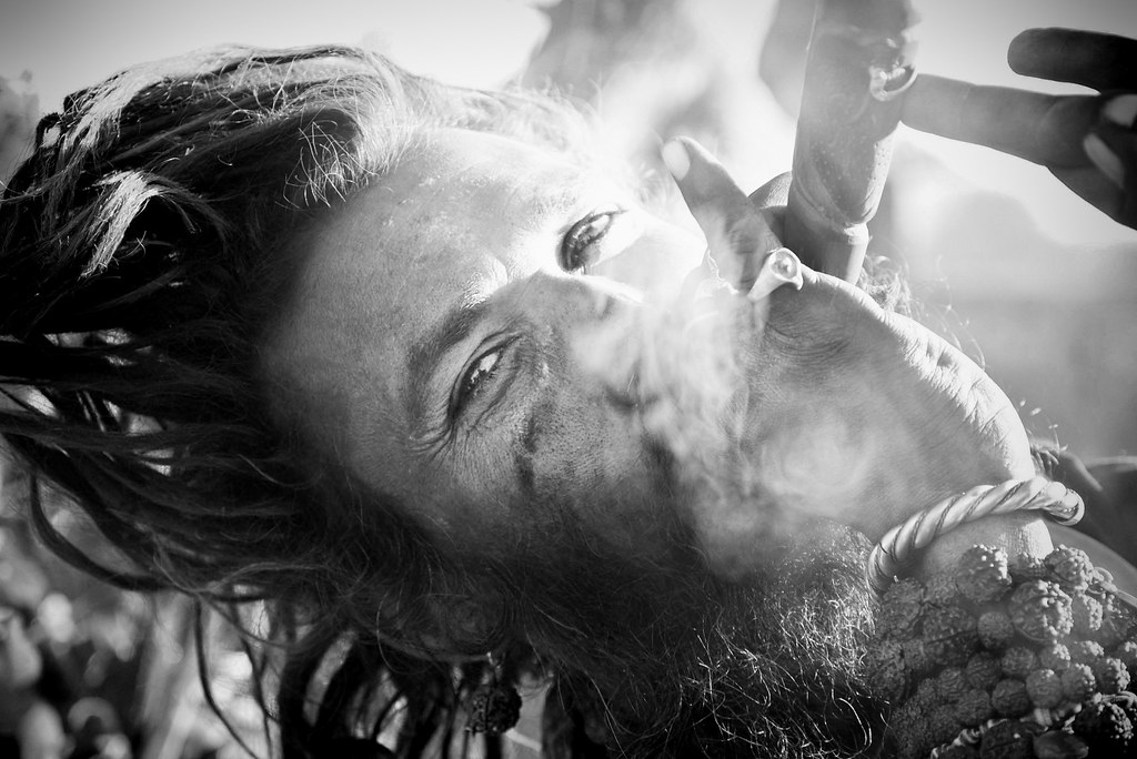
This one is much more engaging. The main issue for me is that it feels too narrowly framed for me to figure out what is actually happening, I wind up pulled in by the blunt central placement of the eyes but in the end frustrated by the lack of legibility. I think ideally this photo would have been taken with a wider lens and the composition placed off center to emphasise a broader sense of motion and to give enough content to make the action of the subject intelligible.
[in response to the picture of the guy smoking]
I see many, many pros in my field that should never be called Pros (where pro=good). That's another story for another day.
Have you seen this pro's work? Maybe his shots are brilliant. McCurry's Afghan girl didn't take much from him except a glance and a decision to aim at her. He didn't get personal with her. He just knew what he was doing. He gave a nod, he received a nod, he shot, he left. Yes, expert photographers have a magical way with the trigger. Years of experience are all packed in the eye and the finger.
You're touching a nerve here. An important point that amateurs should know.
True photographers are a Breed. They aim to "kill". They have nothing to do with weekend snappers that are offended by some critique, that are amateurs and are offended when they are called so. I'm talking in general terms and not pointing at anyone. But it is a Truth.
By the way, I like your Brad Pitt-ish smoking Guru. Very nice image.

This picture, I HIGHLY appreciate the fact that his left hand isn't connecting with the Horn. That alone makes it or breaks it.
Yes I'm tough, but that's how I also judge my stuff.
...
my preference is not posting a new thread for every other photo, but for each member having his 'own' thread presenting his own photos only. In this way every photographer can present his work, possibly explain his views his photography and photography in general and it is easy to come back to view critiques received.
what do you guys think?